This is what’s happening in your site visitors subconscious when they arrive at your store. It’s also why you need dedicated landing pages. To turn those deep-seated questions into a resounding yes.
Because landing pages are one of the strongest tools in your arsenal for sales.
Standing on the shoulders of giants is the best way to boost your business. With the help of creatives and intellects before us, we can see further and clearer, not because our sight is superior. Instead their work inspires our own, raising us up and adding to our stature.
No need to stress about originality when there are so many good foundations for you to build your ideas on top of.
Looking for inspiration for your landing page design? Here’s some of the cleanest, most creative and best converting from the web.
Astrolokeys
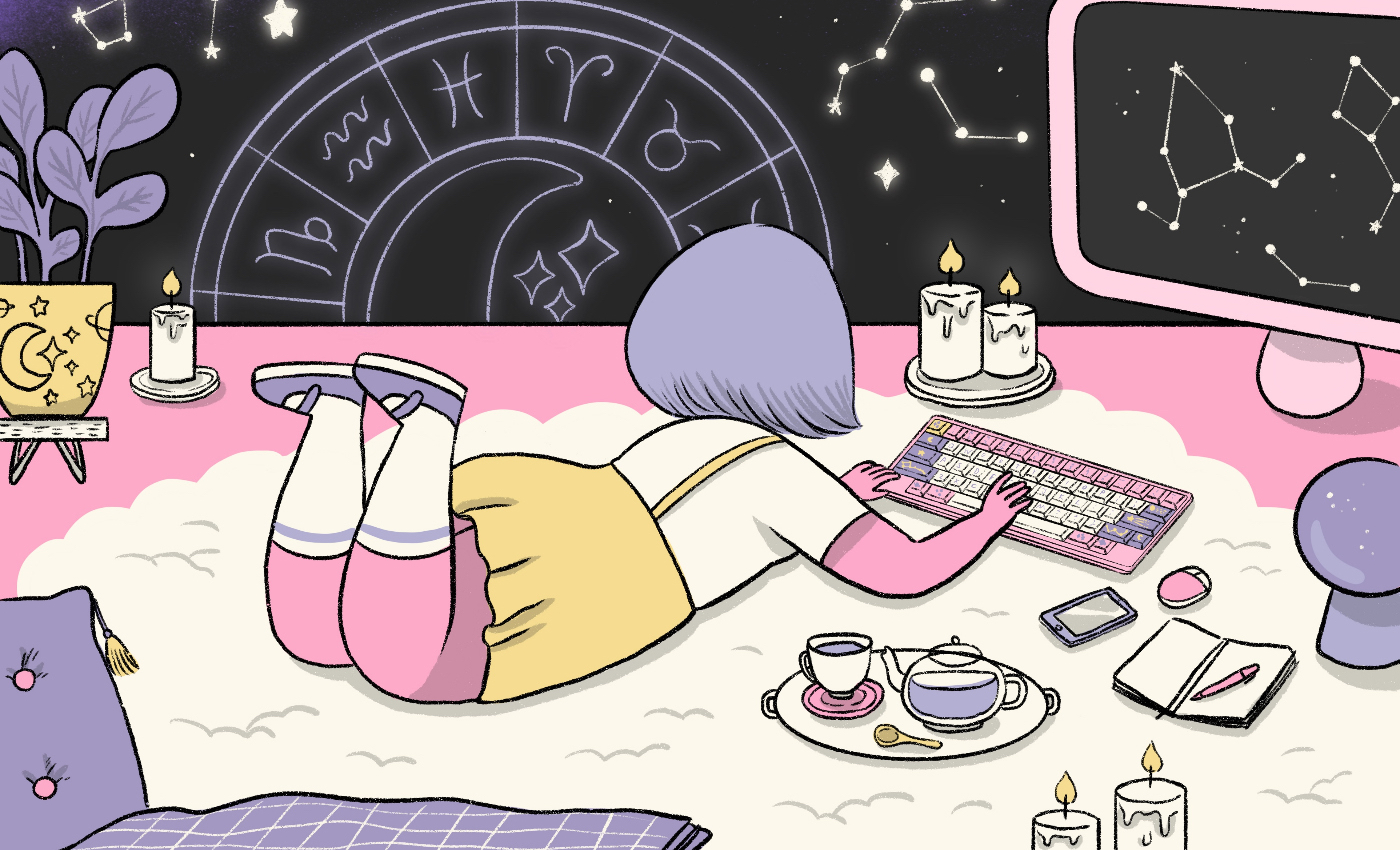
Stunning design using complementary shades of pastel that invoke a strong sense of magic and wonder for those late-night computer sessions, no matter what your hobby is.
Each keyboard design appeals to the personal traits of each zodiac. The type font is reminiscent of memoirs in a diary on a mystical night while indulging in retroelements from the 1980s and beyond. The use of empty space brings attention to each image and its message.
This eCommerce landing page speaks to the artist, the loner, the thinker, the explorer, the dreamer, the curious creator.
Crazybaby
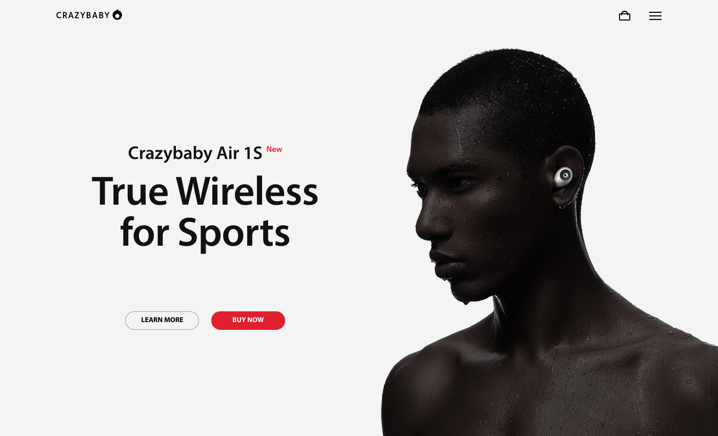
An eye-catching eCommerce landing page that makes great use of contrast, sections, combined with images of the product alone as well as in use. Bright red calls to action immediately draw the readers eye to Buy Now. Using red only in this circumstance is known as the “isolation effect”, a technique used to draw attention to a particular object or element.
Branding and menu navigation is kept to a minimum. User attention remains on the product, its benefits, and striking photography that goes along with it.
Not Pot
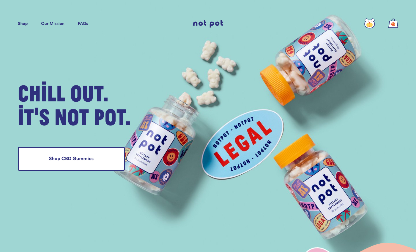
Not Pot inject playfulness into their landing page with vibrant colors, funny copy, big bold typeface, stickers, and unique product images. It resembles a collage of content designed to uplift and of course convert.
“Not Pot” stickers can be seen scattered across the page, yet it doesn’t seem like a forced branding attempt. The page reads naturally, and multiple calls to action are along down the page under varying headings.
Customized graphics are used to showcase the benefits of the products, and user-generated content in the form of testimonials adds weight to the buying decision.
Leaf
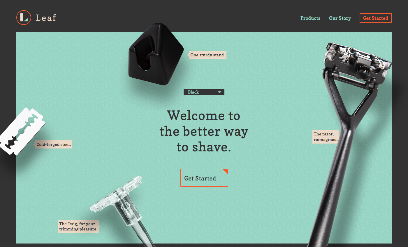
In a world where razor subscription services can transgress into billion-dollar companies (think Dollar Shave Club), we see more highly-optimized and stunning landing pages like Leaf.
A mint green backdrop reminds us that shaving should be a way to refresh and start your day with confidence. The components that make up the razor hover over the backdrop and move ever so subtly in the opposite direction as you navigate your mouse around the page.
Leaf injects comedy further down the page by stating that eggplants and cats can benefit from the product too. The use of GIFS throughout this landing page design commands your attention, putting the focus on the quality and build of the razor, strengthening their value proposition.
Notpla
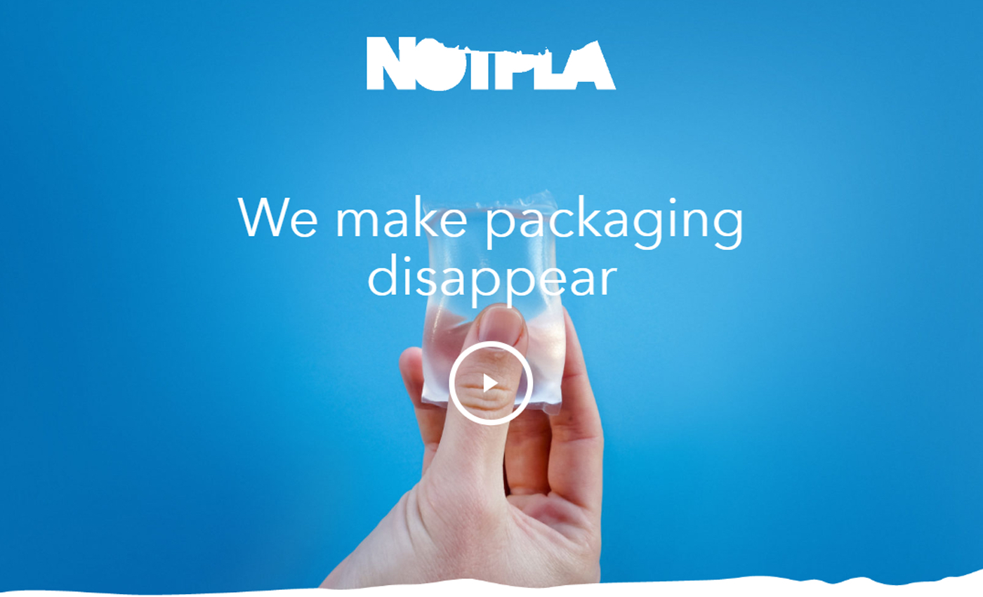
Revolutionary products need disruptive design. Notpla is a plastic alternative that breaks down naturally within weeks. The water ripple animation inside the logo, rich blues and the ripple transition between sections ties in with the production process of Notpla, and also the impact plastic has on our oceans.
Notpla’s landing page design is just as unique and alternative as they are as a team and brand - so they proclaim.
Misfits Market
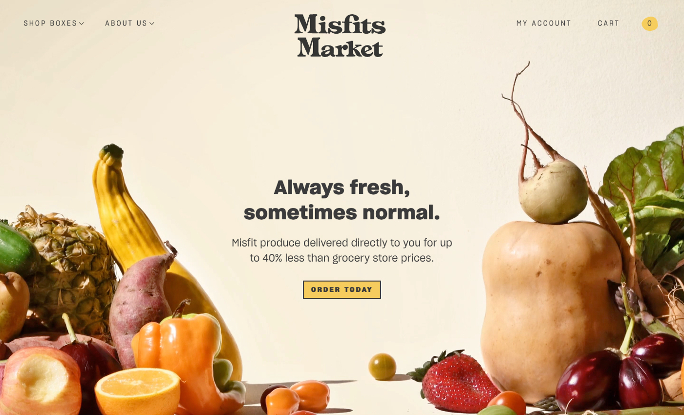
The concept of fresh food needs to be backed by using colors of nature, in this case, yellow, orange and green. Misfits Market have a strong selling proposition strengthened by design that’s clean and informative using custom graphic elements and high quality photography.
Your Skin Love
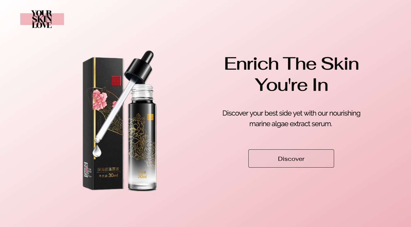
Use of subtle gradient backgrounds represents the soothing effects of the product while tying in with brand colours, strengthening the overall branding and fortifying the value proposition.
This landing page was made with PageFly, and fully completed within the space of an hour with simple drag and drop mechanics.
You can find a ton of great gradient tools to use for your landing page at Bookmarks Design if you want to create a similar effect. Just copy and paste the CSS code into the PageFly editor. We can’t see gradients going out of style any time soon.
Defy
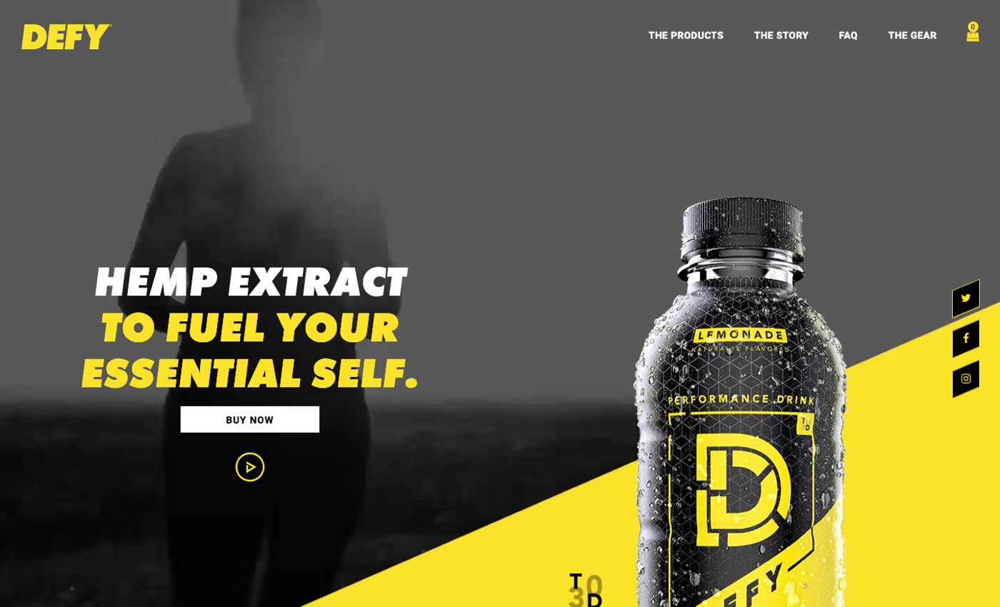
Here’s a design as bold as the product itself. Yellow is energizing, and you’ll find lots of neat animated elements down the page that help you visualize and internalize the benefits of the product.
Dufrane
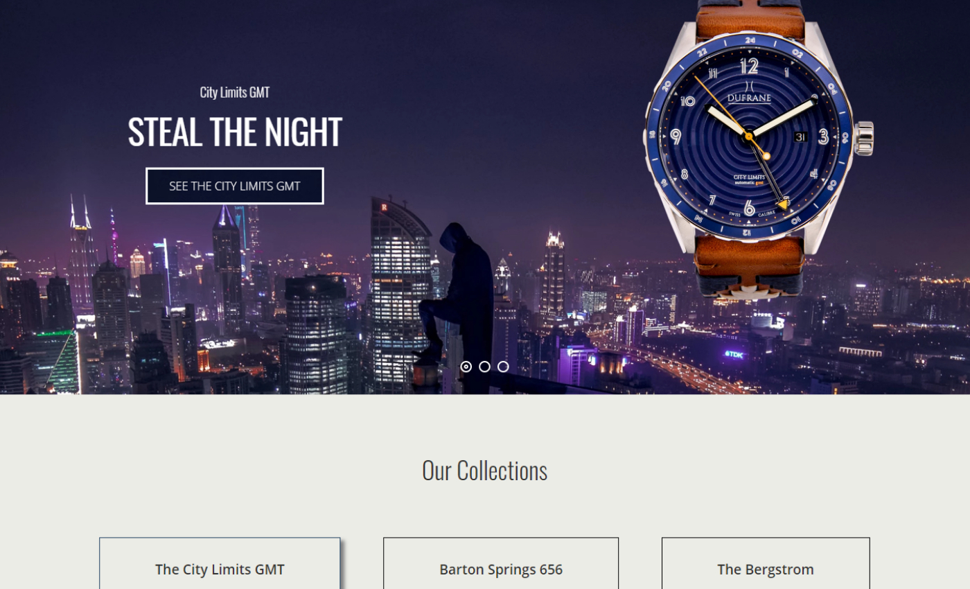
Built with PageFly, this premium watch company has all the design ‘chips’ in place to justify their high-end price tags. The cityscape with the accompanying product is a clever concept that ties the two themes together.
Deplaice Maison
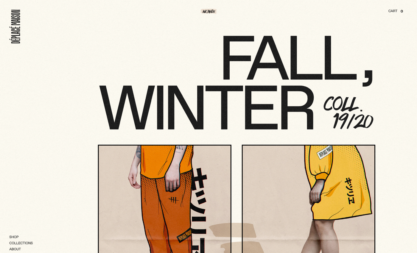
Illustrations are in. Deplaice Maison’s motto - a convergence of art and personalities. This is literally reflected in their mesh of real world photography and Anime-style graphics. There’s lots of interesting design concepts on page that invokes a sense that the site itself is art embodied.
Disconnect
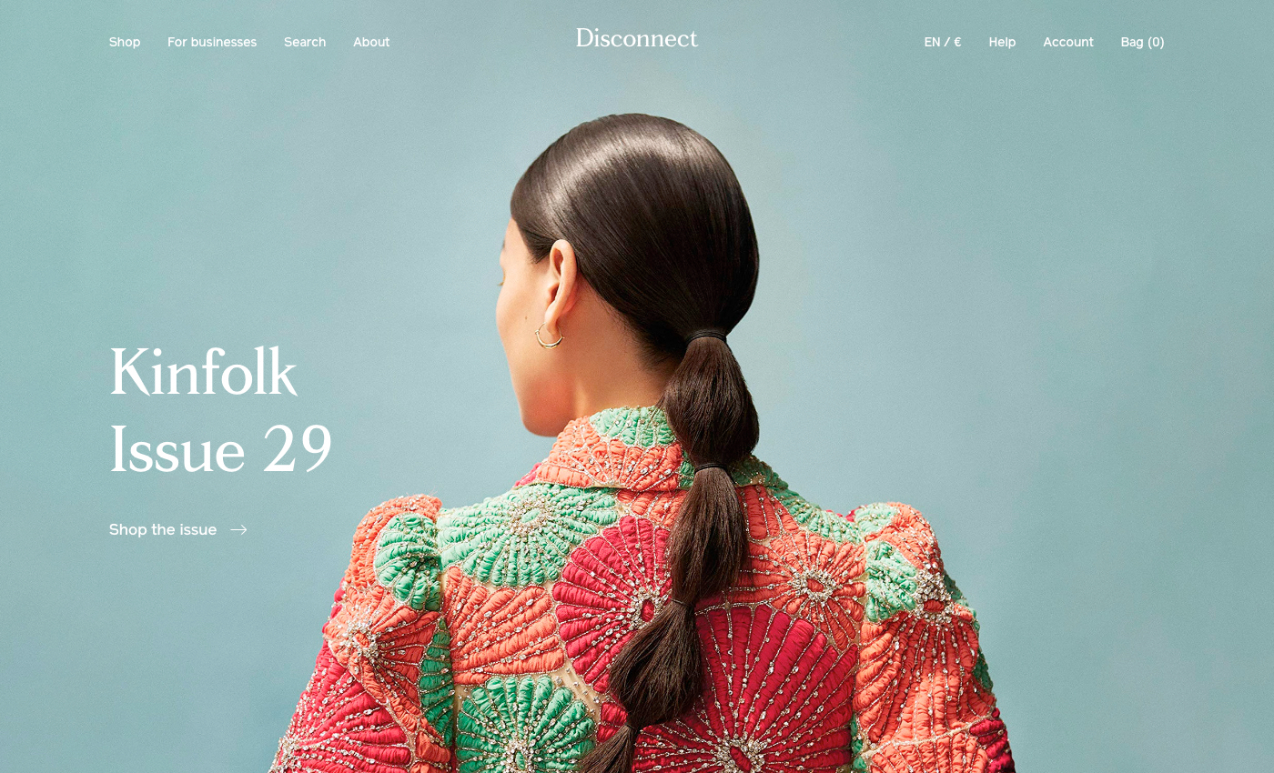
A magazine subscription service that looks just like an actual magazine. You can nearly see the gloss coming through your screen.
Nu:ro
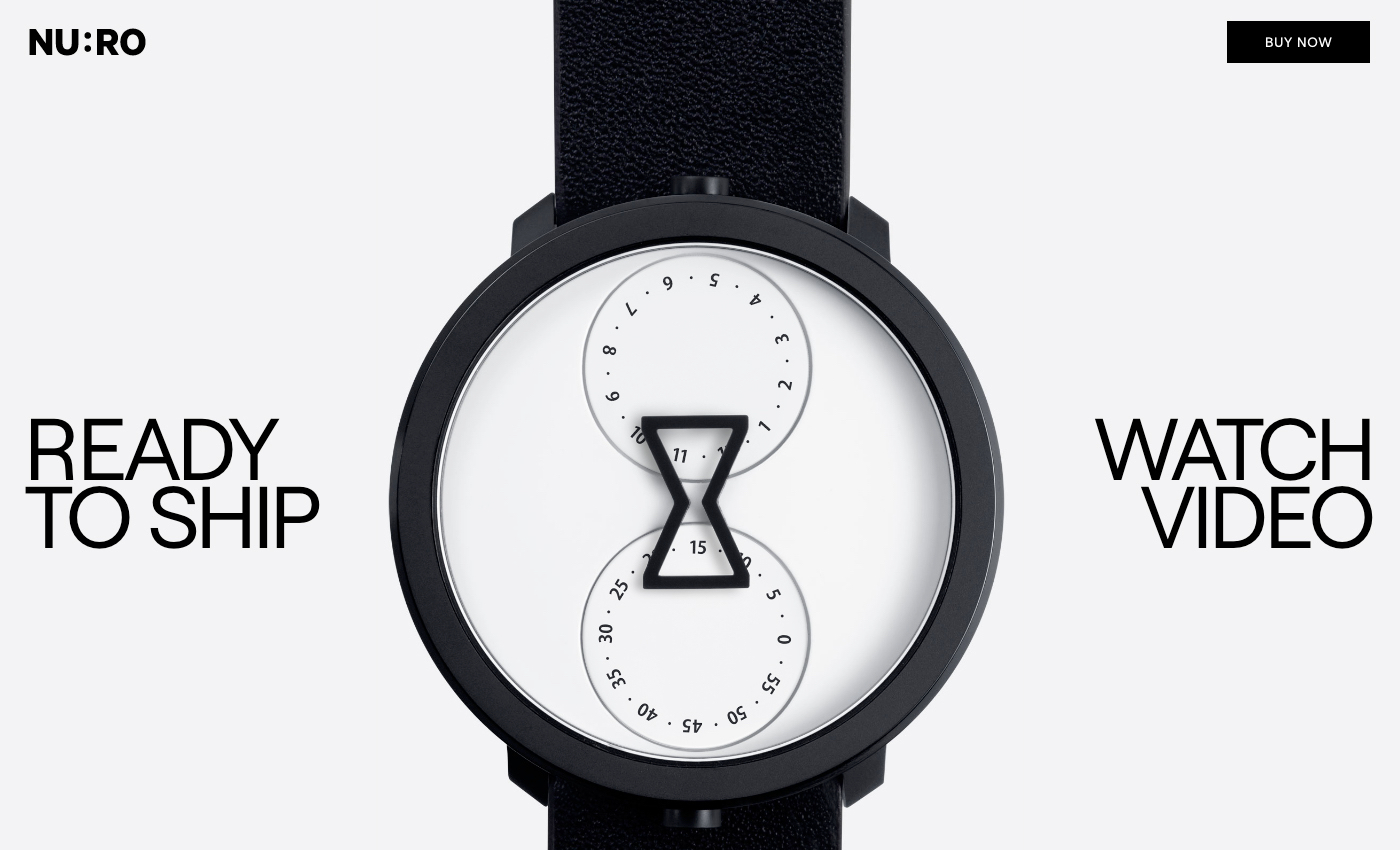
A minimal watch that reads time with two separate dials. The height of minimalism is reflected with black, white and lots of empty space.
Raden
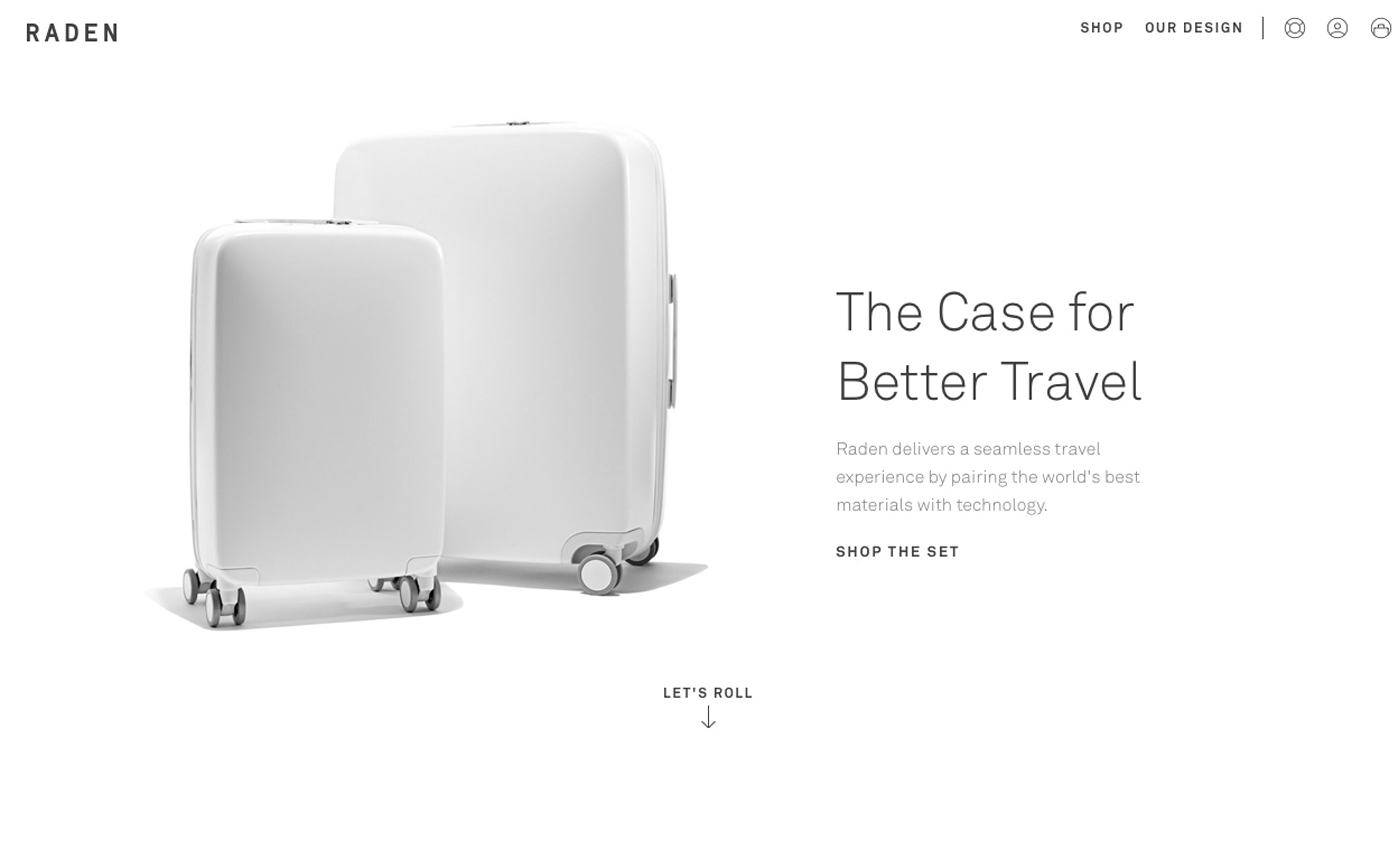
A real problem solving product that sells itself. The landing page design is simple, reminiscent of how the suitcase can make your travel time more efficient and care-free. The way holidays should be enjoyed.
Me Undies
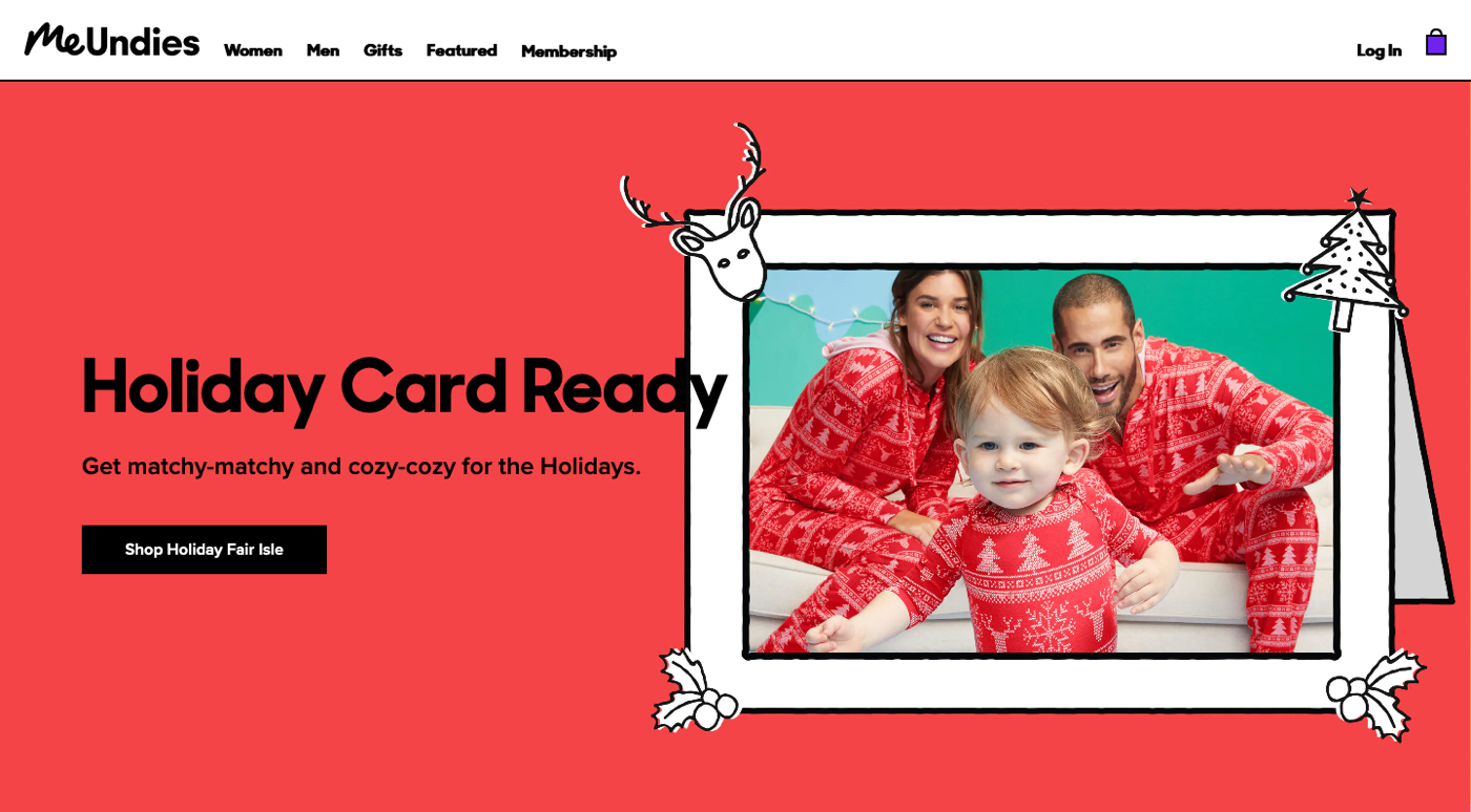
Pyjama parties, sleepovers, fun times. It’s all reflected in the images and bright bold colors on the landing page. Coming into winter, it’s clear they rotate their content based on seasonal events.
Viva Animali
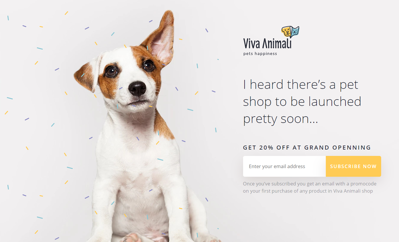
Pet owners will easily be reeled in with these heartwarming images of our favourite beasts. Pay notice of the copywriting - crafted to position their products as the food your pet deserves. Menu navigation is removed to avoid potential distraction and improve bounce rate.
Why landing page design matters for conversions
It needs to be said, that while landing page design isn’t the most important aspect of your page, it certainly should never be overlooked.
Your offer, unique selling proposition, use of great copy and social proof will have the most impact on your conversion rate.
And of course, highlighting benefits rather than features will always bring a greater return on investment in your eCommerce efforts. Just look at how Remedy8 mesh stunning design with clearly laid out benefits.

If you struggle transforming your product features into benefits, remember this:
People don’t want to buy a quarter-inch drill. They want a quarter-inch hole!
By effectively tying your design to your offer, it reflects your brand's essence, adding to your credibility, making you appear more professional and increasing the chances of being remembered in the future.
So. When it comes to your landing page design, consider it part of a bigger picture that creates a strong brand image in the mind’s eye of your site visitors.
Websites are the new storefronts. You only have a matter of seconds to make a good impression on your visitor. But don’t be fooled into thinking you need complex CSS and animated elements to do so. When crafting your landing page design, consider these:
- Can my visitors find what they’re looking for quickly and easily?
- Is the purpose of my landing page made immediately clear?
- Is my page free of unnecessary visual clutter?
- Does the overall aesthetic tie in with my brand, mission, and values?
Once you’ve defined these attributes, you can then start looking into spicing things up with creative design that stops readers in their tracks.
Importance of landing page mobile optimization
The world’s gone mobile mad. Soon we’ll transition away from phones and into the realm of nanotechnology, neural implants and augmented reality contact lenses. But for now, it’s the reign of smart devices.
Smartphones alone are responsible for 50% of global internet traffic. If you don’t build landing pages with this in mind, you’re losing sales.
The solution is to keep mobile users at the front of mind while building, optimizing and scaling landing pages.
If you decide to use PageFly, you can control all the finer aspects of the mobile experience to suit any device. Take a look at the clean, crisp responsive layout of the landing page I just built.
Remember to keep things simple and think about your own preferences when it comes to shopping on your phone.
In summary
No eCommerce store is complete without dedicated landing pages to connect your unique offer with the buyer. Beautiful design is part of the picture that defines your intentions as a brand.
So how do you make these high-converting, brand-defining landing pages?
The game has changed in recent years. The need for complex coding and web dev knowledge soon became replaced by intelligent software solutions that let anyone craft compelling landing pages from scratch….at a very hefty cost.
Now we’re in a new era of powerful, affordable, easy-to-use eCommerce page builders that make the process even more accessible.
PageFly happens to be the No.2 page builder on the Shopify app store. So why choose PageFly if we’re not the best?
We try harder.
When you’re number 2, you have to. We simply can’t afford customer complaints. Or bugs. Or heavy price tags. Or anything less than 24/7 support, easy-to-use mechanics and real, sales-driven results.
And that’s the difference. While the No.1’s attitude is “Play it safe. Don't screw up. Don’t do the wrong thing”.
We say: “Look for new ways. Try harder. Do the right thing.”