Best Minimal Landing Page Design Inspiration
A curated collection of Minimal landing page design for your inspiration. Get inspired by real landing page examples, each review featuring a full screenshot and highlighting standout features.
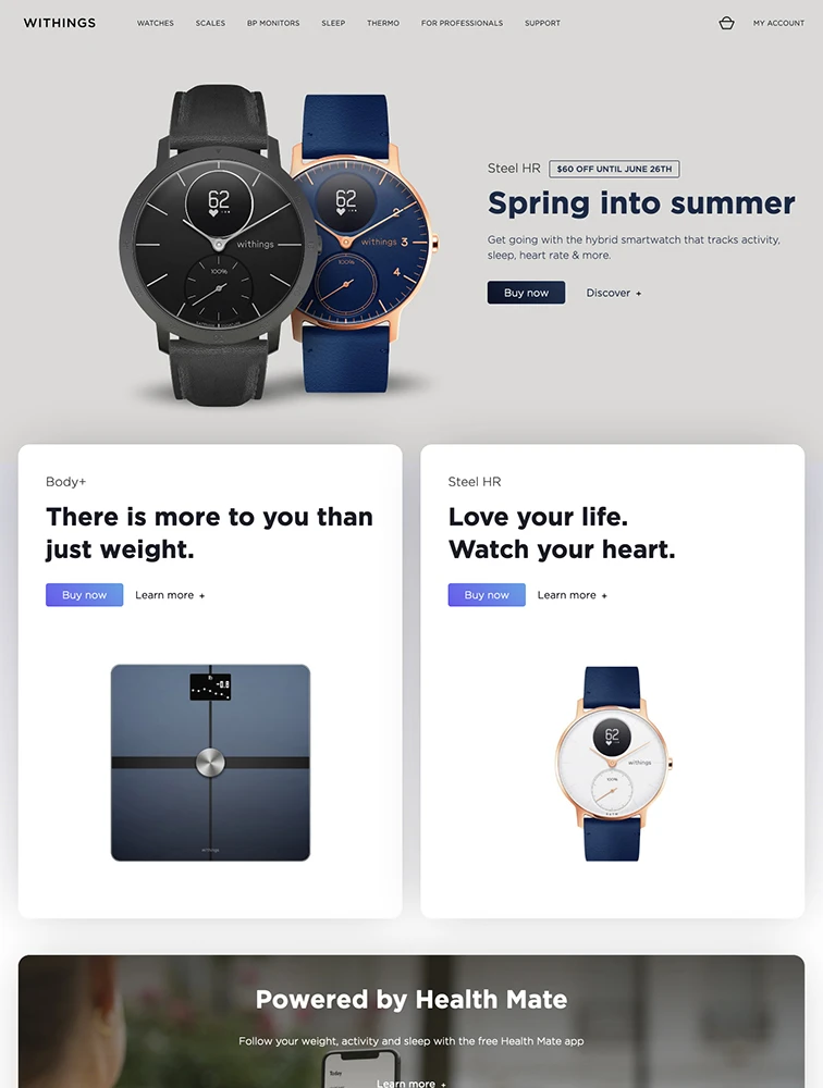
 Withings
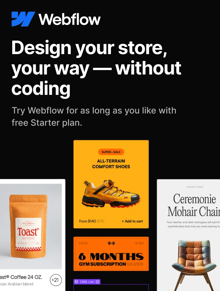
 Webflow
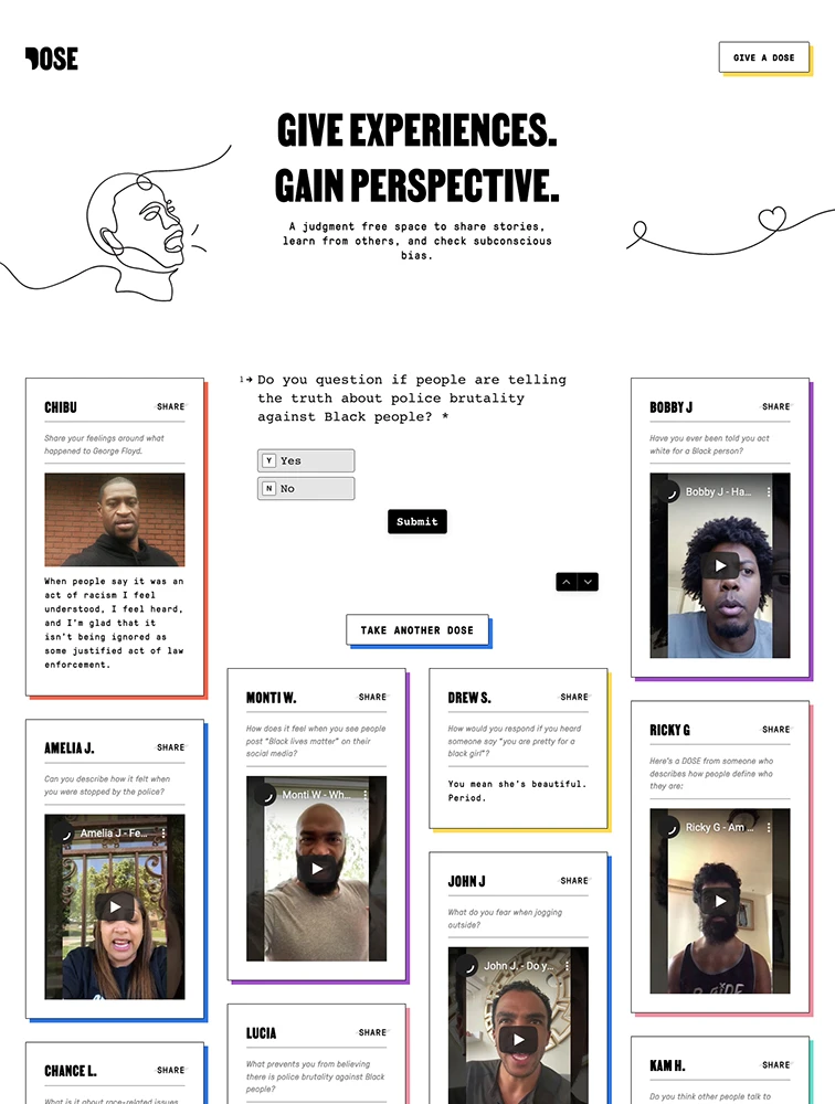
Give a Dose

 Mobbin.com
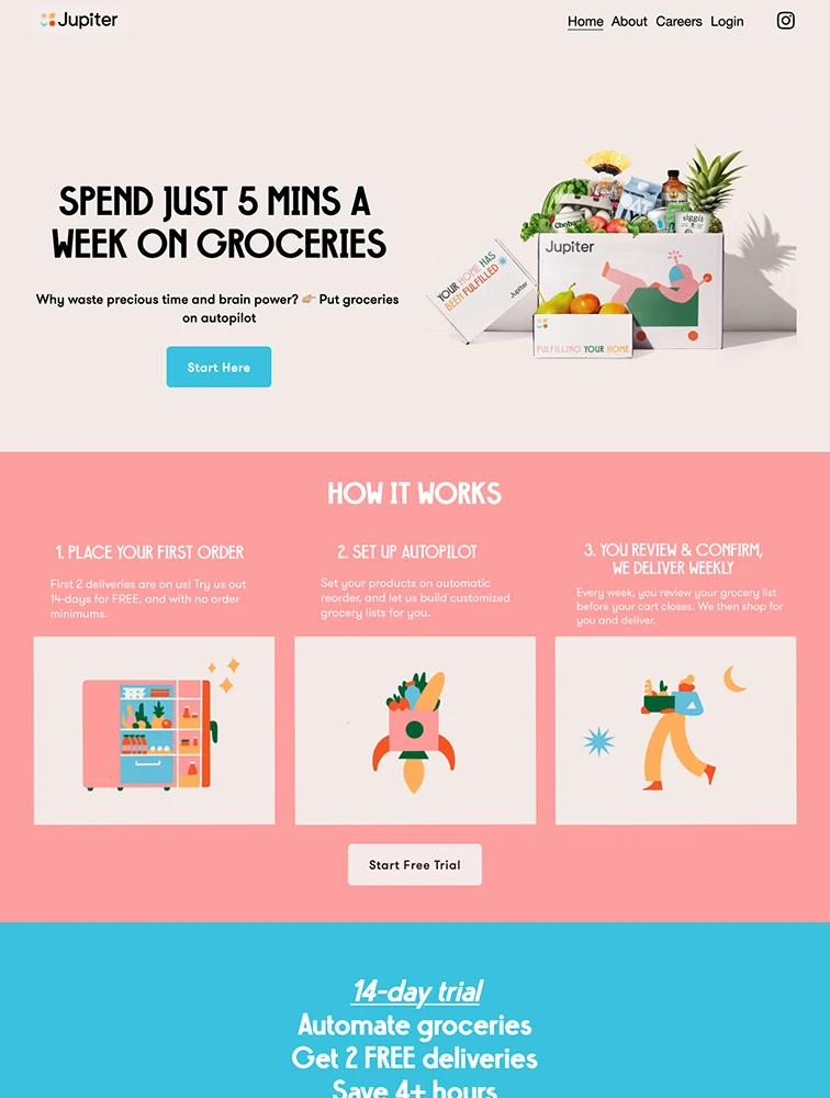
 Jupiter
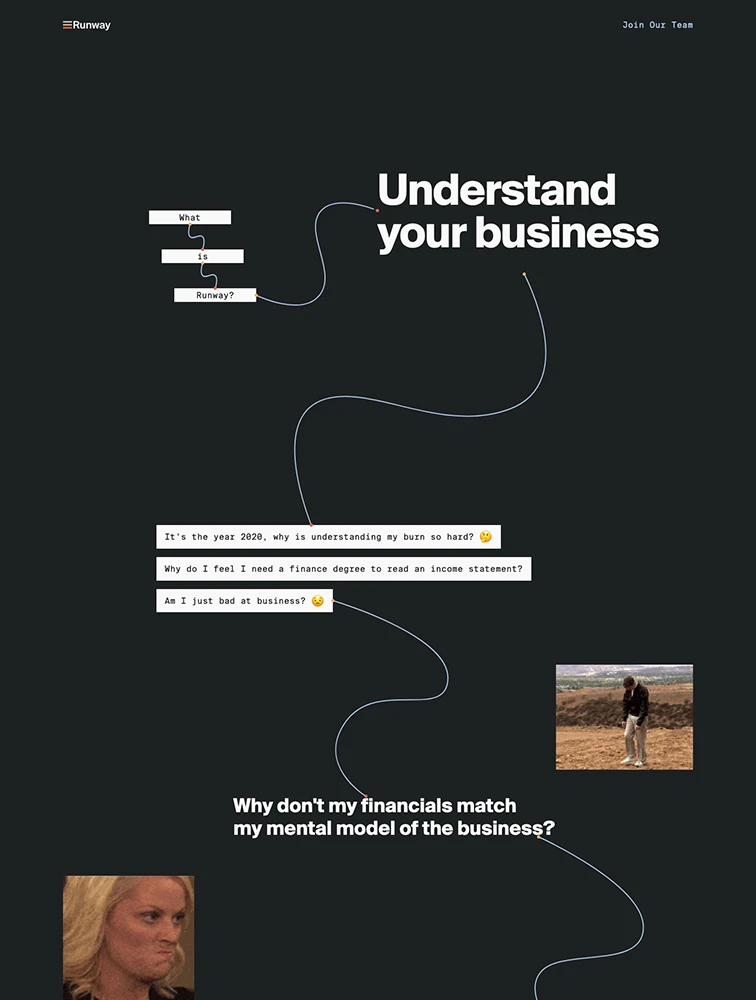
 Runway Financial
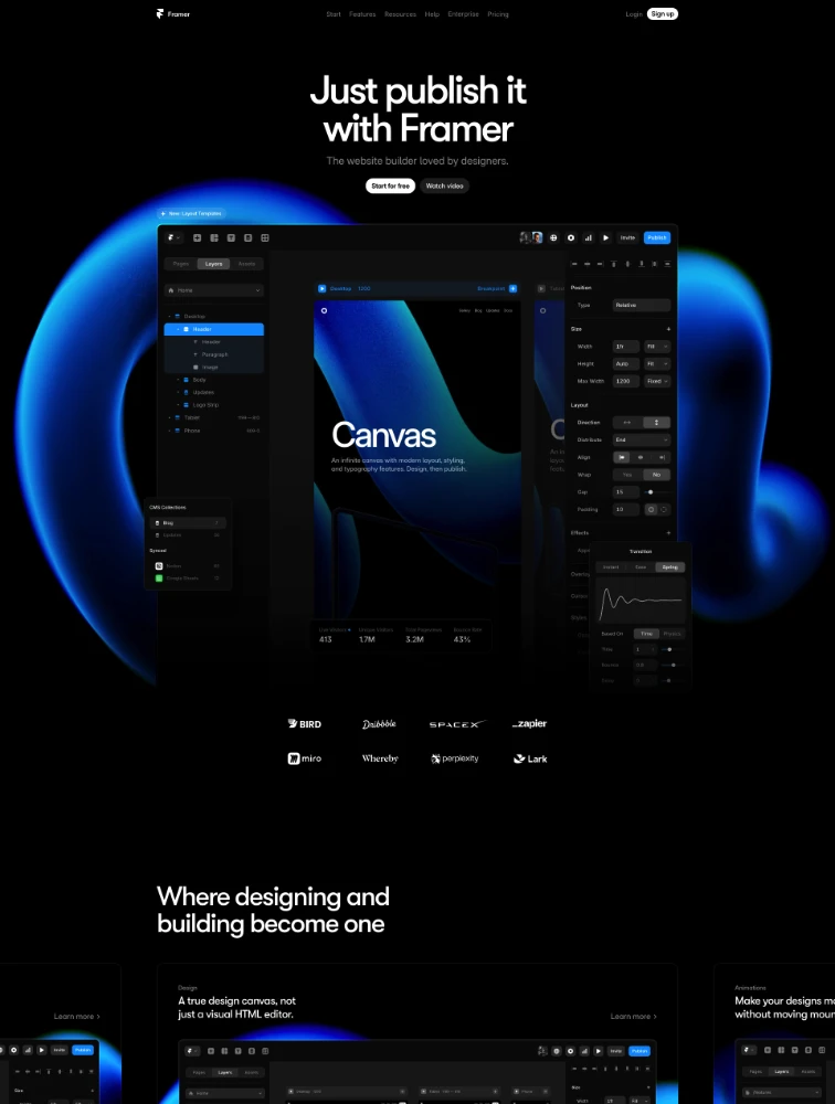
 Framer

 Khoa Lê
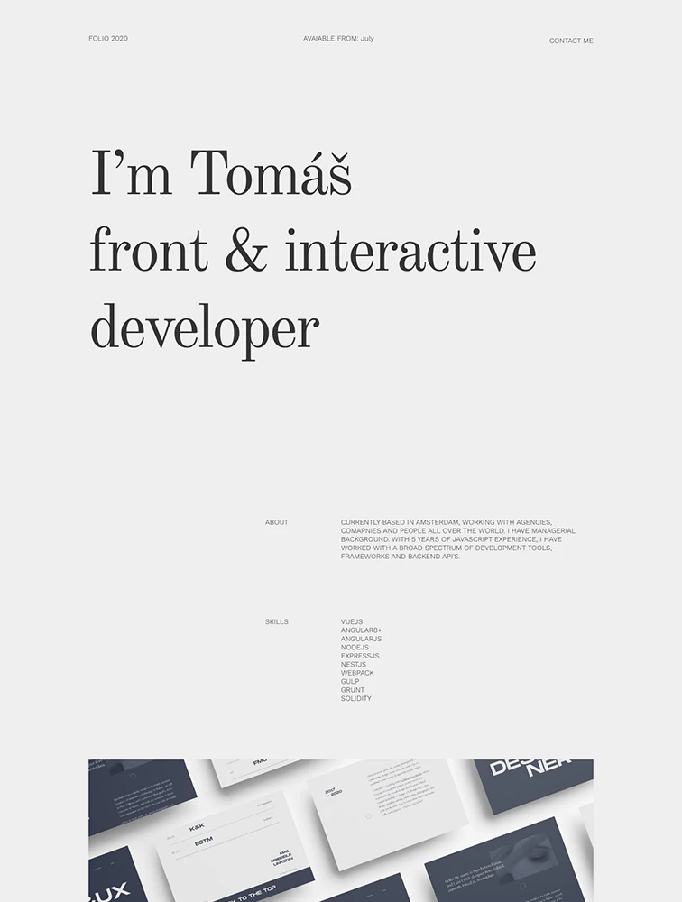
 Tomas Kmet
 Featured Partner
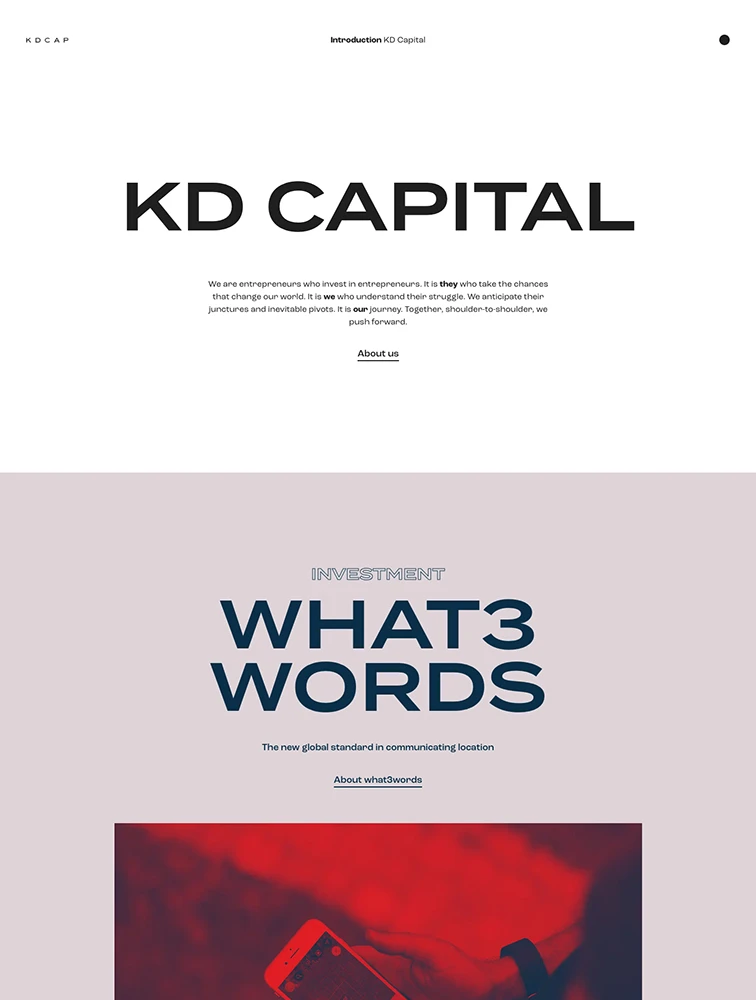
KD Capital

 The Moon Exhibition
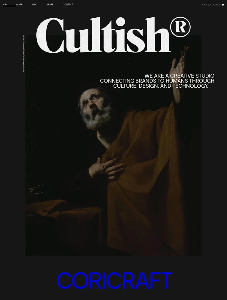
 CULTISH
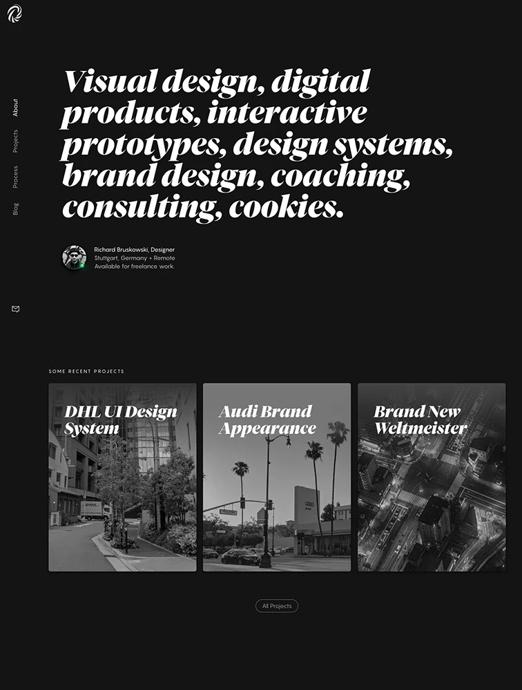
 Richard Bruskowski
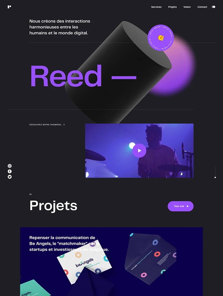
 Reed
Reed
Featured Partner
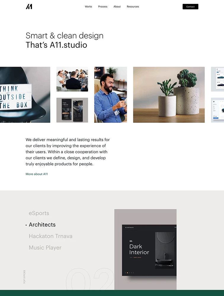
 A11.studio
Featured Partner
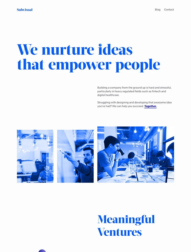
 Subvisual
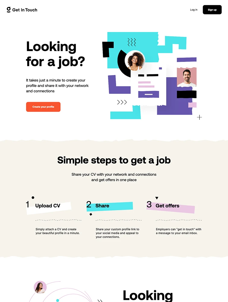
Get in touch
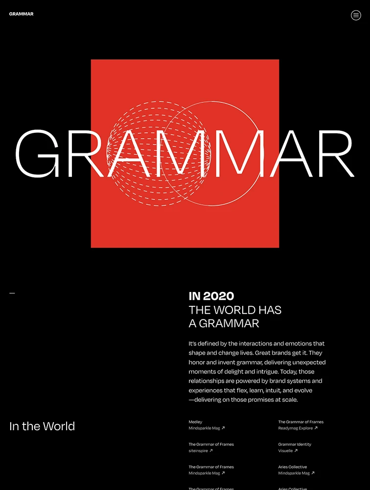
 Grammar
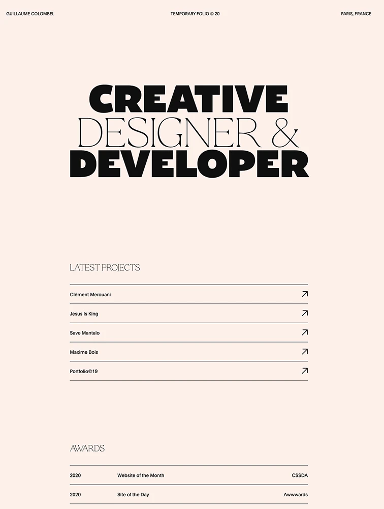
 Guillaume Colombel
Featured Partner
 Pixelismo
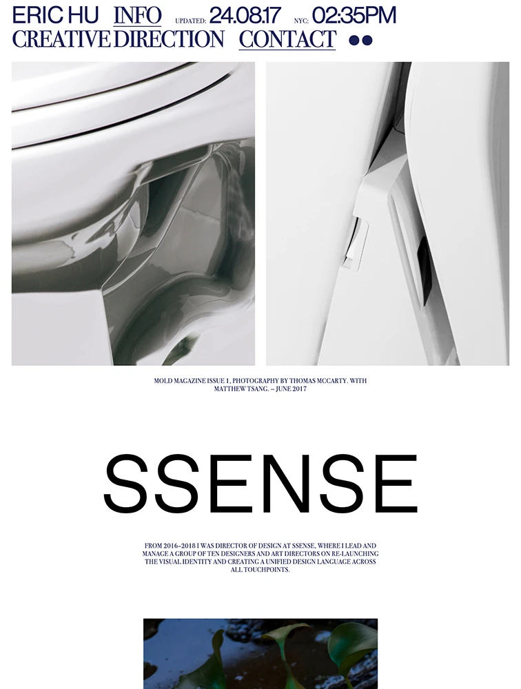
 Eric Hu
Featured Partner
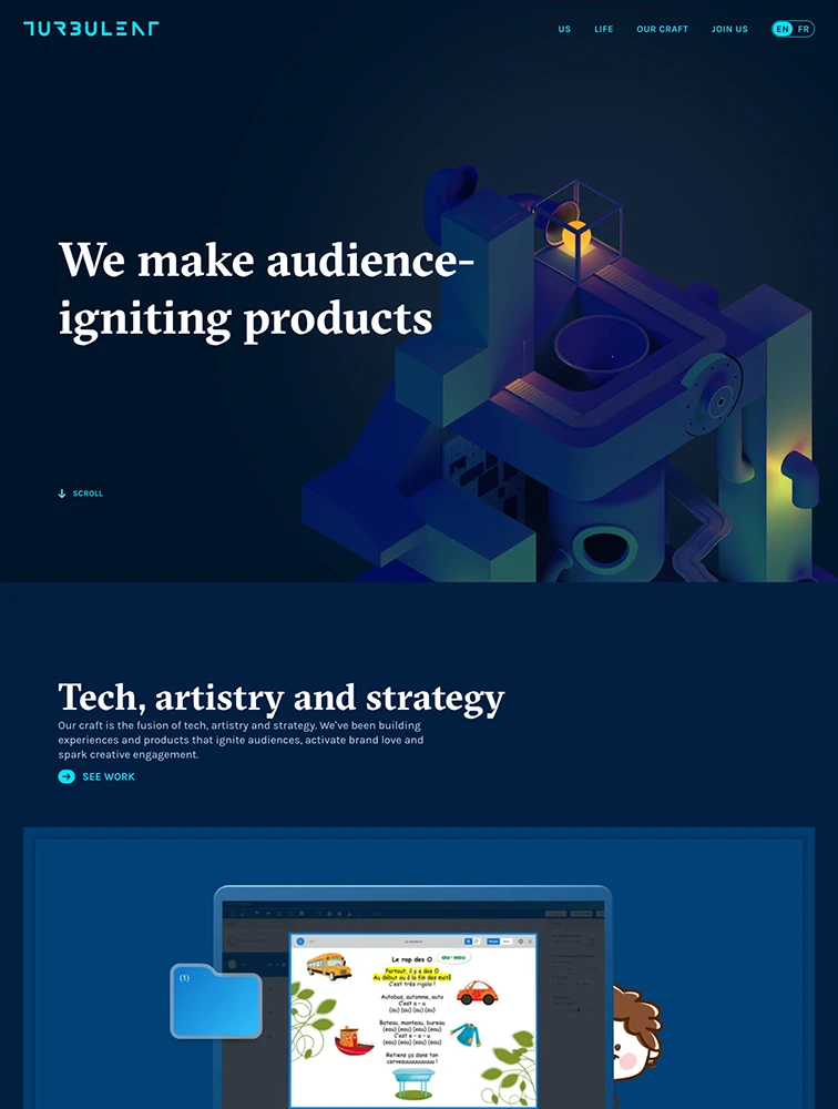
 Turbulent
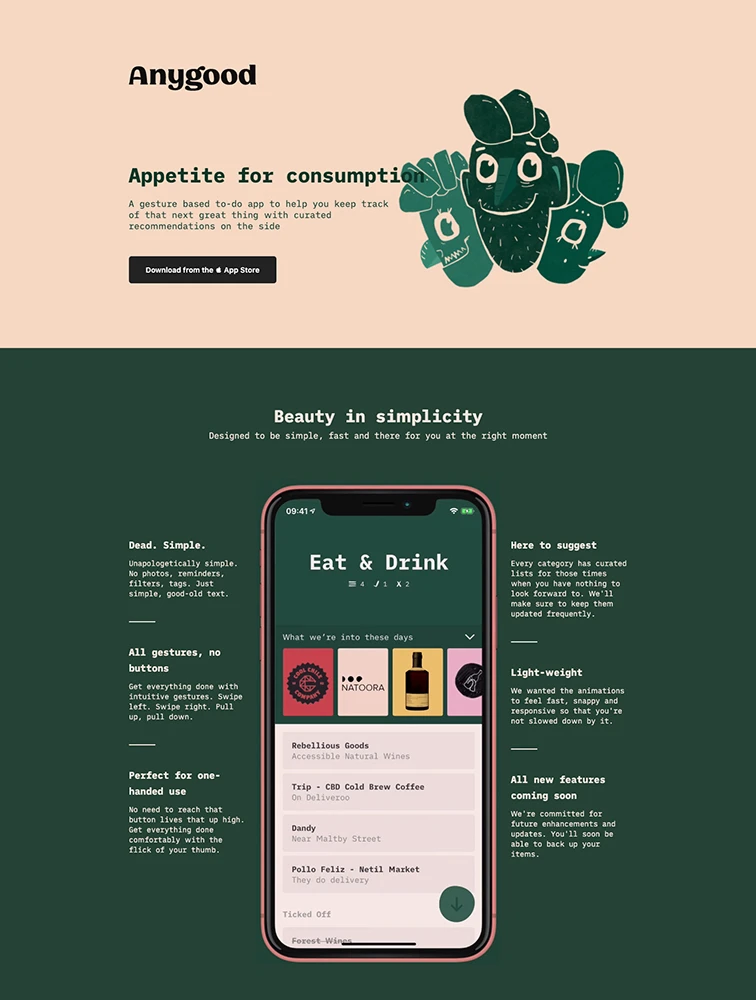
Anygood

 Satu Pelkonen
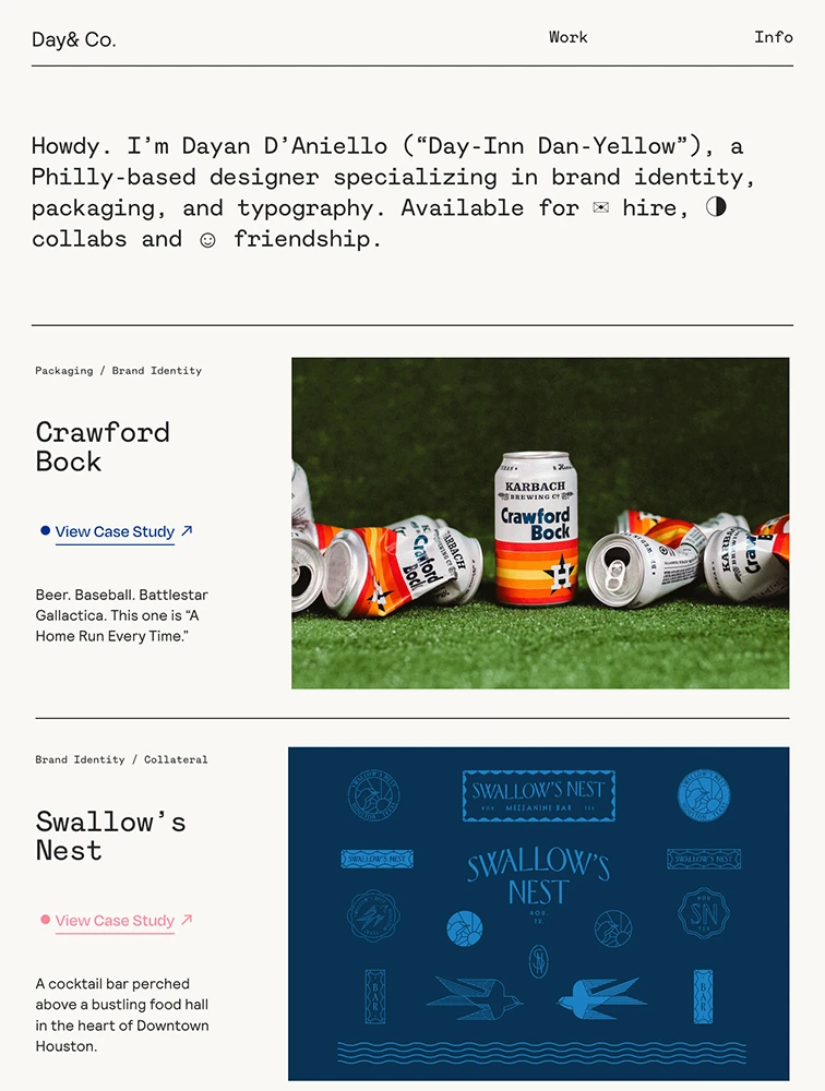
 Day& Co.

 Bruno Cirilo
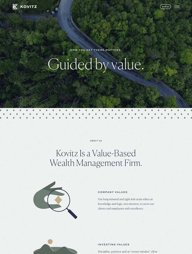
 Kovitz
Frequently Asked Questions
Everything you need to know about minimal landing pages
What is a Minimal landing page?
A Minimal landing page is a specialized web page designed to showcase minimal products, services, or content and convert visitors into customers, users, or leads. These pages focus on highlighting the unique aspects of minimal offerings, demonstrating value through compelling visuals and copy, building trust through social proof and credentials, and driving specific actions through clear calls-to-action. Minimal landing pages are essential for promoting minimal-specific solutions, launching new offerings, running targeted marketing campaigns, and establishing market presence in the minimal space.
What makes Minimal landing pages effective?
Effective Minimal landing pages convert through: (1) Clear value proposition immediately communicating benefits specific to minimal, (2) Visual showcase with high-quality images, videos, or demos demonstrating minimal offerings, (3) Targeted messaging addressing pain points and needs of minimal audiences, (4) Social proof including testimonials, case studies, client logos, and reviews from minimal customers, (5) Strategic calls-to-action tailored to minimal conversion goals, (6) Trust signals like credentials, certifications, awards, or recognition relevant to minimal, (7) Mobile optimization since many minimal visitors browse on phones, (8) Clear navigation and user experience guiding visitors toward conversion, and (9) Performance optimization ensuring fast loading for better engagement.
What key elements should Minimal landing pages include?
Essential Minimal landing page elements include: (1) Compelling hero section with headline, subheadline, and primary CTA relevant to minimal, (2) Value proposition section explaining unique benefits and differentiators, (3) Features or offerings section highlighting key aspects of minimal products/services, (4) Visual content including images, videos, or interactive elements showcasing minimal solutions, (5) Social proof section with testimonials, reviews, case studies, or client logos, (6) Benefits section explaining how minimal offerings solve problems or create value, (7) Trust indicators like awards, certifications, security badges, or industry recognition, (8) Clear calls-to-action strategically placed throughout the page, (9) Contact information or forms for inquiries, and (10) Mobile-responsive design ensuring great experience across devices.
How should Minimal landing pages be structured for maximum conversion?
Structure Minimal landing pages for optimal conversion through: (1) Above-the-fold section with immediate value communication and clear CTA, (2) Logical flow guiding visitors from awareness to interest to action, (3) Progressive disclosure revealing information in digestible sections, (4) Strategic CTA placement at multiple points matching visitor journey, (5) Visual hierarchy emphasizing most important elements through size, color, and position, (6) Scannable content using headers, bullet points, and white space for easy consumption, (7) Social proof strategically positioned near decision points, (8) Reduced friction by minimizing form fields and simplifying conversion process, (9) Trust building throughout with credentials, guarantees, and transparency, and (10) Mobile-first design ensuring seamless experience on all devices. Test different structures to find what resonates best with your minimal audience.
What conversion rates should Minimal landing pages target?
Minimal landing page conversion rates vary by traffic source, offer type, and audience. Typical benchmarks: For purchases or sign-ups from paid traffic, target 3-8%. For lead generation or contact forms, aim for 8-15%. For newsletter subscriptions or content downloads, expect 15-30%. For free trials or demos, target 10-25%. Traffic source impacts conversion: organic search typically converts at 8-15%, paid ads at 3-10%, social media at 2-8%, email campaigns at 15-30%, and referrals at 10-20%. Factors affecting minimal conversion include: clarity of value proposition, strength of offer, quality of traffic, page design and usability, trust signals, and competitive alternatives. Improve conversion by A/B testing headlines, CTAs, imagery, form length, and social proof. Focus on qualified conversions that match your ideal minimal customer profile.