Lapa Ninja Lapa Ninja
PRO

Categories

  • Browse All ⭐ 7245
  • Software 646
  • Photography 510
  • Course 39
  • Home & Living 55
  • SaaS ⭐ 679
  • Dev Tools 225
  • Art 9
  • Book 48
  • Freelance 9
  • Business ⭐ 2425
  • Design Tools 454
  • Typography 710
  • Social Media 10
  • Insurance 23
  • Minimal ⭐ 3039
  • No-Code 30
  • Gradient 447
  • Community 637
  • Architecture 8
  • Agency ⭐ 944
  • Open Source 11
  • Pattern 67
  • Event 129
  • Hosting 30
  • Portfolio 1054
  • Finance 360
  • Bento Grid 75
  • Fashion 364
  • CMS 35
  • Studio ⭐ 833
  • Fintech 59
  • Isometric 146
  • Beauty 135
  • Mail 38
  • Web3 66
  • Crypto 134
  • Retro Style 96
  • Lifestyle 143
  • Bot 18
  • 3D Websites 155
  • Blockchain 90
  • Blog 74
  • Health & Fitness 435
  • Hardware 72
  • E-commerce 947
  • DeFi 14
  • News 51
  • Food & Drinks 299
  • Wearable 9
  • Technology 1441
  • Marketing 59
  • Magazine 54
  • Travel 160
  • Automotive 28
  • Corporate 1076
  • Ventures 43
  • Entertainment 407
  • Sports 4
  • NFT 96
  • Productivity 986
  • Product Management 67
  • Film 12
  • Culture 576
  • Metaverse 4
  • Product 131
  • Creative 4942
  • Music 38
  • Marketplace 1
  • Prototype 93
  • AI 182
  • Design 2
  • Game 15
  • Real Estate 80
  • Coming Soon 212
  • App 766
  • Illustration 1431
  • Education 426
  • Furniture & Interiors 137
  • Miscellaneous 654

Colors

  • Blue 1142
  • Black 1730
  • White 1203
  • Multiple Colors 1602
  • Gray 907
  • Green 700
  • Red 454
  • Orange 367
  • Purple 434
  • Yellow 507
  • Navy 155
  • Teal 257
  • Pink 275
  • Brown 285
OG Images Fonts Sections Templates
Webflow Free Templates Framer Free Templates Download 600+ Freebies Free Illustrations
Learn Design Free Design Books Articles by Lapa
Subscribe (opens in new tab)
Go Pro
Lapa Ninja Lapa Ninja
SaaS E-commerce Portfolio Fashion Agency 3D Websites
View all websites →
OG Images Fonts Sections Templates Newsletter (opens in new tab)
Go Pro

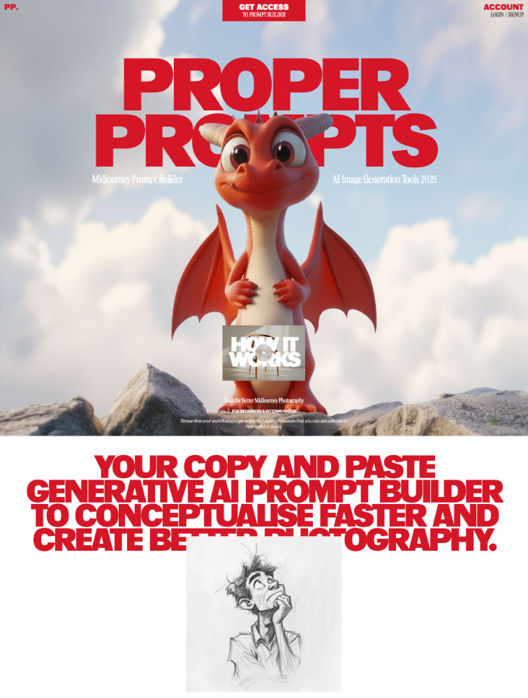
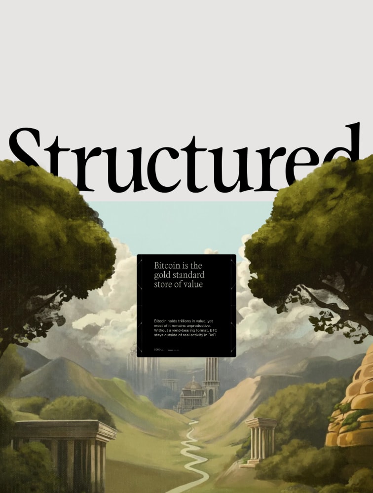
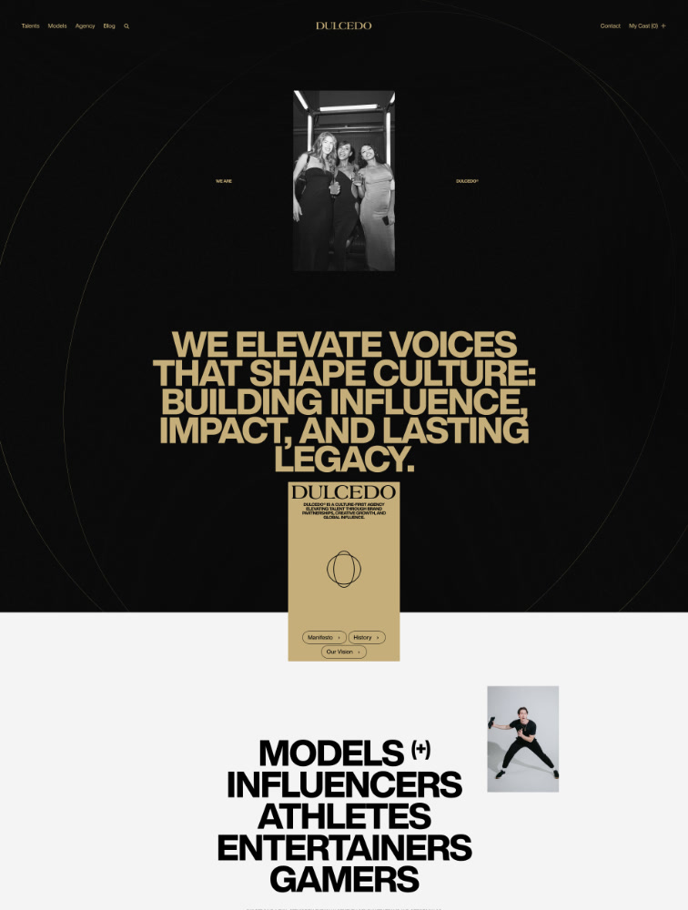
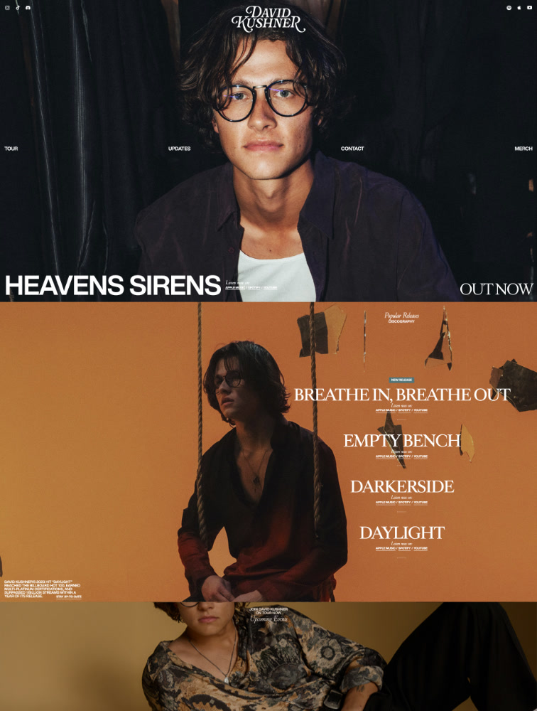
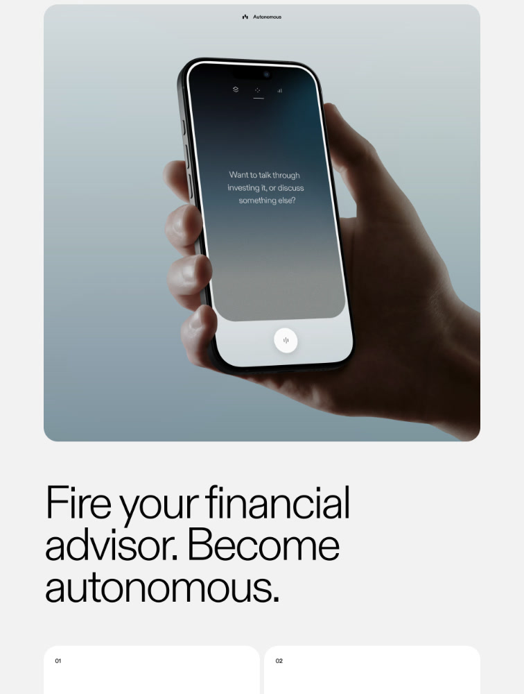
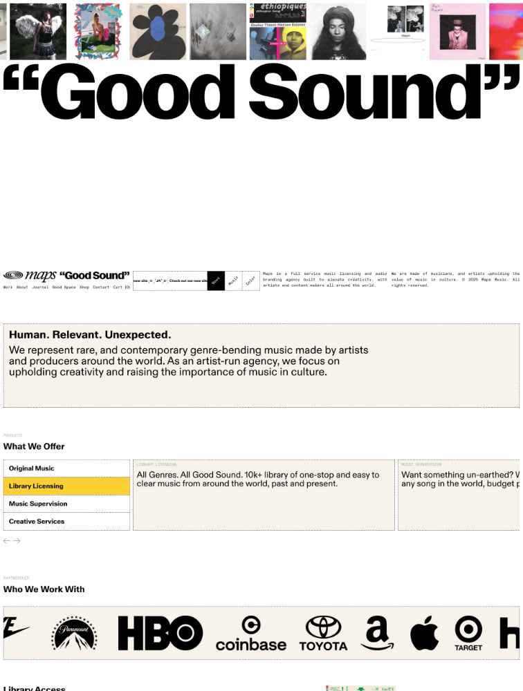
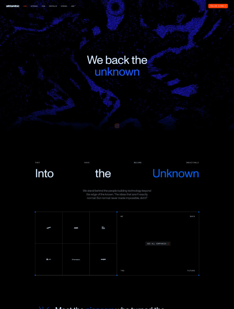
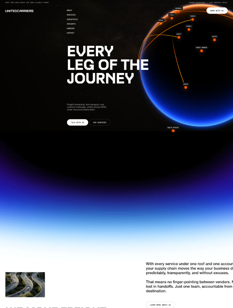
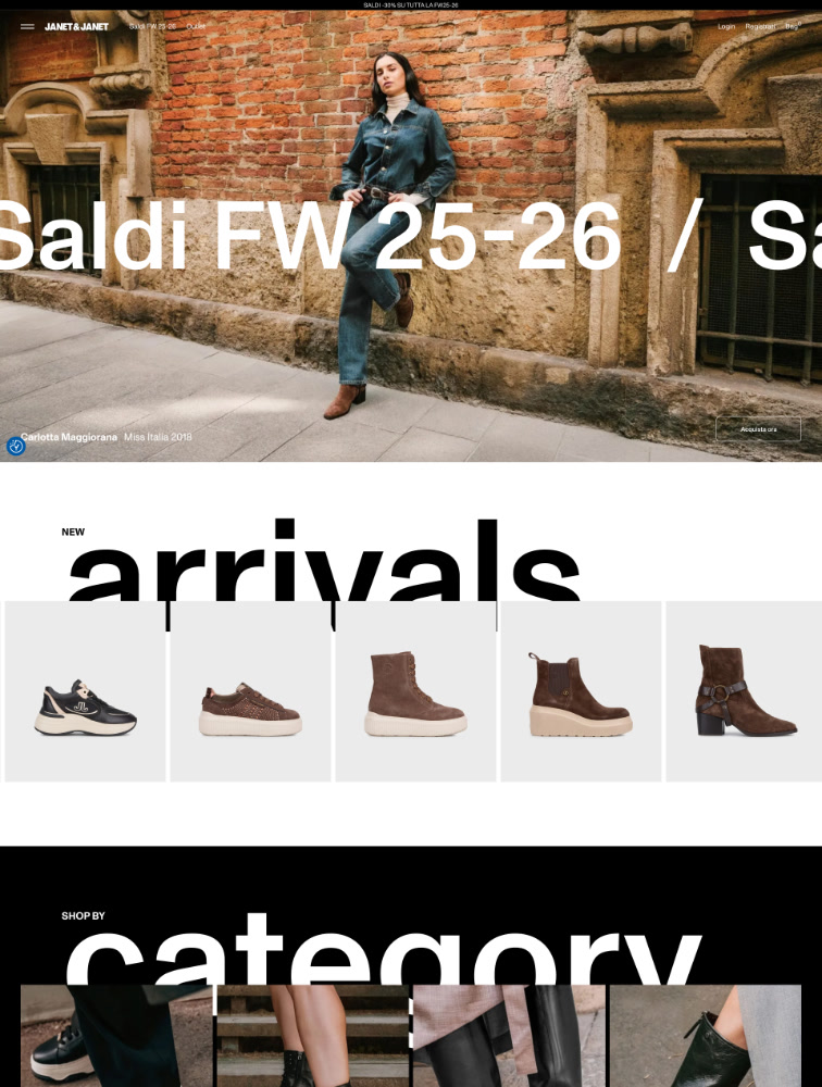
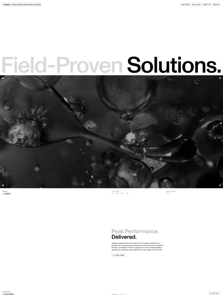
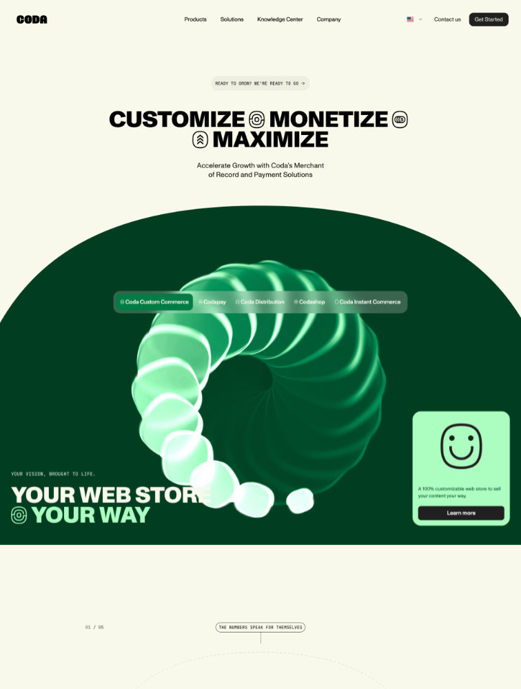
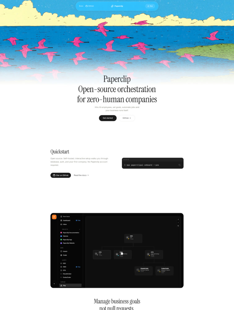
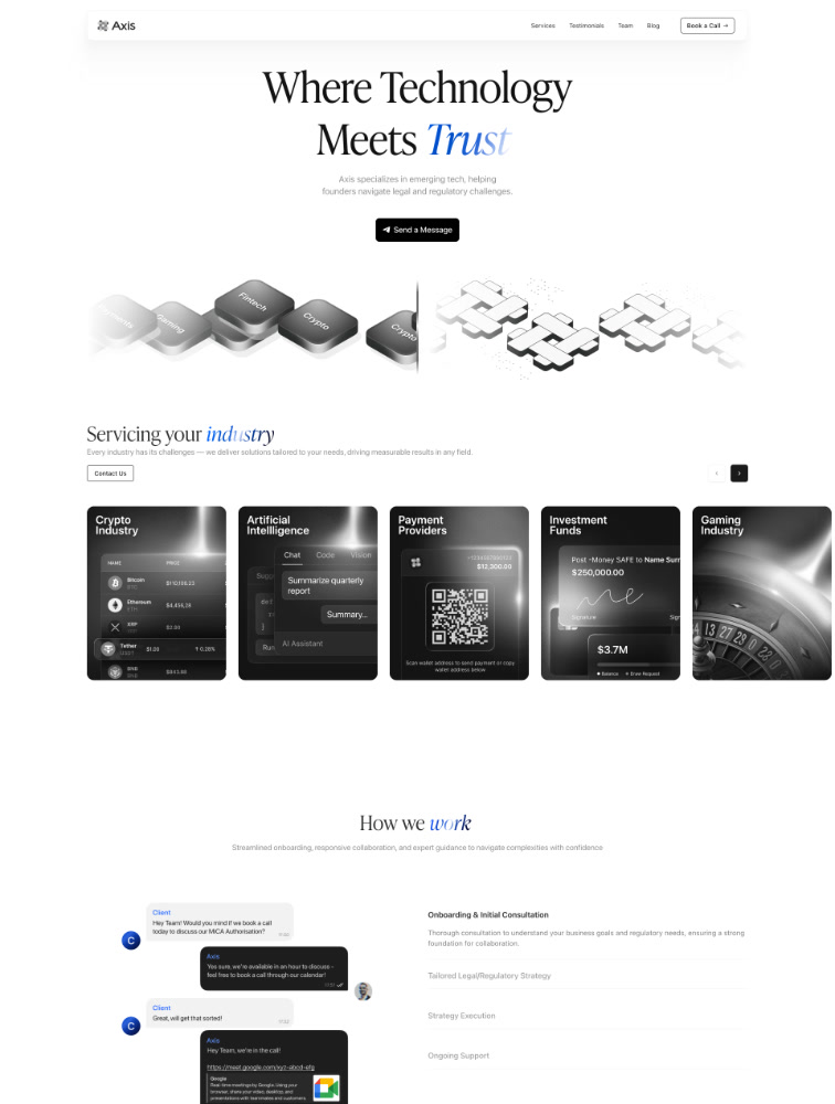
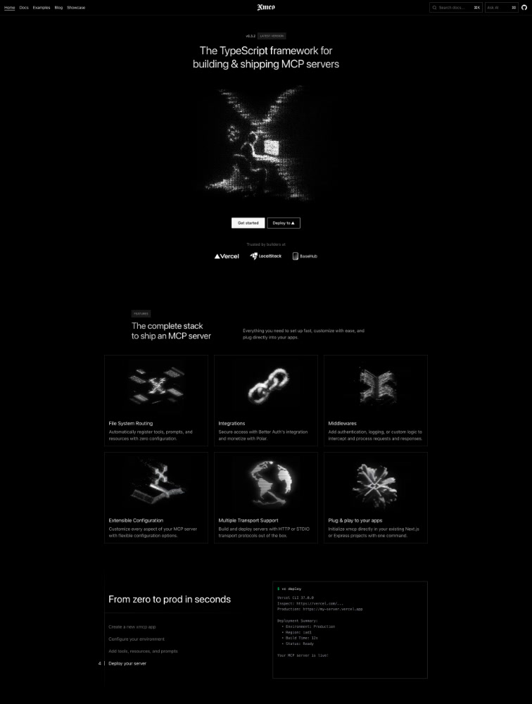
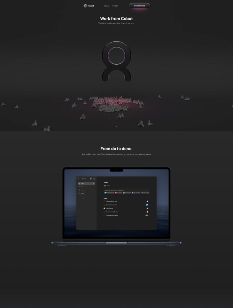
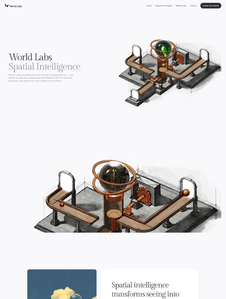
Popular Website Typefaces

Explore landing page designs based on the typefaces used. Find inspiration from sites using specific fonts like Inter, Suisse Int'l, etc. Currently listing 596 typefaces.

All
Mono Fonts ⭐ Heavy Fonts ⭐ Serif Fonts ⭐ Light Fonts Condensed Fonts Rounded Fonts Handwriting Fonts

Inter

109 websites
Inter example: Merlin
Inter example: Vibe-X
Inter example: Cloudflare Sandbox
Inter example: David AI
Inter example: React Email

Pp neue montreal

85 websites
Pp neue montreal example: Beaucoup
Pp neue montreal example: Sleep Well Creatives
Pp neue montreal example: Chipsa
Pp neue montreal example: CHRLS.DSGN
Pp neue montreal example: Stephanie Bruce

Suisse

50 websites
Suisse example: Bleibtgleich
Suisse example: Kikk Festival 2025
Suisse example: Dayos
Suisse example: Mouthwash Studio
Suisse example: Visual Domain

Neue haas grotesk

47 websites
Neue haas grotesk example: Hugin
Neue haas grotesk example: Board.fun
Neue haas grotesk example: Quantum Body
Neue haas grotesk example: FUTURE THREE
Neue haas grotesk example: Michael Aust

Pp editorial new

34 websites
Pp editorial new example: Sleep Well Creatives
Pp editorial new example: Visual Domain
Pp editorial new example: Best Friend Finance
Pp editorial new example: Somefolk
Pp editorial new example: Perplexity Comet

Aeonik

21 websites
Aeonik example: REF Digital Agency
Aeonik example: Genie
Aeonik example: Form&Fun
Aeonik example: Racepoint
Aeonik example: Clay Boan

Founders grotesk

21 websites
Founders grotesk example: Visual Domain
Founders grotesk example: Reform Collective
Founders grotesk example: Kindsight
Founders grotesk example: Proper Prompts
Founders grotesk example: Sons & Daughters

Helvetica now

20 websites
Helvetica now example: Dulcedo
Helvetica now example: David Kushner
Helvetica now example: Dapper
Helvetica now example: Somefolk
Helvetica now example: Infinite Machine

Geist

19 websites
Geist example: Sunset
Geist example: Parable
Geist example: Hyperbolic
Geist example: Heynds
Geist example: Oleg Coada

Gt america

18 websites
Gt america example: Duna
Gt america example: Tilt
Gt america example: Design Beyond Barriers
Gt america example: Ocean
Gt america example: Heyday Canning

Abc diatype

14 websites
Abc diatype example: Ona
Abc diatype example: LORE
Abc diatype example: Normal Computing
Abc diatype example: A Present Force
Abc diatype example: Speakeasy

Abc monument grotesk

14 websites
Abc monument grotesk example: OnSpec
Abc monument grotesk example: Coda
Abc monument grotesk example: EverythingMoves
Abc monument grotesk example: OrdinaryFolks
Abc monument grotesk example: HOLIDAYS

Helvetica neue

13 websites
Helvetica neue example: Everest Systems
Helvetica neue example: Elevate
Helvetica neue example: FLORA
Helvetica neue example: The Playa
Helvetica neue example: OrdinaryFolks

Pp mori

13 websites
Pp mori example: Matic
Pp mori example: Nivedha Nirmal
Pp mori example: Charm
Pp mori example: Web Design London
Pp mori example: Gamma

Dm sans

12 websites
Dm sans example: Abhishek Jha
Dm sans example: Resolute AI
Dm sans example: Lottiefiles
Dm sans example: Turn.io
Dm sans example: Truus

Roobert

11 websites
Roobert example: monopo NYC
Roobert example: Swehl
Roobert example: Ada
Roobert example: Mesh Architects
Roobert example: Clay

Graphik

10 websites
Graphik example: Bloom & Wolf
Graphik example: Alone in New York
Graphik example: Distributional
Graphik example: Luma AI
Graphik example: Büro

Gt alpina

10 websites
Gt alpina example: Rendezvous Barbers
Gt alpina example: Heyday Canning
Gt alpina example: Fabric
Gt alpina example: Morgenmete
Gt alpina example: Rekorder Studios

Manrope

10 websites
Manrope example: Dryft
Manrope example: Mike Kus
Manrope example: SOMAREALITY
Manrope example: Obscura VPN
Manrope example: Inette

Times now

10 websites
Times now example: Bloom & Wolf
Times now example: Dream Recorder
Times now example: Radical Face
Times now example: Kindsight
Times now example: Bisou Gallery
  • 1
  • 2
  • 3
  • 4
  • 5
  • …
  • 30
Page 1 of 30
Showing 1-20 of 596 typefaces

Frequently Asked Questions

Everything you need to know about typeface in landing page design

Why is typeface choice important for landing page design?

Typeface choice is one of the most critical design decisions for landing pages because typography directly impacts readability, brand perception, user trust, and conversion rates. The right typeface improves comprehension by up to 40%, ensuring visitors quickly understand your value proposition. Typography establishes emotional tone - serif fonts convey tradition and trustworthiness (ideal for finance, law, luxury), while sans-serif fonts communicate modernity and clarity (perfect for tech, startups, apps). Typeface influences perceived credibility, with professional typography increasing trust by 30-50%. It creates visual hierarchy guiding attention from headlines to CTAs through size, weight, and style variations. Typography affects loading speed - optimized web fonts load in under 100ms while poor implementation can add 2-3 seconds. It impacts accessibility with proper fonts, sizing, and contrast enabling readability for users with visual impairments. Most importantly, typography differentiates your brand creating distinctive identity through consistent font usage across all touchpoints.

What are the main typeface categories and when should I use each?

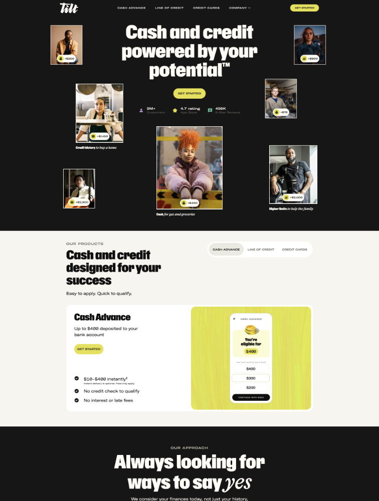
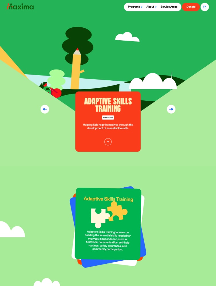
Main typeface categories include: Serif fonts (Times New Roman, Garamond, Merriweather) with decorative strokes at letter ends, ideal for traditional industries like finance, law, luxury goods, publishing, and education where trust and authority matter. They work excellently for body text in long-form content. Sans-serif fonts (Helvetica, Inter, Roboto, Poppins) without decorative strokes, perfect for modern brands, technology companies, startups, apps, and clean interfaces. They're highly readable on screens making them ideal for headlines, UI elements, and body text. Monospace fonts (Courier, Monaco, JetBrains Mono) with fixed character width, used sparingly for code snippets, technical documentation, or creating distinctive developer-focused brands. Display fonts (custom decorative typefaces) for headlines and hero sections when brand personality demands uniqueness, used sparingly due to limited readability. Script fonts mimicking handwriting, rarely appropriate for landing pages except specific luxury or wedding industries. For most landing pages, combine a bold sans-serif for headlines with either the same font family at lighter weight or a readable serif for body text, maintaining 2-3 fonts maximum to avoid visual chaos.

What are typography best practices for landing page conversion?

Typography best practices for high-converting landing pages: Use 2-3 font families maximum - typically one for headlines, one for body text, and occasionally an accent font. Establish clear hierarchy through size, weight, and spacing variations making the most important elements (value proposition, CTAs) immediately obvious. Ensure readability with minimum 16px for body text, 1.5-1.8 line height for body copy, and 50-75 characters per line for optimal reading. Maintain sufficient contrast meeting WCAG standards (4.5:1 for body text, 3:1 for large text) ensuring accessibility. Optimize loading by using variable fonts, loading only necessary weights, and implementing font-display: swap to prevent invisible text. Create scannable content with clear headings, bullet points, short paragraphs (3-4 lines), and whitespace between sections. Use responsive typography with fluid sizing adjusting gracefully across devices. Align text appropriately - left-aligned for Western languages, centered for short headlines only. Make CTAs stand out through bold weights, contrasting colors, and strategic sizing. Test typography across devices and browsers ensuring consistency.

How do I choose and pair typefaces effectively?

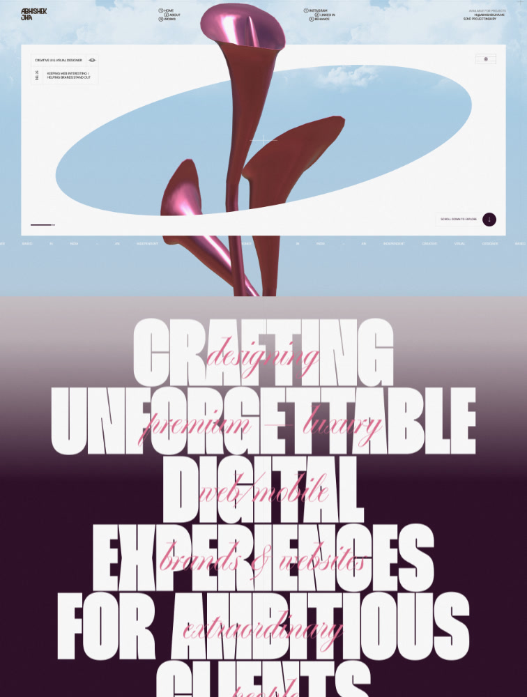
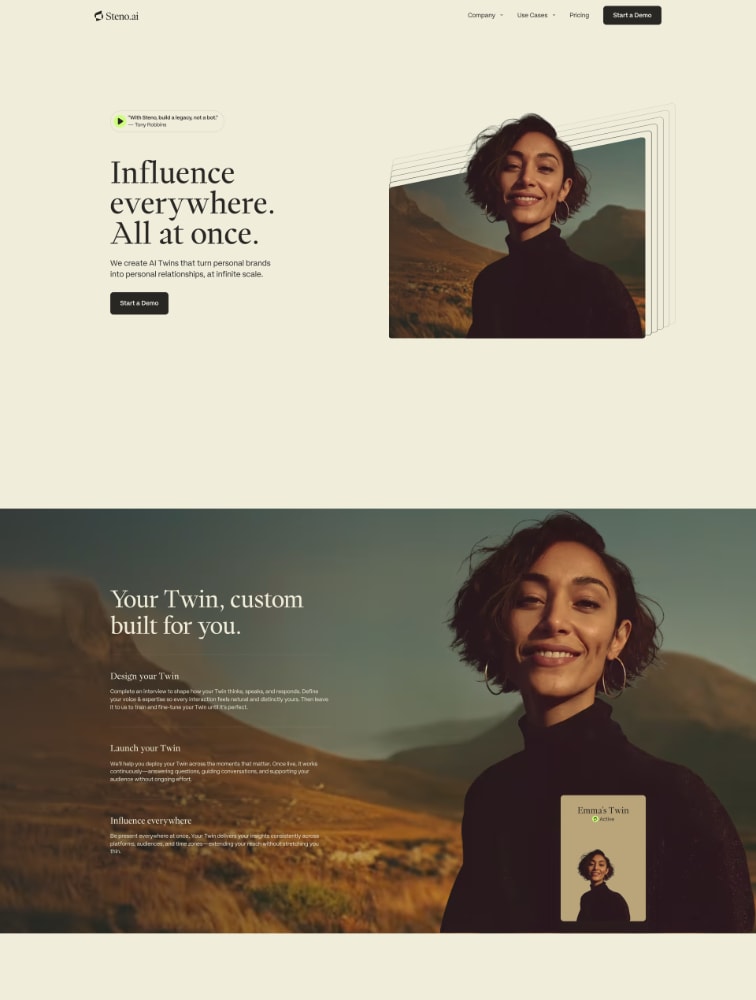
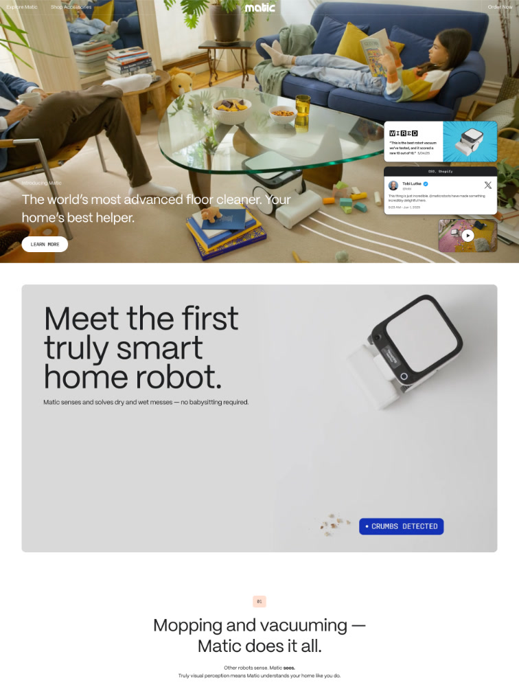
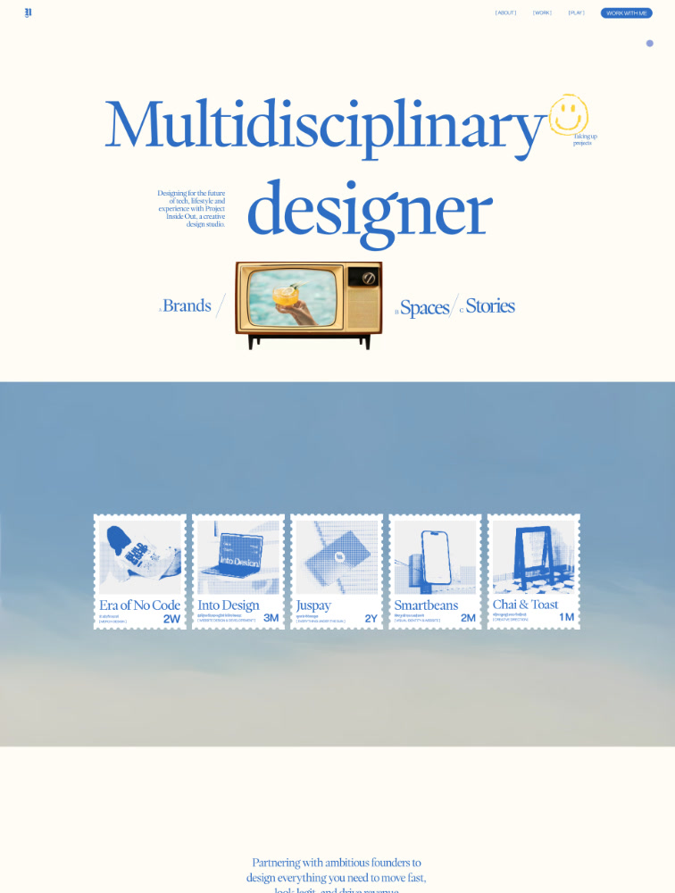
Effective typeface selection and pairing strategies: Start by defining brand personality - modern and clean (geometric sans-serifs like Montserrat), friendly and approachable (humanist sans-serifs like Open Sans), traditional and trustworthy (classic serifs like Georgia), or bold and unique (display fonts for headlines). Match fonts to audience expectations - tech audiences expect clean sans-serifs, luxury audiences appreciate elegant serifs, creative audiences embrace unique typography. For pairing, use contrast - pair bold sans-serif headlines with lighter serif body text, or geometric headlines with humanist body. Maintain consistency within the same font family using different weights and styles (Inter Regular for body, Inter Bold for headlines). Test readability by viewing fonts at actual sizes in realistic contexts, not just specimens. Consider technical aspects - choose fonts with complete character sets for your languages, multiple weights for hierarchy, and good web performance. Browse proven systems like Google Fonts, Adobe Fonts, or Font Squirrel for quality web fonts. Look at successful landing pages in your industry on sites like Lapa.ninja at lapa.ninja/typeface/ to see what typography approaches convert well for similar products and audiences.

What common typography mistakes hurt landing page conversion?

Common typography mistakes that reduce conversion: Using too many fonts (more than 3) creating visual chaos and unprofessional appearance, reducing trust and increasing cognitive load. Insufficient contrast between text and background making content difficult or impossible to read, particularly problematic for accessibility. Body text too small (under 16px) straining eyes and increasing bounce rates, especially on mobile devices where 60%+ of traffic occurs. Poor hierarchy with similar sizing for headlines, subheads, and body making it unclear what's most important. Excessive line length (over 90 characters) or too short (under 40 characters) hurting readability and comprehension. Centered body text creating uneven left edges that slow reading and increase fatigue. Loading too many font weights bloating page size and slowing load times by 2-4 seconds. Using decorative display fonts for body text sacrificing readability for aesthetics. Not testing fonts across devices leading to rendering inconsistencies or missing fallbacks. Ignoring web font loading strategies causing flash of invisible text (FOIT) or unstyled text (FOUT). Trendy fonts that quickly date your design. Poor letter-spacing, word-spacing, or line-height making text cramped or too loose. Text on busy backgrounds without sufficient contrast or overlays. Always prioritize readability and conversion over aesthetic preferences alone.

Lapa Ninja - your go-to destination for web design inspiration. Created to help designers find inspiration, learn, and sharpen their skills, the site showcases curated content from the best landing page designs on the web, updated daily. Featured on Product Hunt with over 1,600 votes, Lapa Ninja is a trusted resource in the design community. Show your support by Buying me a Coffee ☕️ (opens in new tab)
Submit your websites 💌 [email protected]

Stay Updated

Get the latest design inspiration delivered to your inbox. Support our work and join the community!

Lapa Ninja - The Best Landing Page Inspiration | Product Hunt (opens in new tab)

Follow Us

  • Pinterest (opens in new tab)
  • X / Twitter (opens in new tab)
  • Bluesky (opens in new tab)
  • LinkedIn (opens in new tab)
  • Cosmos (opens in new tab)
  • RSS (opens in new tab)

Articles

  • What is a Landing Page? Beginner's Guide to Designing High-Converting Pages
  • Free Illustrations Library for Your Project
  • Top Free Resources for SVG Patterns
  • The Best Free Stock Photo Sites

Download Free Design Books

  • The Ultimate UI Design Roadmap
  • Law By Design
  • Why Do We Interface?
  • Design Engineering Handbook
  • The Grit Season 2

Free Design Resources

  • AI Startup Free Website Ui Kit
  • Instrument Design Studio Portfolio Free Template for Figma
  • Cooking Free Template for Figma
  • Open Fashion - Free eCommerce UI Kit for Figma
  • Kohaku - Minimal Portfolio Free Template for Framer
All screenshots © of their respective owners.