Best Black Landing Page Design Inspiration
A curated collection of black landing page design for your inspiration. Get inspired by real landing page examples, each review featuring a full screenshot and highlighting standout features.
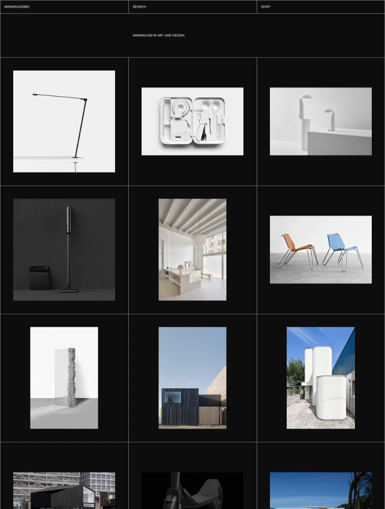
 Minimalissimo
Minimal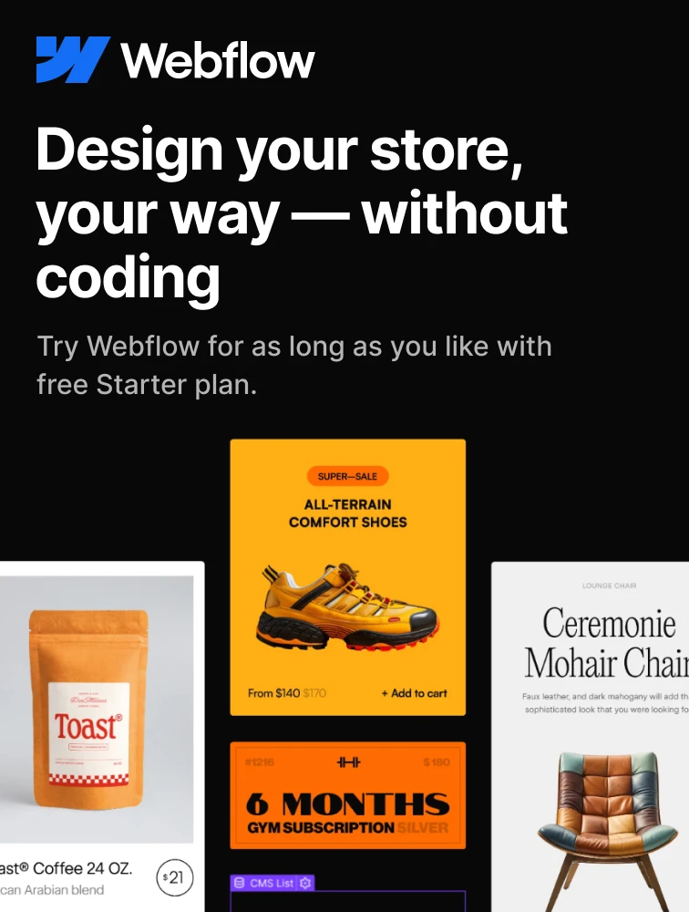
 Webflow
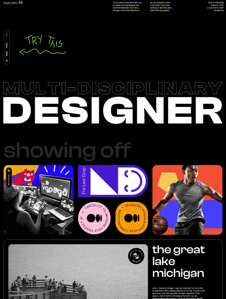
Anna Sherruble
Portfolio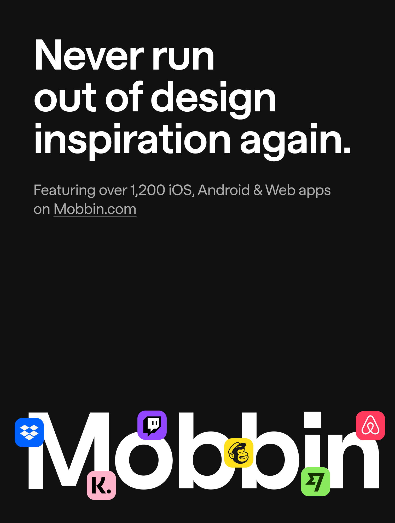
 Mobbin.com
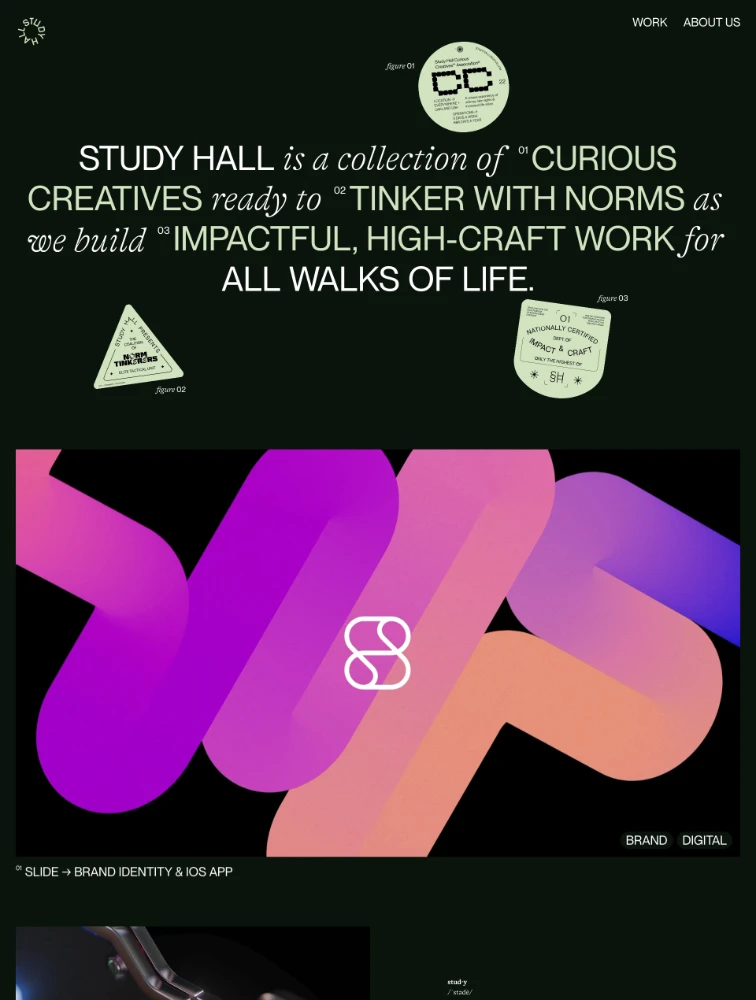
 Study Hall
Studio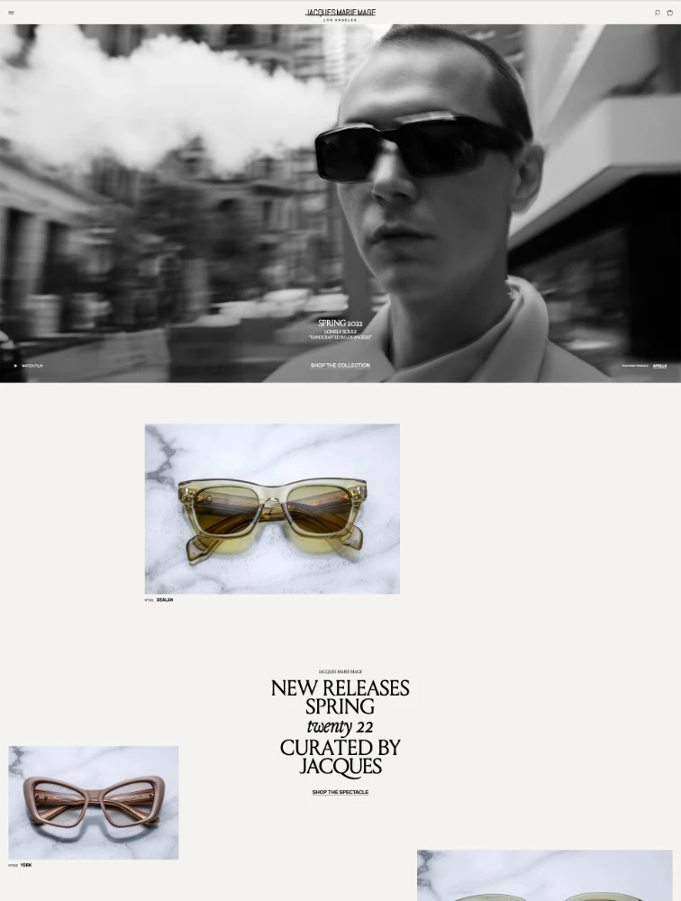
 Jacques Marie Mage
eCommerce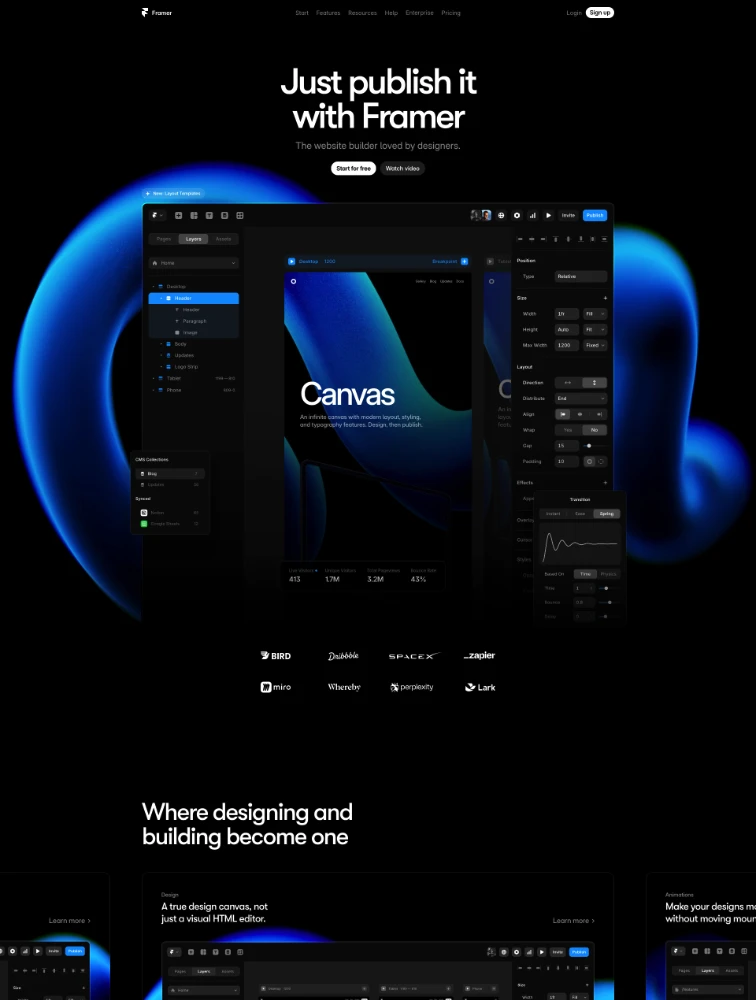
 Framer
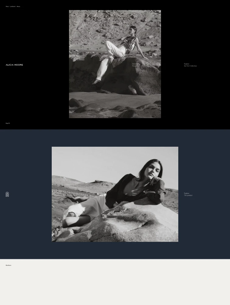
 Alicia Moore
Fashion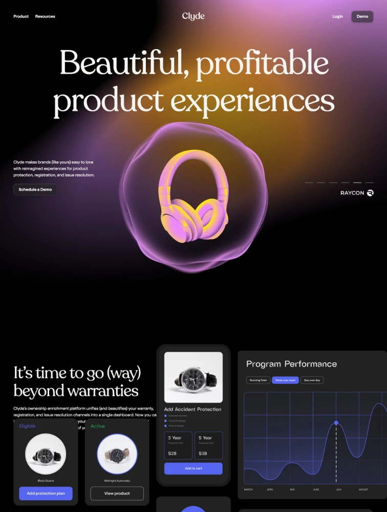
 Clyde
Clyde
3D Websites
 Featured Partner
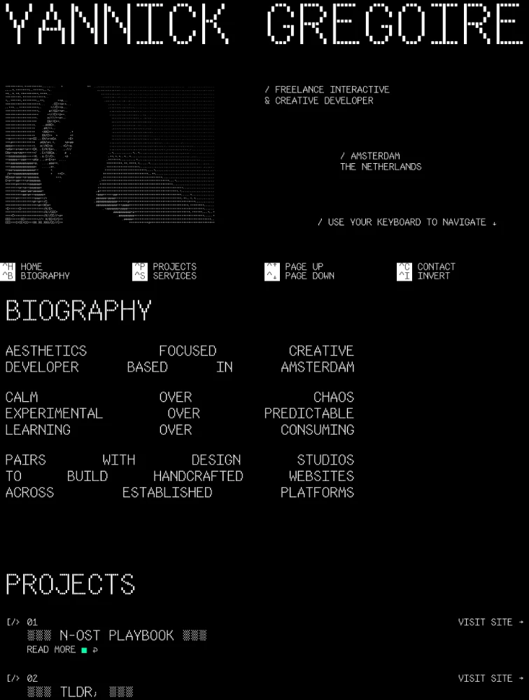
 Yannick Gregoire
Portfolio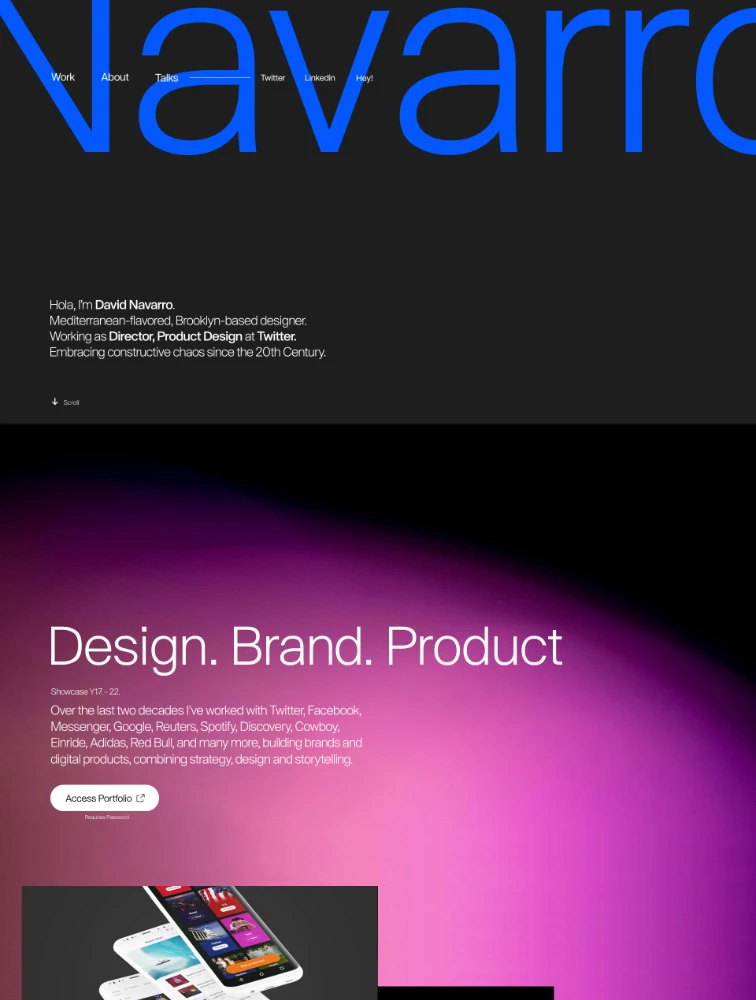
 David Navarro
Portfolio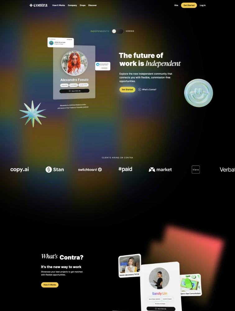
 Contra
Freelance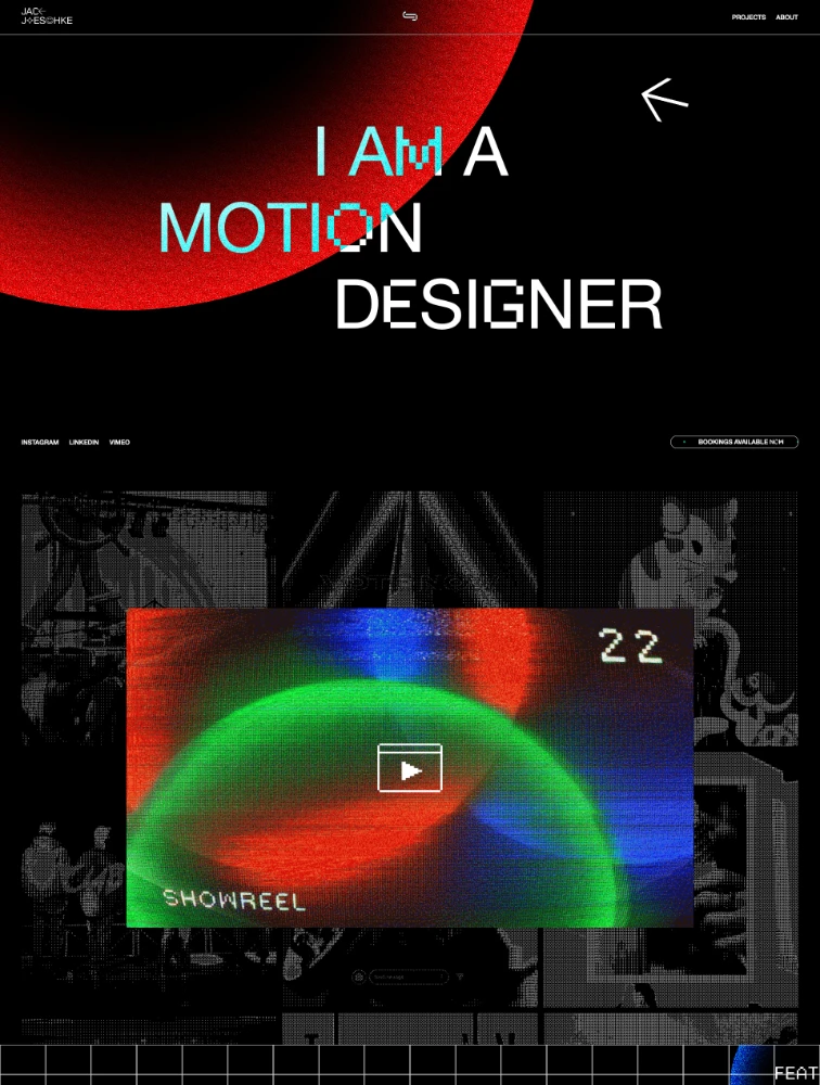
 Jack Jaeschke
Portfolio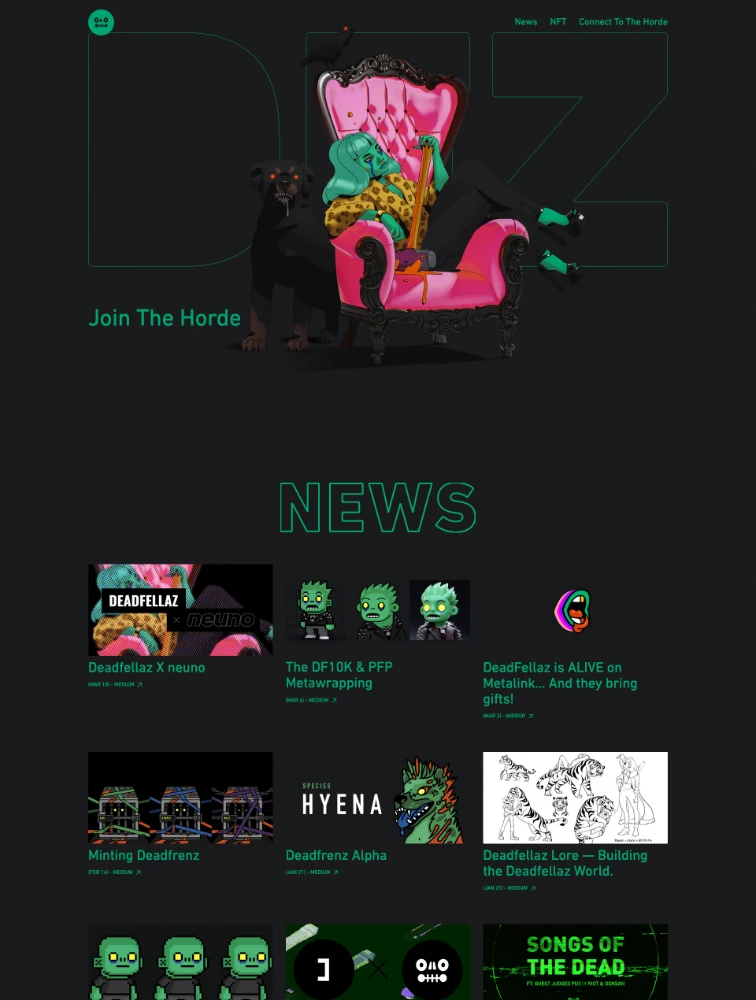
 DeadFellaz
NFT
Featured Partner
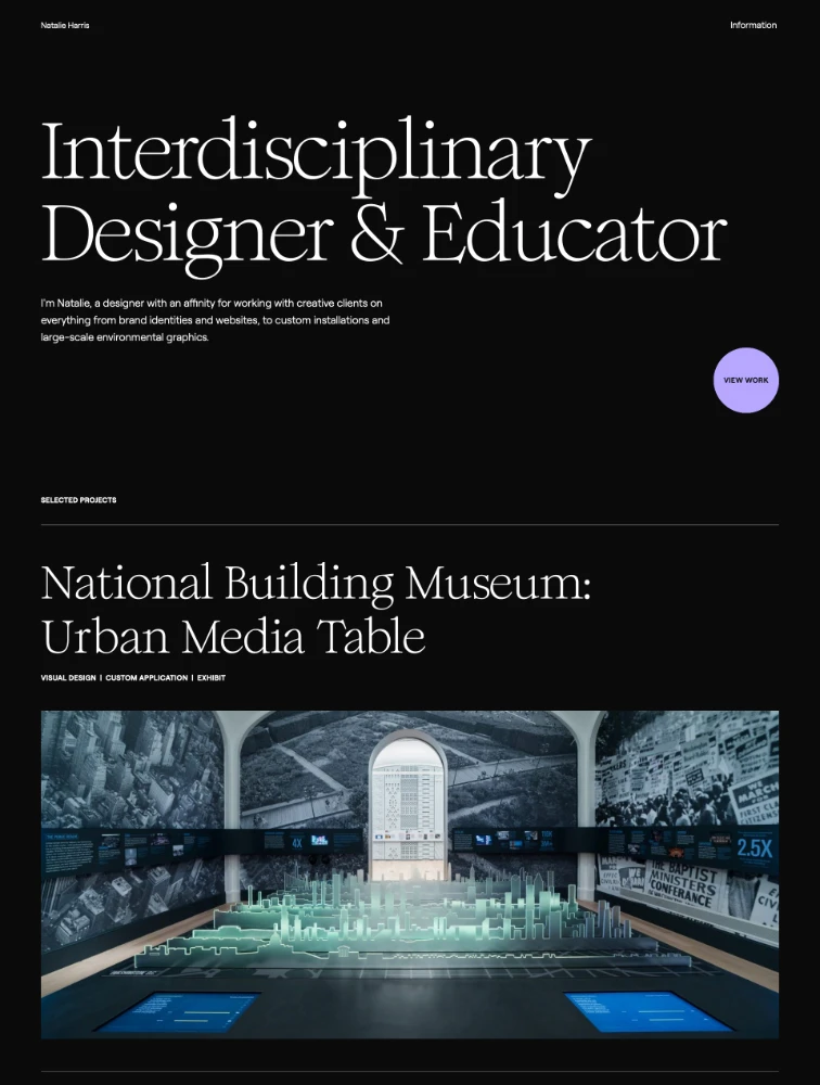
 Natalie Harris
Portfolio
Featured Partner
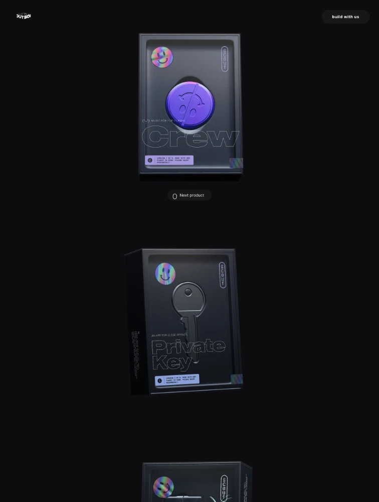
Scout
3D Websites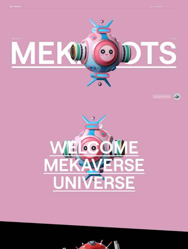
 MekaVerse
NFT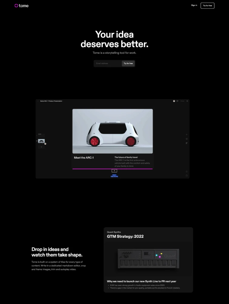
 Tome
Tome
Productivity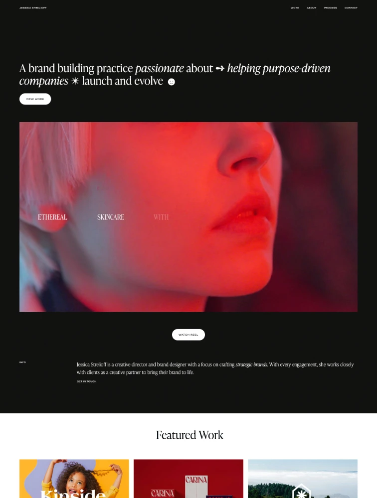
 Jessica Strelioff
Portfolio
Featured Partner
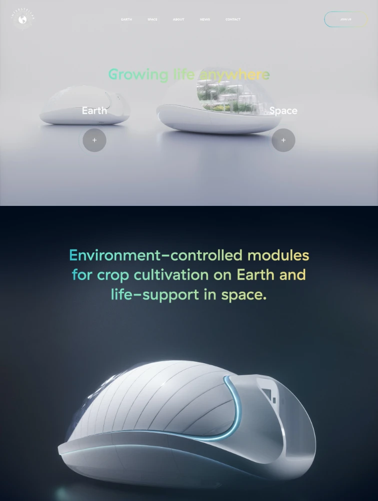
 Interstellar Lab
Technology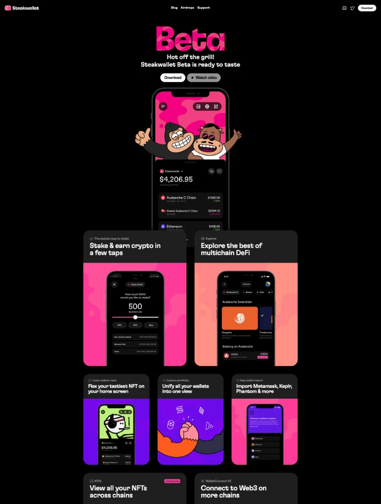
 Steakwallet
App
Featured Partner
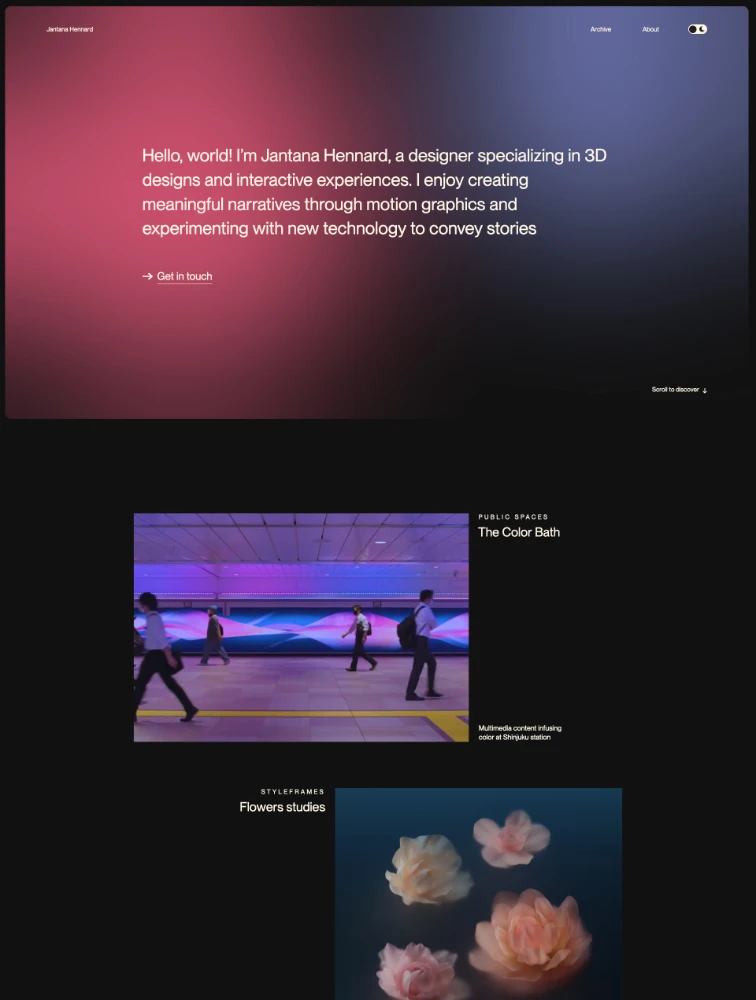
Jantana Hennard
Portfolio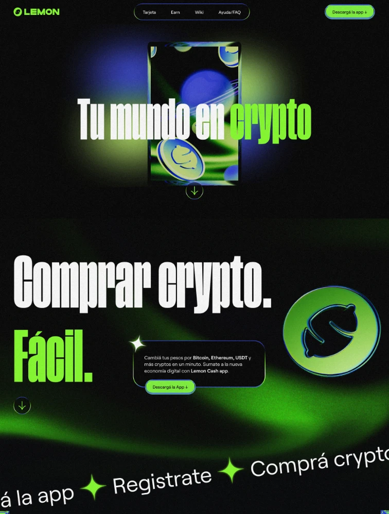
 Lemon
Lemon
App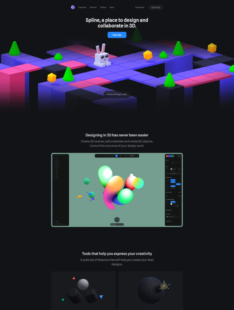
 Spline
Design Tools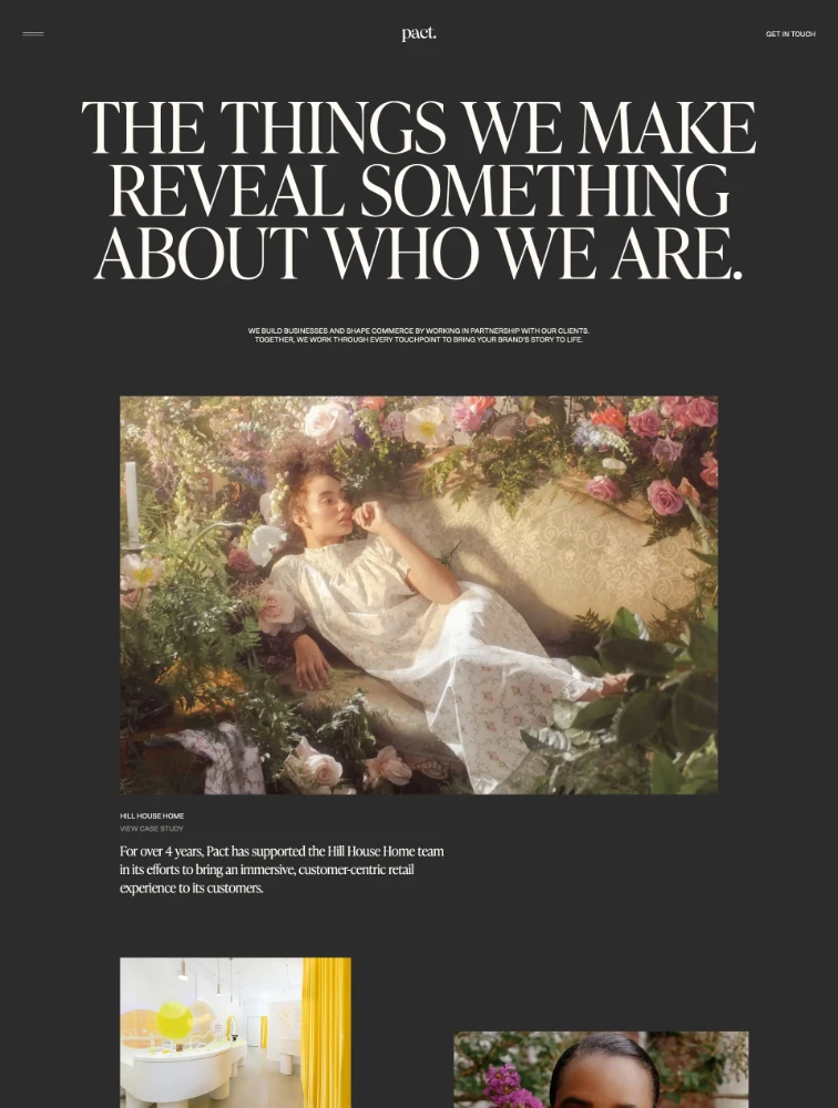
 Pact Studio
Studio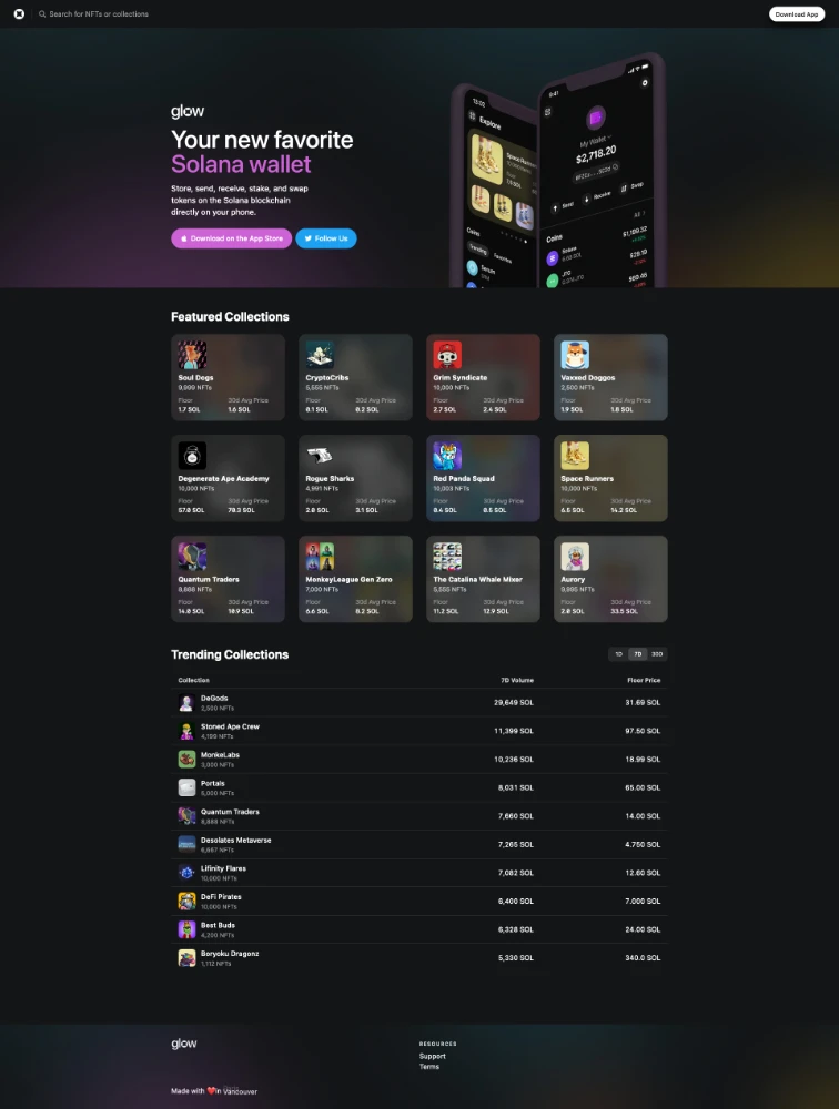
 Glow Wallet
App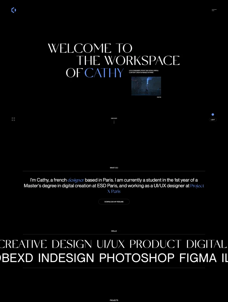
 Cathy Dolle
PortfolioFrequently Asked Questions
Everything you need to know about black landing pages
Why use black and dark mode in landing page design?
Black and dark mode landing pages have become increasingly popular as users embrace dark interfaces across devices and applications. Black backgrounds offer multiple advantages: they create sophisticated, premium aesthetics conveying luxury and exclusivity; provide superior contrast making CTAs, text, and important elements pop dramatically; reduce eye strain in low-light conditions improving user comfort; appeal strongly to tech-savvy millennials and Gen Z audiences who prefer dark interfaces; save battery life on OLED/AMOLED screens; and create memorable, bold statements differentiating from typical white pages. Dark mode is particularly effective for premium products, creative agencies, technology companies, gaming platforms, photography portfolios, entertainment properties, and brands targeting modern, design-conscious audiences.
What is dark mode and how does it differ from just using black backgrounds?
Dark mode is a comprehensive design approach using dark color schemes throughout the interface, not just pure black backgrounds. True dark mode typically uses dark grays (#121212, #1e1e1e) rather than pure black (#000000) to reduce eye strain and prevent excessive contrast. It involves careful consideration of: elevated surfaces using lighter shades to show hierarchy and depth, desaturated colors that work better on dark backgrounds than vibrant colors used in light mode, adjusted contrast ratios ensuring text readability while avoiding harsh pure white on pure black, appropriate shadow and elevation treatments different from light mode, and color palette adjustments since colors appear different on dark backgrounds. Modern dark mode also respects user system preferences through CSS prefers-color-scheme media queries, allowing automatic switching based on device settings.
What are best practices for dark mode landing page design?
Dark mode landing page best practices: Use dark grays (#0a0a0a, #1a1a1a, #2d2d2d) instead of pure black (#000000) which is harsh and increases eye strain. Ensure text contrast meets WCAG accessibility standards using off-white or light gray (#e0e0e0, #f5f5f5) text rather than pure white which creates excessive contrast. Create depth through elevation using progressively lighter shades for raised elements rather than shadows. Desaturate colors by 20-40% as vibrant colors overwhelm on dark backgrounds. Test thoroughly across devices and lighting conditions. Provide light/dark mode toggle respecting user preferences. Use strategic color accents that pop against dark backgrounds for CTAs. Implement smooth transitions when switching modes. Consider loading dark mode by default at night using time-based detection. Optimize images and graphics for dark backgrounds, potentially providing alternate versions. Ensure brand colors work effectively on dark backgrounds, adjusting if necessary.
What types of brands and industries work best with black/dark mode landing pages?
Black and dark mode landing pages excel for: Premium and luxury brands including high-end watches, luxury cars, designer fashion, and jewelry where black conveys exclusivity and sophistication. Technology companies especially developer tools, gaming platforms, and innovative SaaS products where dark interfaces are expected. Creative industries including design agencies, photography portfolios, video production, and music platforms where black provides dramatic presentation. Entertainment properties including streaming services, gaming, esports, and nightlife venues. Cryptocurrency, blockchain, and fintech projects targeting tech-savvy audiences. Architecture and interior design firms showcasing visual work. However, black may not be ideal for: Healthcare requiring trust and cleanliness associations. Education targeting older demographics. E-commerce selling everyday products. Children's products. Traditional B2B expecting conservative presentation. Food and beverage where appetizing photography needs bright backgrounds. Always consider target audience preferences and test dark mode adoption rates.
How does dark mode affect landing page conversion rates and user behavior?
Dark mode significantly impacts user behavior and conversion metrics: Positive effects include increased time on page (10-30% longer sessions) as reduced eye strain enables comfortable extended viewing, higher engagement rates particularly during evening hours when dark mode is most appreciated, improved perceived value and premium brand positioning boosting conversion for luxury products by 15-25%, stronger CTA visibility with proper contrast increasing click-through rates by 20-40%, and better mobile experience as dark mode saves battery encouraging longer sessions. However, potential negative impacts include reduced conversion among older demographics less familiar with dark interfaces, readability challenges if contrast isn't managed properly, some product types (especially food, children's items, healthcare) seeing 10-30% lower conversion due to inappropriate associations, and accessibility issues for users with certain visual impairments preferring light mode. Best practice: offer dark/light mode toggle defaulting to user system preferences, A/B test dark vs light mode measuring conversion, engagement, and bounce rates with your specific audience, and monitor analytics by time of day as dark mode typically performs better in evening hours. Studies show dark mode increases conversion 5-15% for tech products but may decrease it 10-20% for traditional products.