Best Gradient Landing Page Design Inspiration
A curated collection of Gradient landing page design for your inspiration. Get inspired by real landing page examples, each review featuring a full screenshot and highlighting standout features.
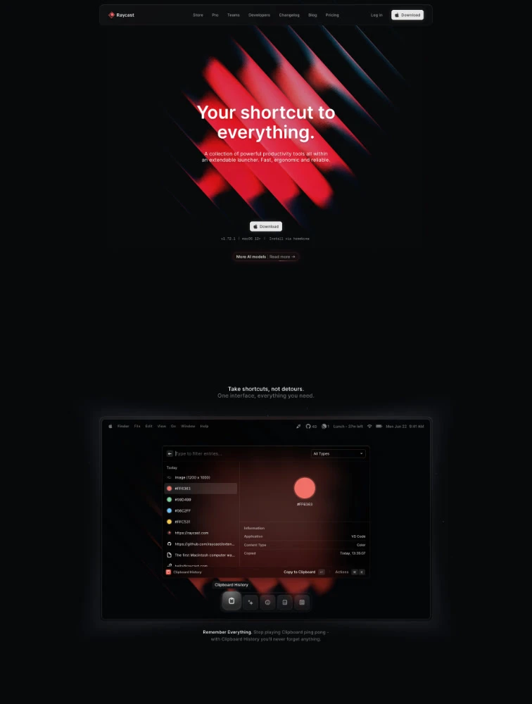
 Raycast
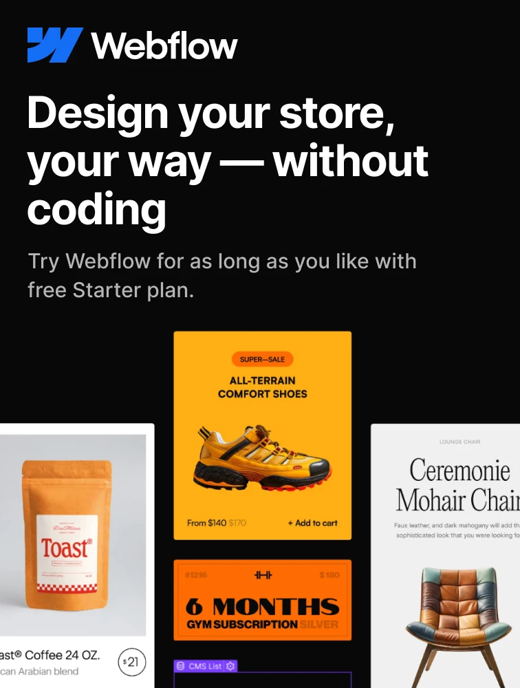
 Webflow
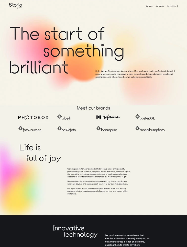
Storio group
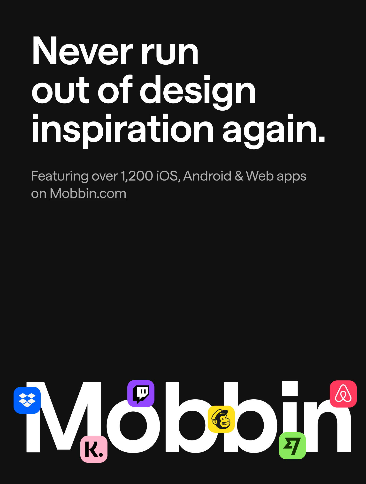
 Mobbin.com
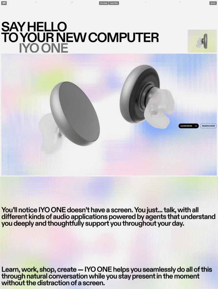
 IYO
IYO
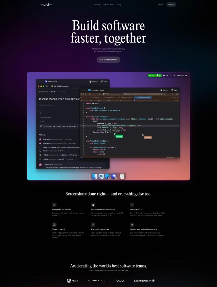
 Multi
Multi
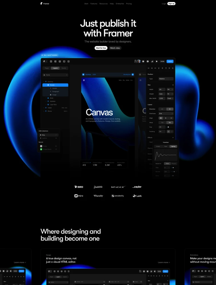
 Framer
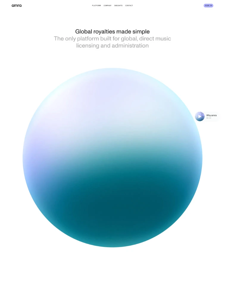
 amra
amra
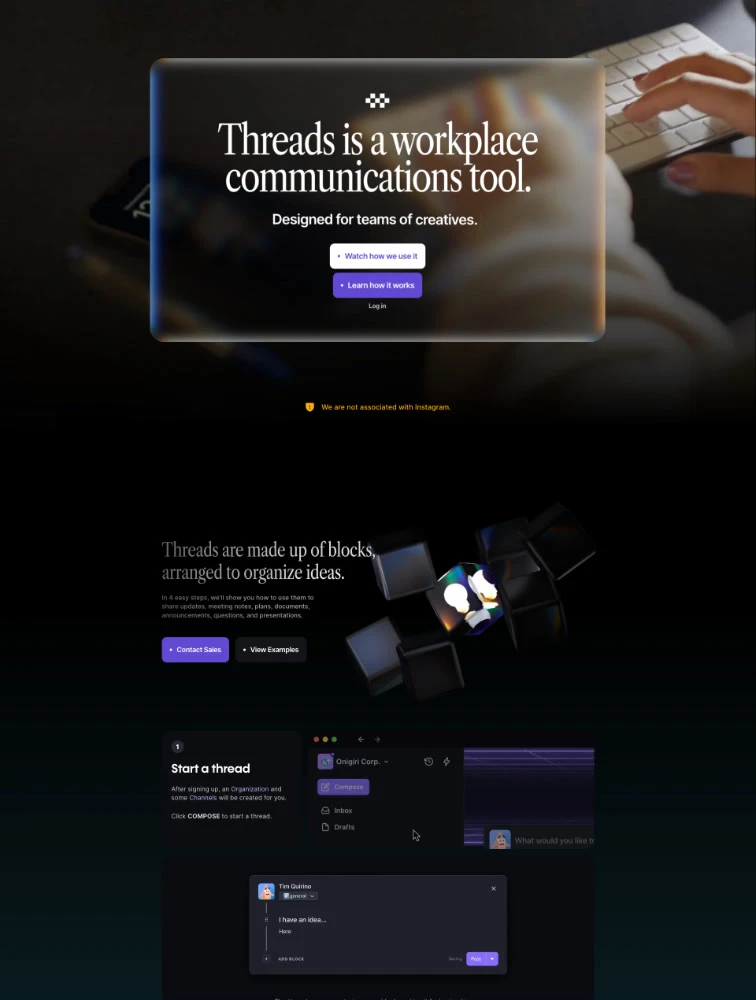
 Threads
 Featured Partner
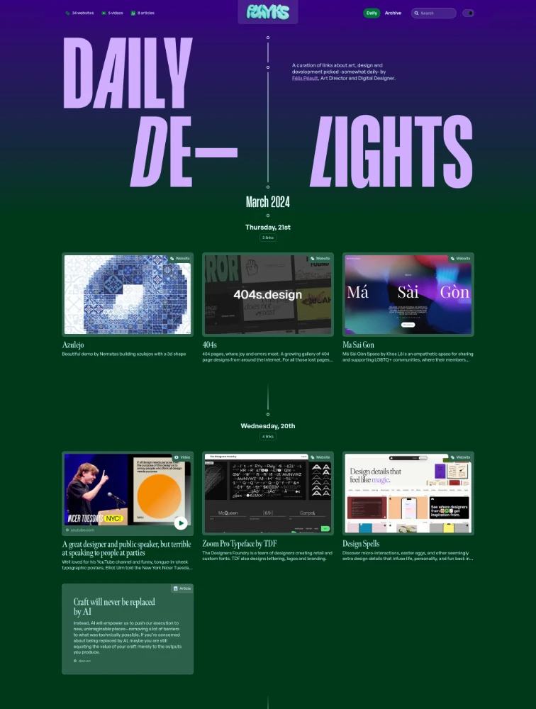
 Daily Delights
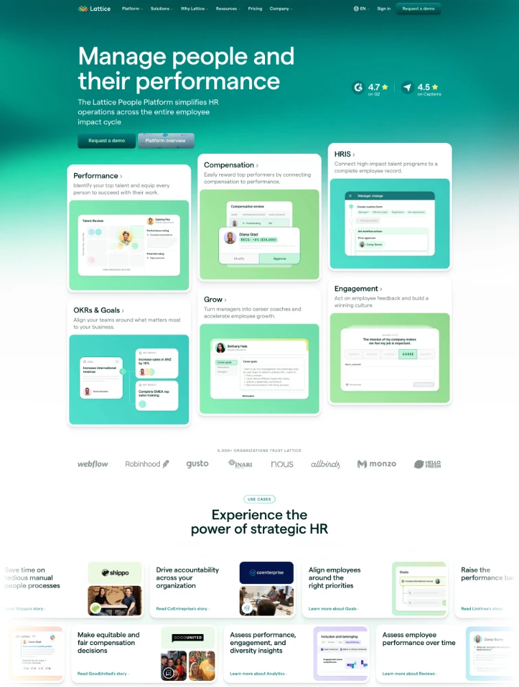
 Lattice
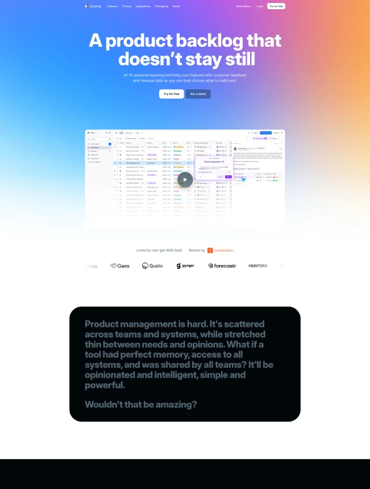
 Cardinal
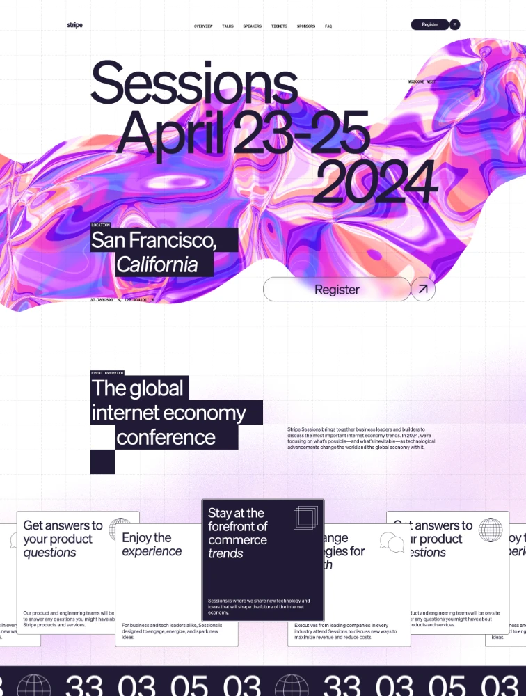
 Stripe Sessions 2024
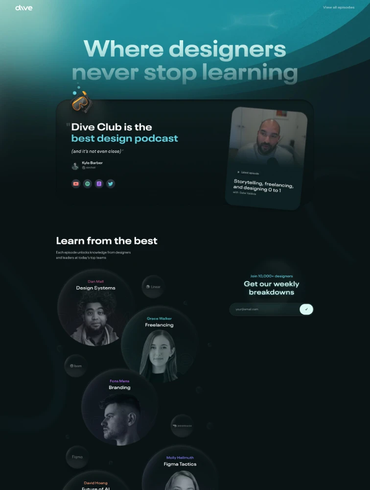
 Dive
Dive
Featured Partner
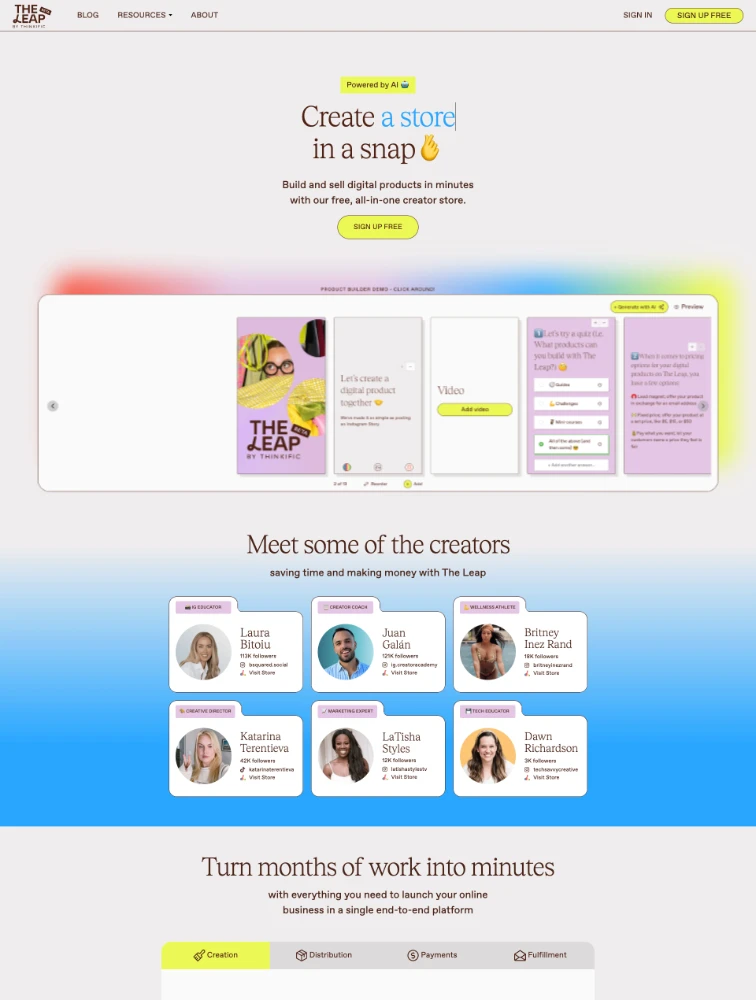
The Leap
Featured Partner
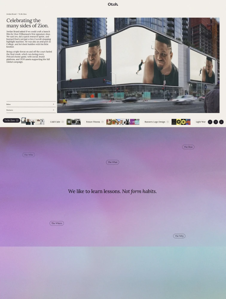
 Otoh
Otoh
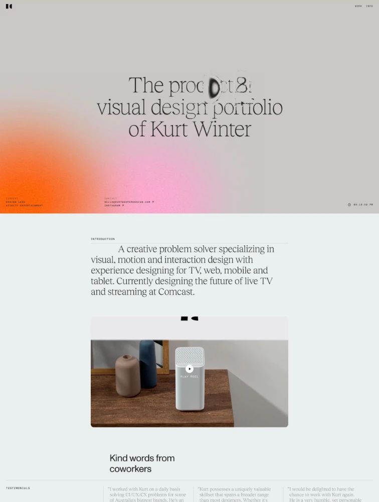
 Kurt Winter

Common
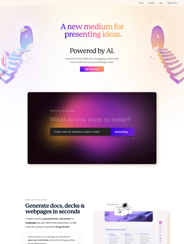
Gamma
Featured Partner
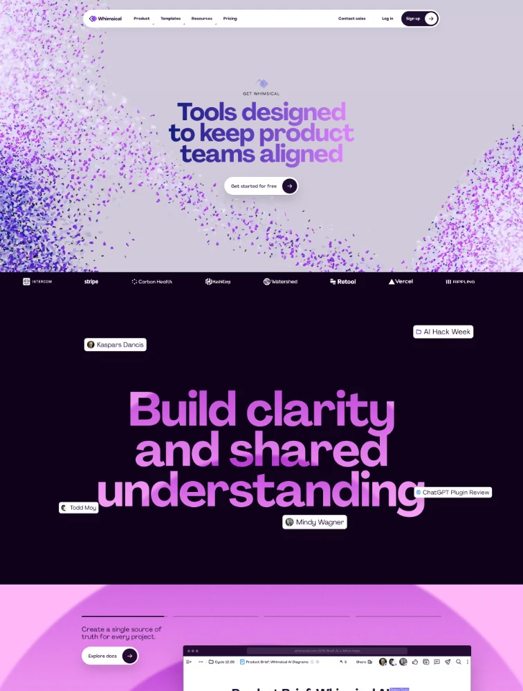
 Whimsical
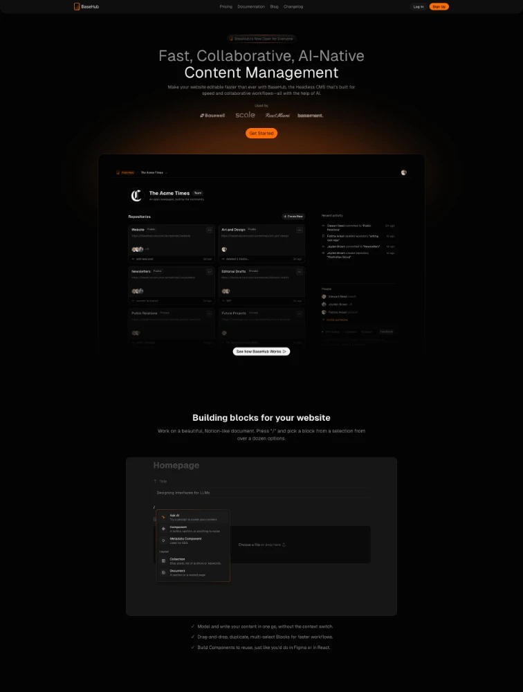
 BaseHub
Featured Partner
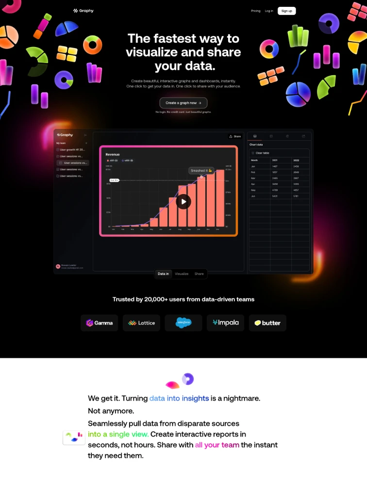
 Graphy
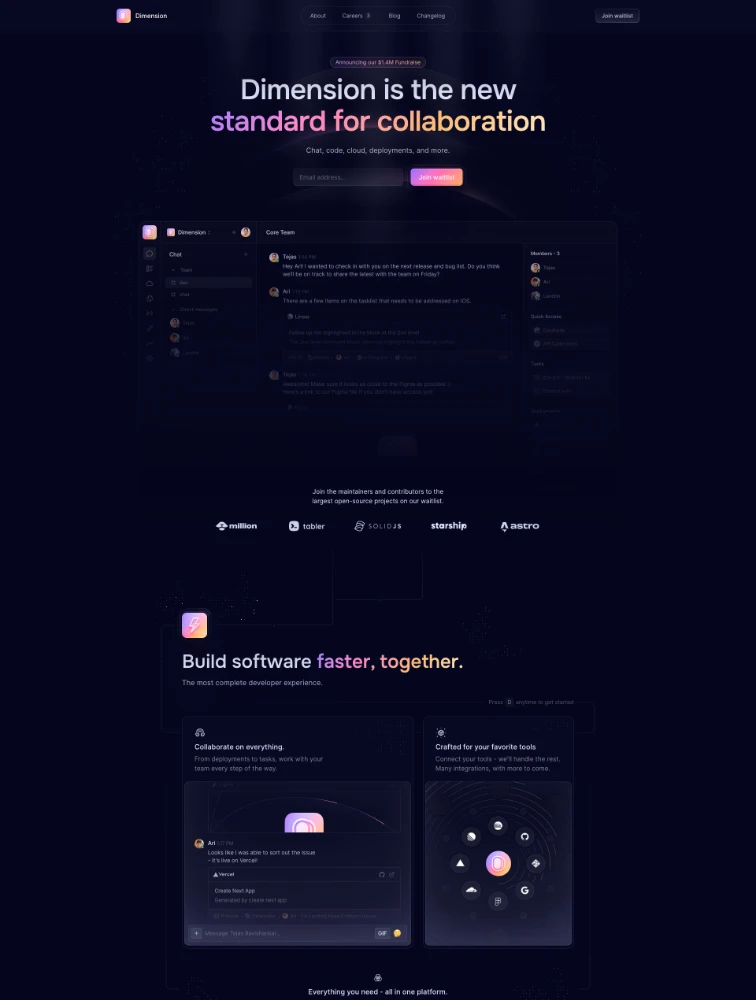
 Dimension
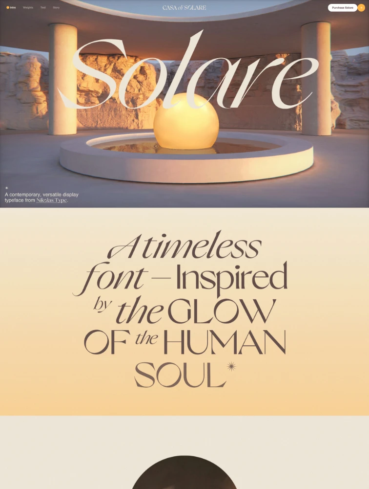
 Solare
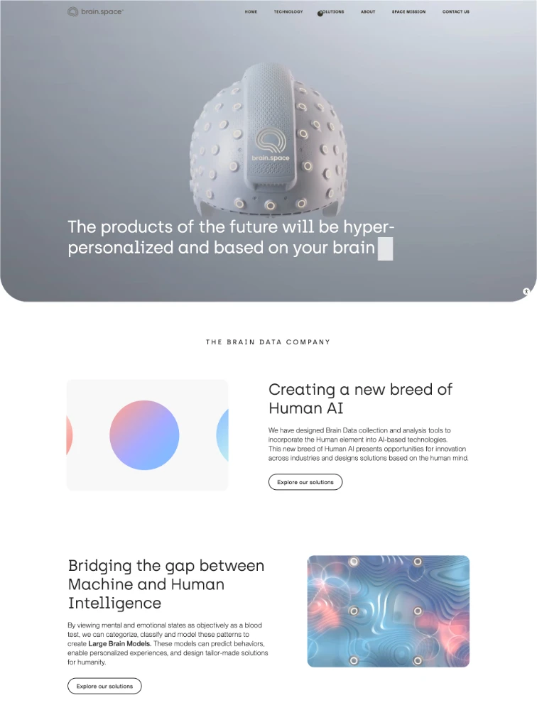
brain.space
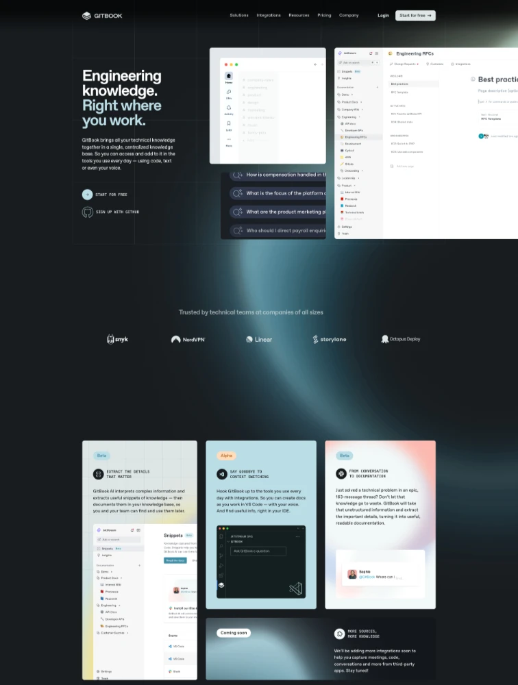
 GitBook
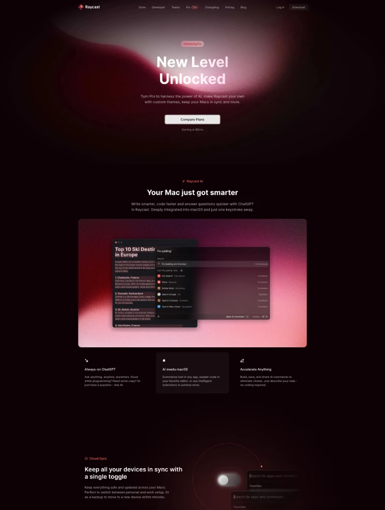
 Raycast Pro
Frequently Asked Questions
Everything you need to know about gradient landing pages
What are Gradient landing pages?
Gradient landing pages use smooth color transitions as a primary design element, featuring gradient backgrounds, button effects, overlays, or hero sections that blend multiple colors seamlessly. These pages leverage CSS gradients to create depth, dimension, and visual interest without heavy image files. On Lapa.ninja, gradient landing pages showcase how color transitions can enhance brand identity, create emotional impact, guide visitor attention, and establish contemporary aesthetics particularly effective for technology, creative, and innovation-focused brands. When used strategically, gradients improve visual hierarchy, make CTAs more appealing, and differentiate from flat-design competitors.
What types of gradients work best for landing pages?
Effective gradient types include: Linear gradients transitioning colors along straight lines, ideal for backgrounds and headers creating subtle depth. Radial gradients emanating from center points, excellent for drawing attention to CTAs. Conic gradients rotating around centers, useful for unique visual elements. Mesh gradients with multiple color points creating organic effects. Subtle gradients with closely related colors maintaining professionalism. Bold gradients with contrasting colors making strong statements for innovative brands. Animated gradients creating dynamic backgrounds. Choose based on brand personality: subtle for professional services, bold for entertainment, animated for tech products. Always ensure sufficient text contrast and test across devices.
How do gradients affect landing page performance and conversion?
Gradients impact pages positively when implemented well: CSS-based gradients require no image files, reducing page weight and loading faster than photo backgrounds. They work responsively across screen sizes without additional assets and render crisply at any resolution. For conversion, gradients create visual interest keeping visitors engaged, establish modern brand perception, guide attention through color intensity toward CTAs, and differentiate from flat-design competitors. However, excessive gradients can overwhelm content, poor color combinations create accessibility issues, and trendy gradients may date quickly. Best practice: use gradients strategically as accents while ensuring readability, maintaining brand consistency, and A/B testing against solid alternatives.
What are best practices for gradient landing page design?
Gradient best practices: Maintain sufficient text contrast ensuring WCAG accessibility (4.5:1 minimum for body text, 3:1 for large text) across the entire gradient. Use gradients strategically not everywhere - apply to hero sections, CTAs, or specific accents while keeping most content on solid backgrounds. Choose colors aligned with brand palette and appropriate color psychology. Test gradient angles and direction - vertical suggests growth, horizontal suggests progress, diagonal adds dynamism. Optimize gradient stops for performance - simpler gradients render faster. Ensure mobile responsiveness as gradients may appear differently on small screens. Consider fallbacks for older browsers. Balance boldness with usability. A/B test implementations measuring conversion impact.
Where can I find gradient landing page inspiration?
Browse lapa.ninja/category/gradient for curated examples of effective color transition usage. When reviewing examples: analyze how pages balance gradient boldness with readability, note which industries use subtle vs bold approaches, study gradient placement (backgrounds, sections, CTAs, typography), observe integration with other design elements, identify color combinations aligning with your brand, screenshot specific implementations, note animation approaches and performance, cross-reference with your industry category, observe mobile implementations, and extract strategic purpose behind gradient use. Adapt principles authentically to your brand rather than copying directly.