Best Typography Landing Page Design Inspiration
Discover typography website designs. Professional, responsive designs for your next project.
Webflow
Mobbin.com
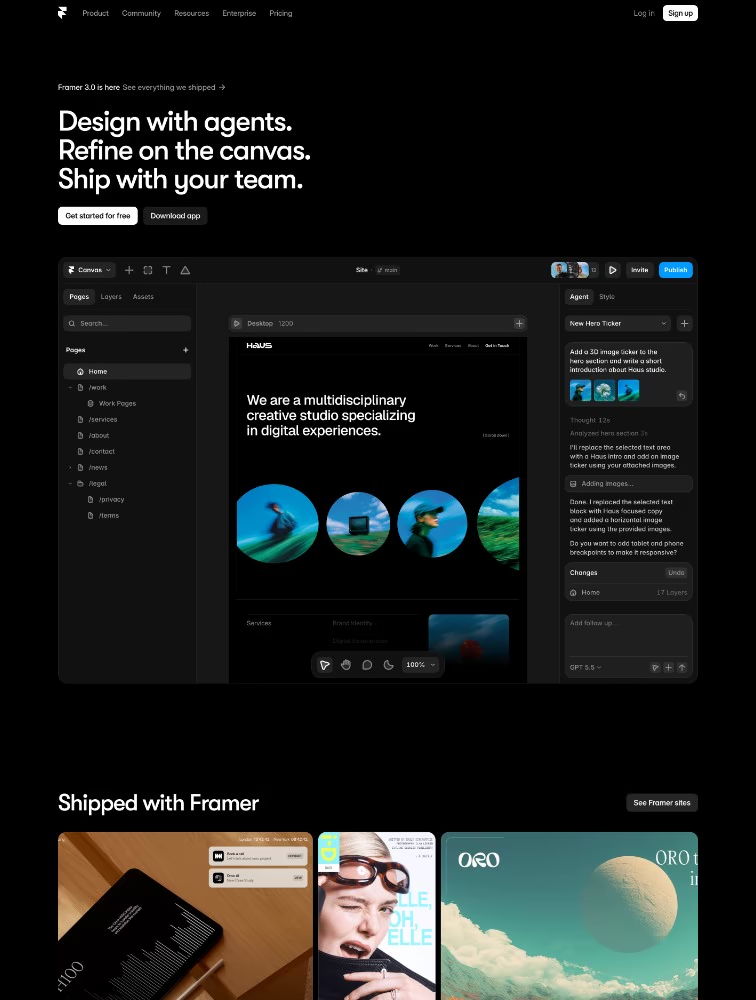
Framer 3.0
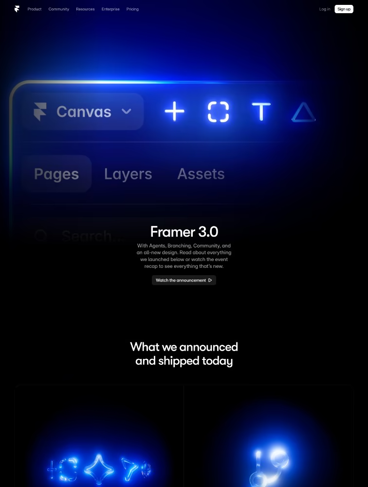
Framer 3.0
Webflow
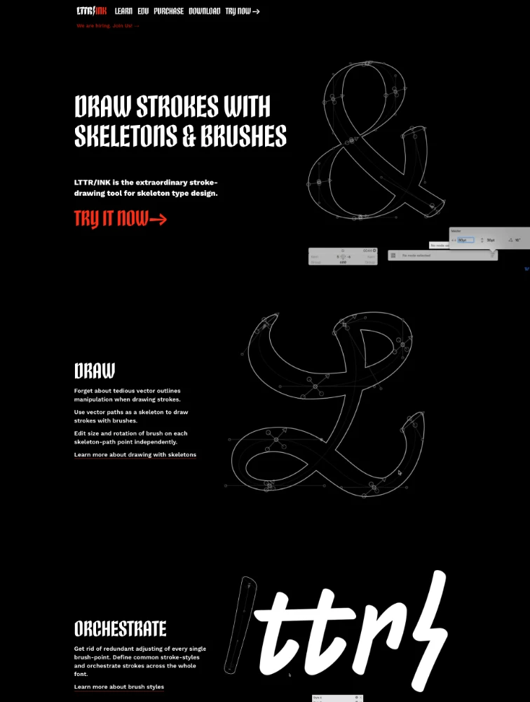
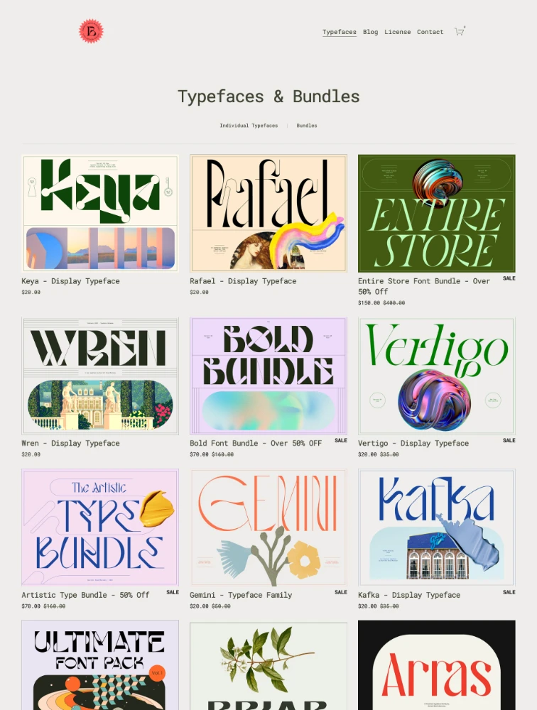
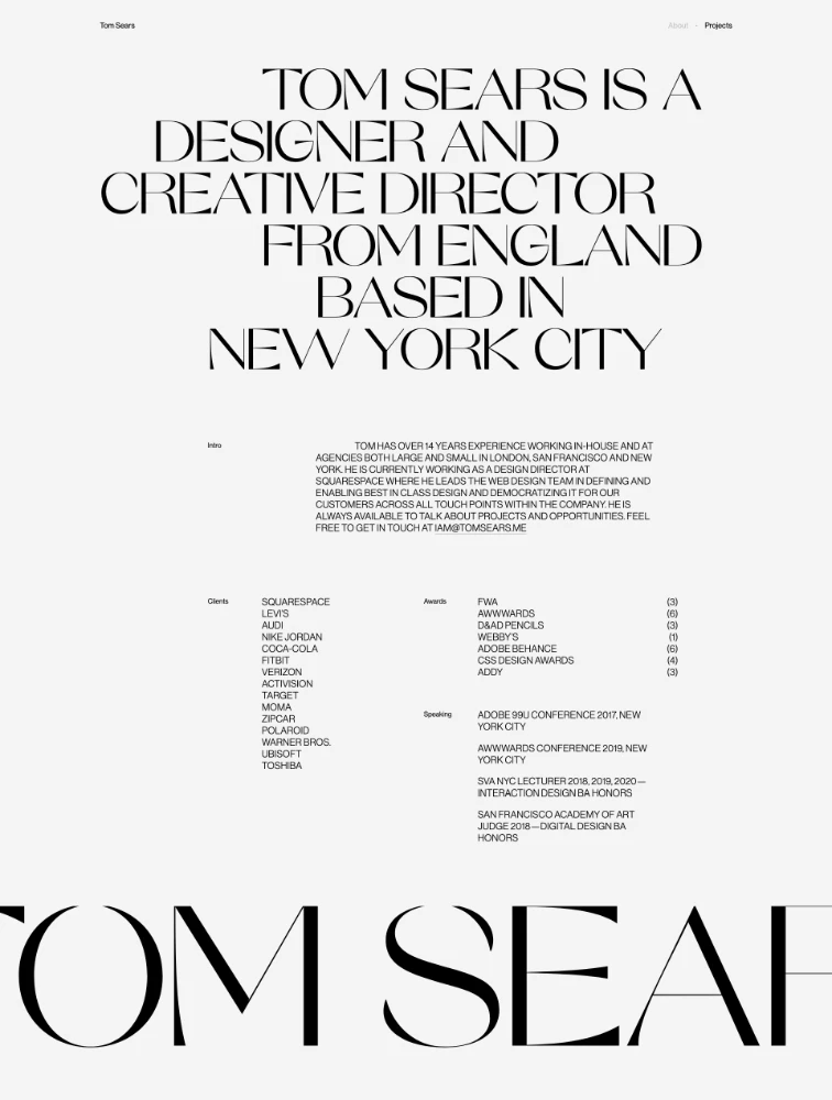
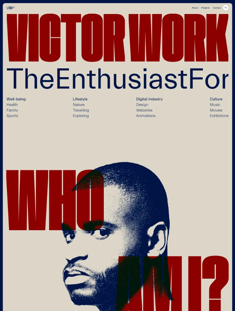
Our Sponsored

Frequently Asked Questions
Everything you need to know about typography landing pages
What are Typography landing pages?
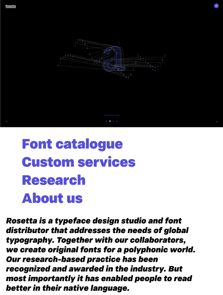
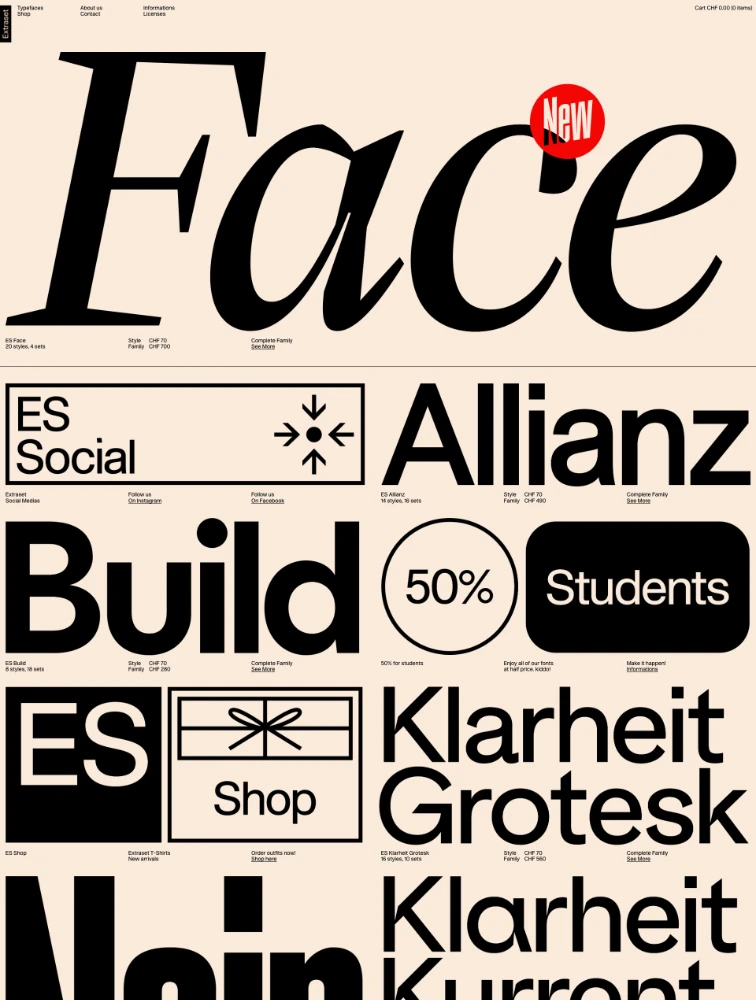
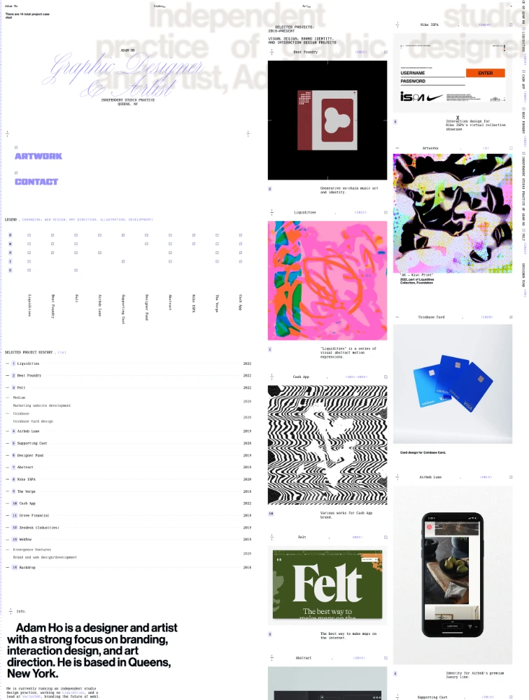
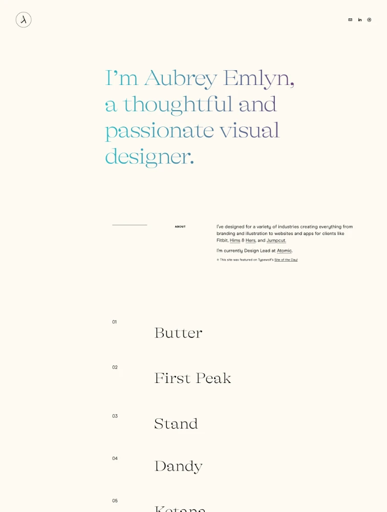
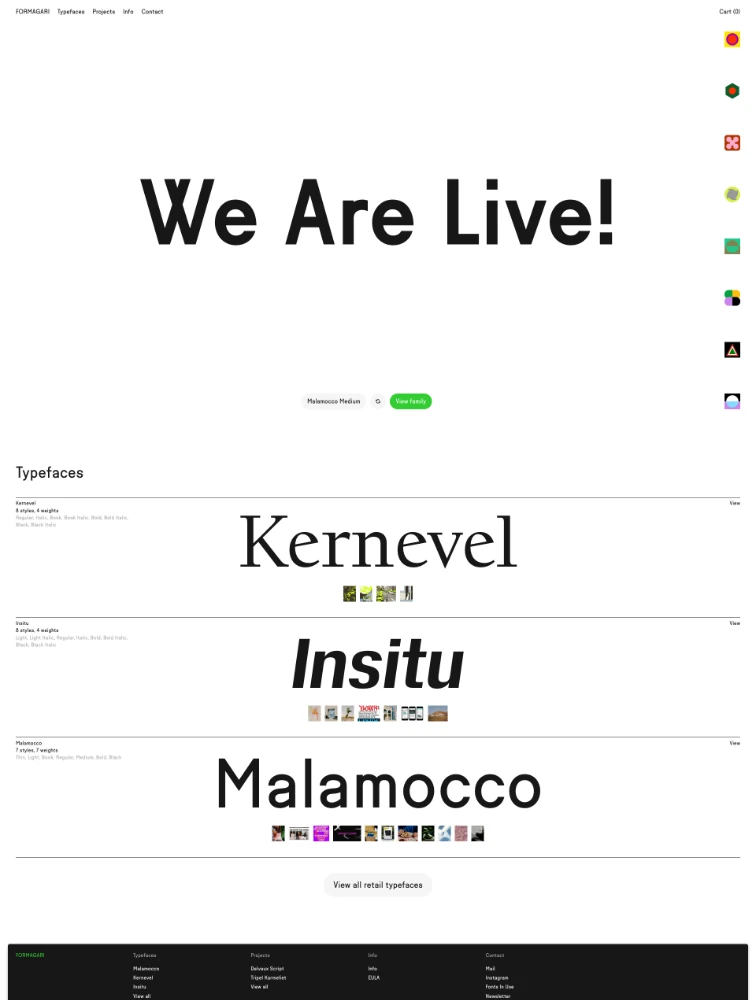
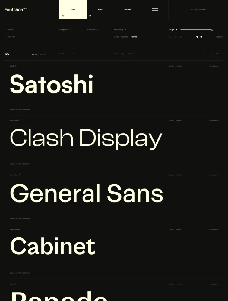
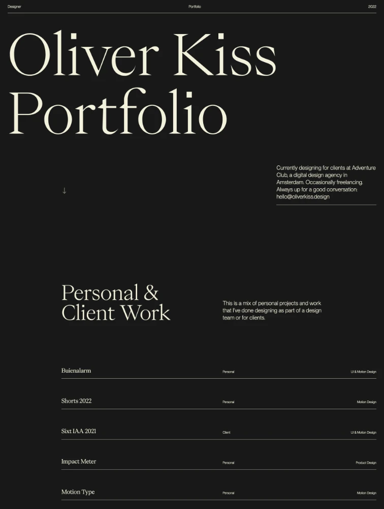
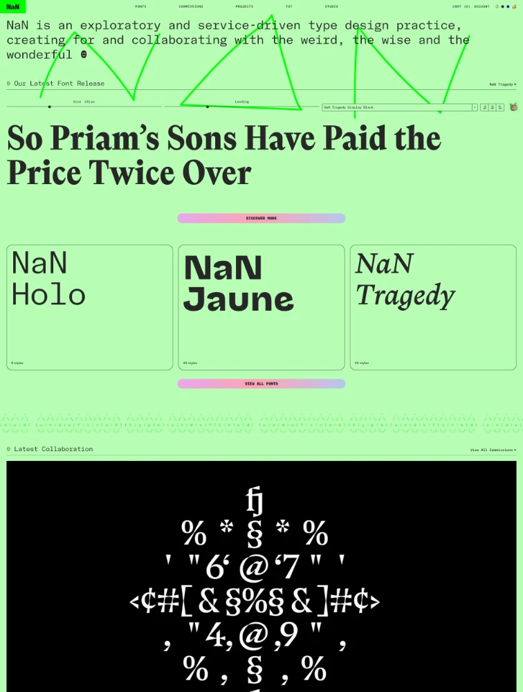
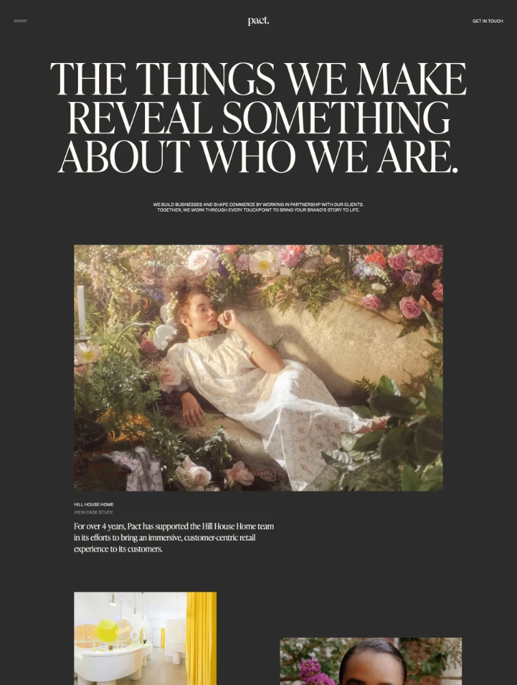
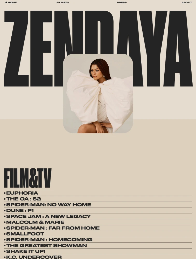
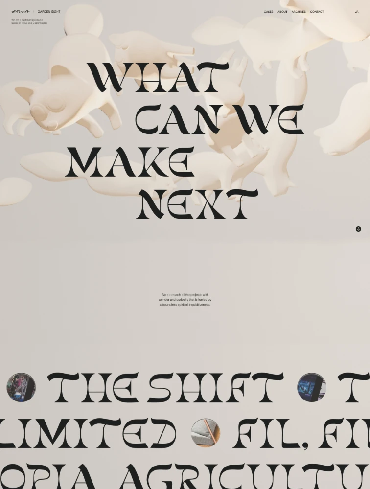
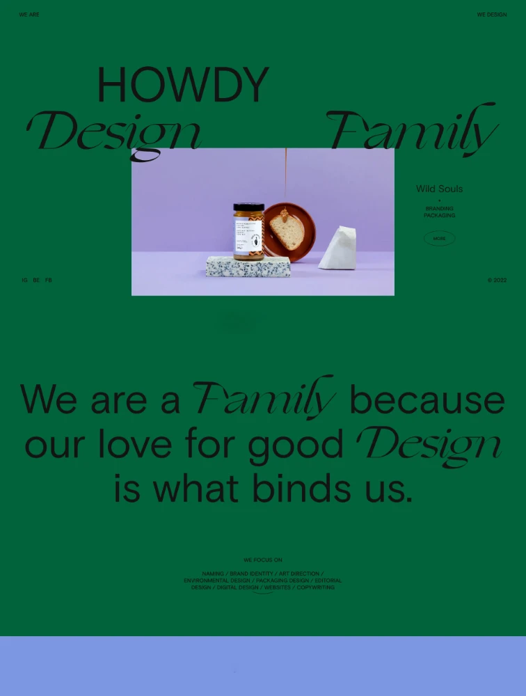
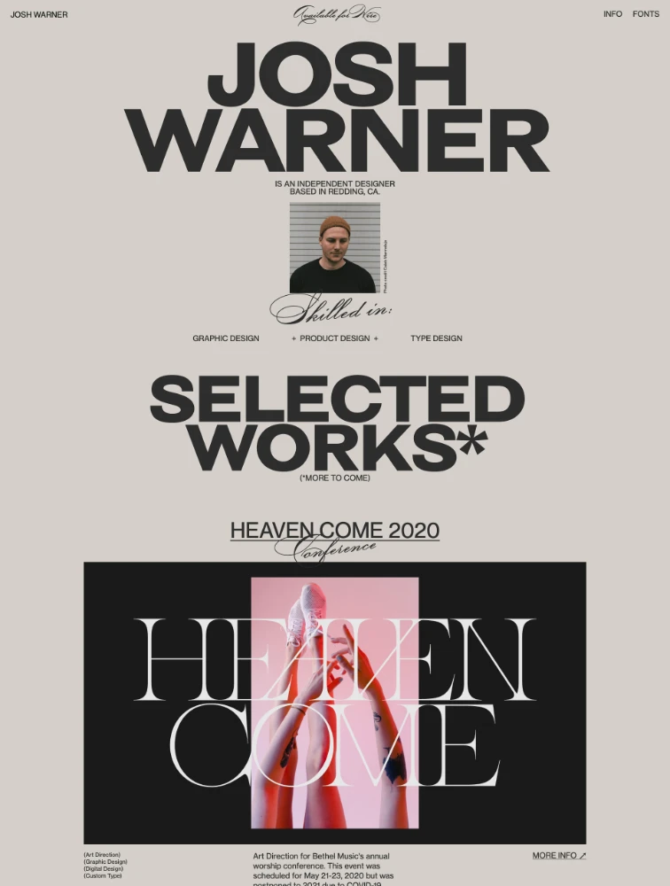
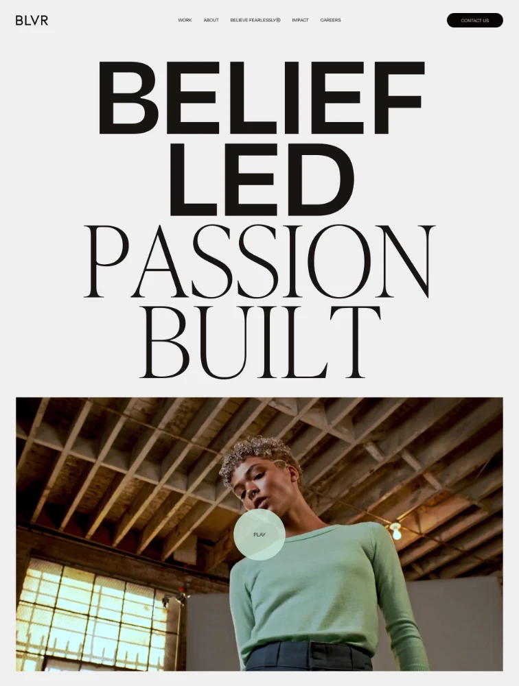
Typography landing pages use type as the primary design element, featuring bold headlines, creative text layouts, interesting font pairings, and text-driven visual hierarchy rather than relying heavily on images or graphics. These pages demonstrate how powerful typography alone can create impact, communicate brand personality, guide visitor attention, and drive conversion. On Lapa.ninja, typography-focused landing pages showcase how font selection, sizing, spacing, and layout create distinctive brand identity, improve readability and comprehension, establish visual hierarchy directing attention to CTAs, and differentiate from image-heavy competitors through typographic sophistication.
What makes typography-focused landing pages effective?
Typography-driven pages succeed through: Exceptional readability enabling visitors to consume content easily and understand value quickly. Clear visual hierarchy using size, weight, and spacing to guide attention from headlines to CTAs. Fast loading performance since text-focused pages load dramatically faster than image-heavy alternatives. Strong brand personality communicated through font selection reflecting brand values and target audience. Accessibility benefits as text-focused content works better for screen readers and assistive technologies. Mobile excellence since typography typically adapts more gracefully to small screens than complex layouts. SEO advantages as text content is fully indexable and crawlable. Scalability across languages and markets without cultural image concerns. Cost efficiency avoiding expensive photoshoots or illustration. Focus directing attention to message and conversion elements without visual distraction.
What are typography best practices for landing pages?
Typography best practices: Establish clear hierarchy using size, weight, color, and spacing to guide reading order from most to least important. Limit font families to 2-3 maximum for cohesion - typically one for headlines, one for body, occasional accent. Choose web fonts optimized for screen reading with good x-height and letter spacing. Ensure sufficient line height (1.5-1.8 for body text) and line length (50-75 characters optimal). Maintain excellent contrast meeting WCAG standards (4.5:1 minimum for body, 3:1 for large text). Optimize font loading using font-display: swap and loading only necessary weights. Use responsive typography with fluid sizing adapting to viewport. Align text for readability (left-aligned for Western languages). Create visual interest through size variation, weight contrast, and strategic color. Test typography across devices and browsers ensuring consistency.
What fonts and pairings work best for landing pages?
Effective font strategies: Sans-serif fonts for headlines (like Inter, Poppins, Montserrat) providing modern, clean aesthetics. Serif fonts for body text or headlines (like Merriweather, Playfair Display) adding elegance and trustworthiness. Monospace fonts sparingly for technical content or code samples. Display fonts for impact in hero sections if brand-appropriate. Font pairings combining contrasting styles - geometric sans-serif headlines with humanist sans body, or serif headlines with sans-serif body. System fonts for maximum performance when brand allows. Variable fonts enabling weight and width adjustments without multiple files. Choose fonts matching brand personality: sans-serif for tech and modern brands, serif for traditional and trustworthy brands, geometric for minimalist and clean brands, humanist for friendly and approachable brands.
Where can I find typography landing page inspiration?
Visit lapa.ninja/category/typography for examples of text-driven designs. When reviewing: identify font families used and whether they're custom or web fonts, analyze typographic hierarchy and how it guides attention, study font pairings and contrast strategies, note text sizing, spacing, and layout approaches, observe how typography creates brand personality, identify animation and interaction techniques with text, analyze color usage in typography, evaluate mobile implementations and responsive strategies, note how typography integrates with minimal imagery, consider performance and loading strategies, and extract principles for creating visual interest through type alone. Focus on how typography serves conversion goals rather than purely aesthetic choices.