Heavy Fonts Collection
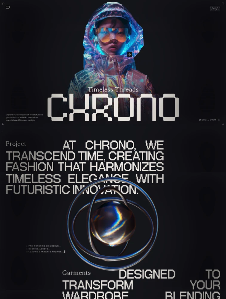
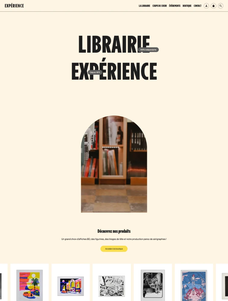
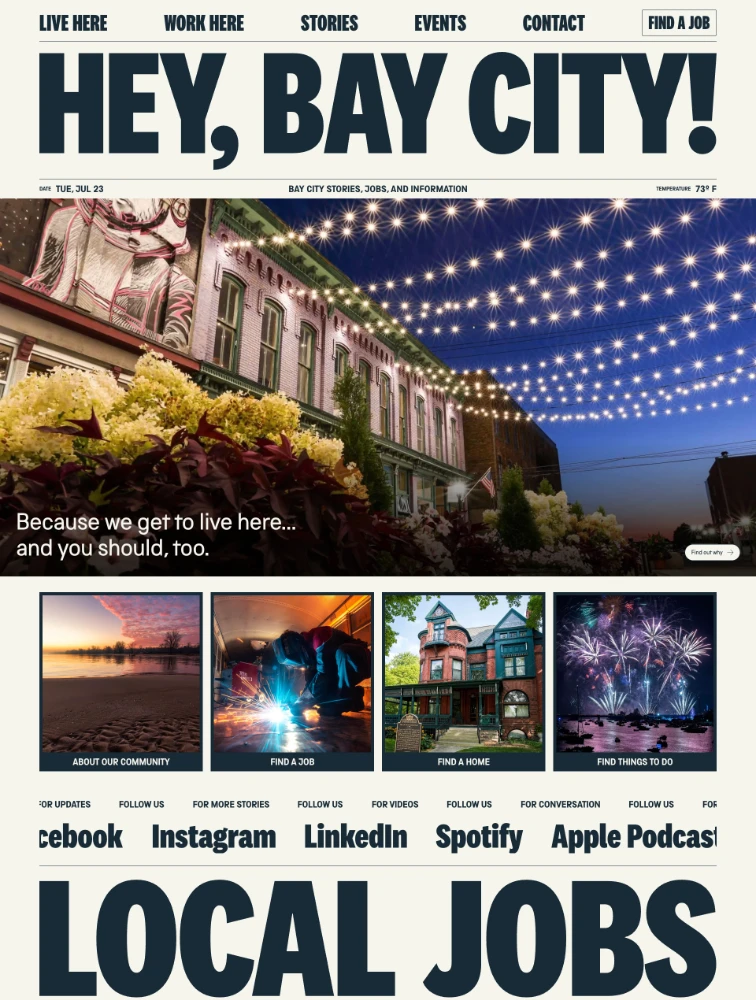
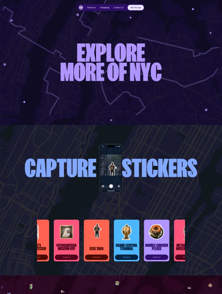
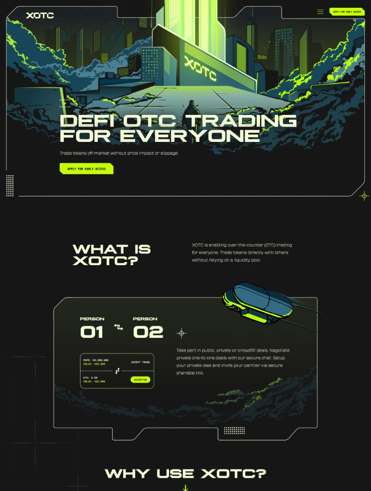
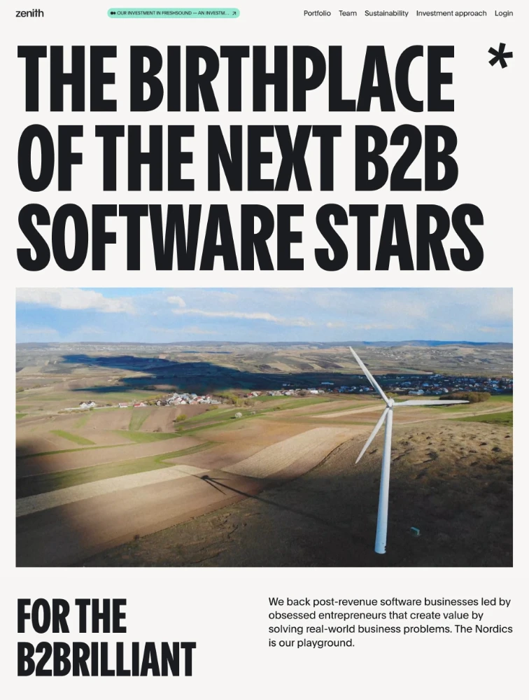
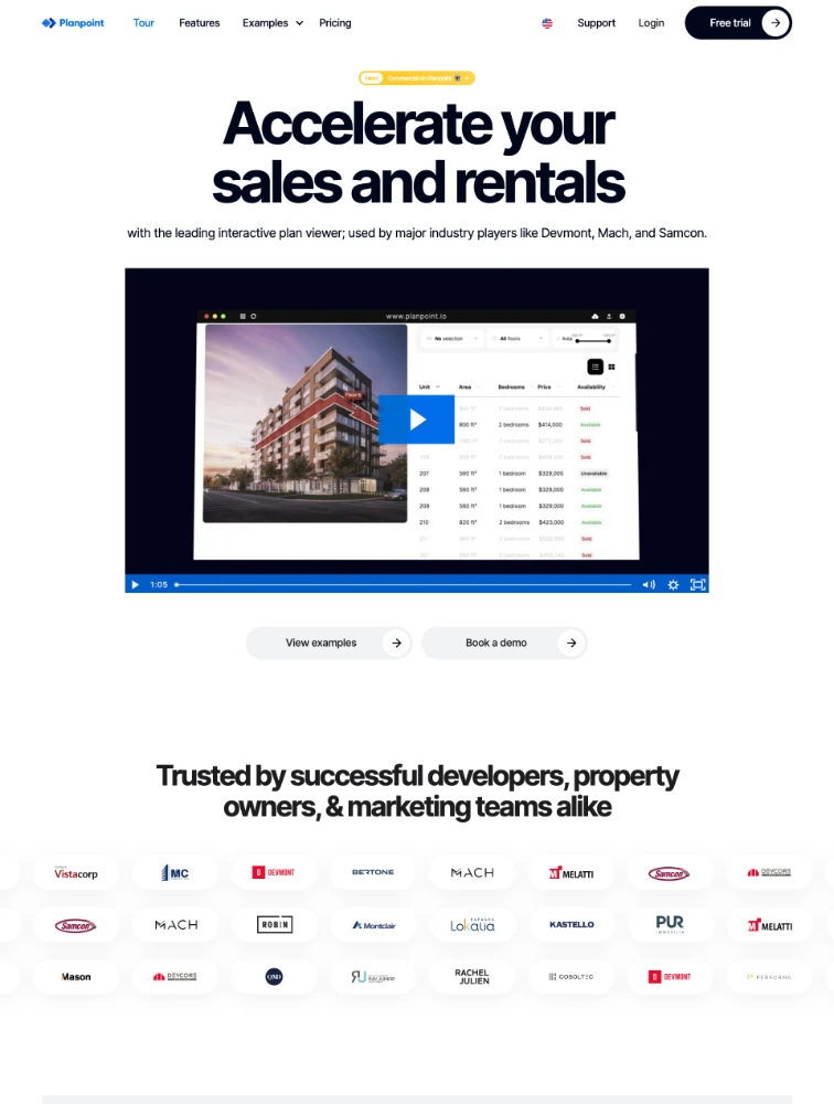
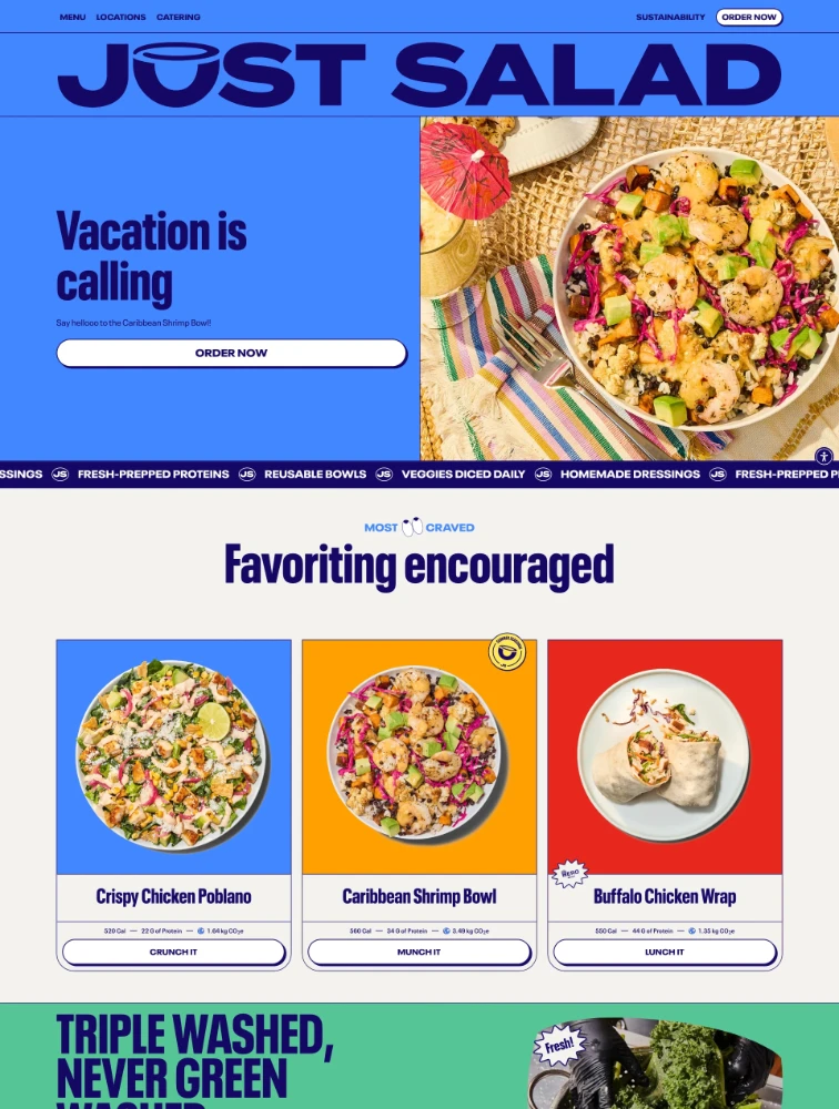
Explore websites using Heavy Fonts typefaces. Find design inspiration from sites that use this specific font collection.

Frequently Asked Questions
Everything you need to know about heavy fonts landing pages
What are Heavy Fonts landing pages?
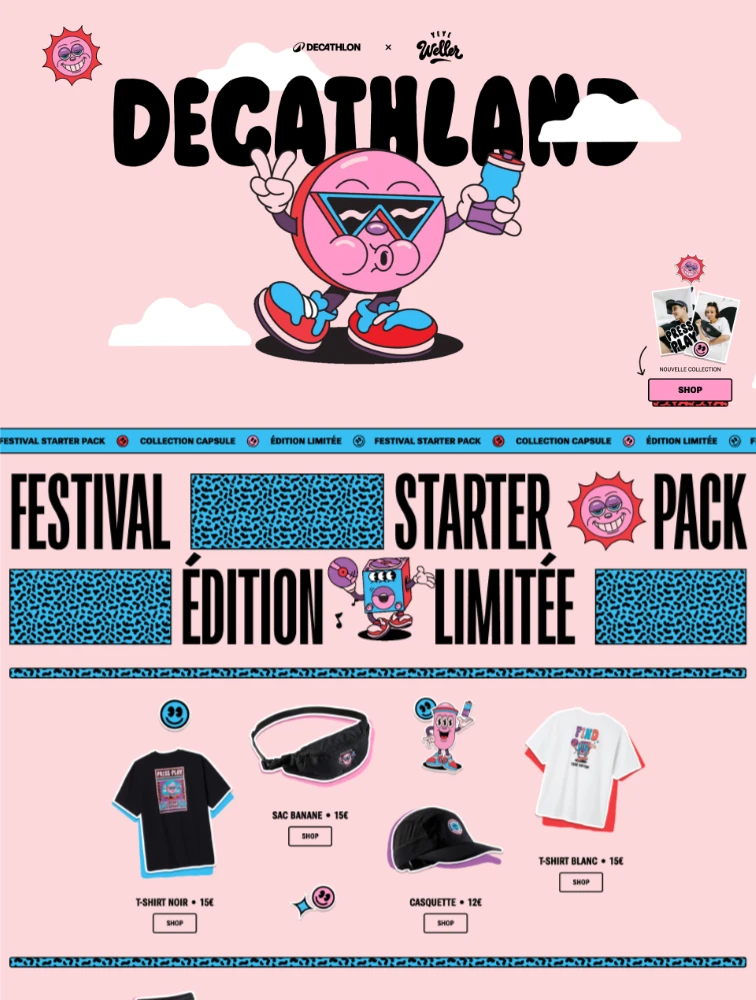
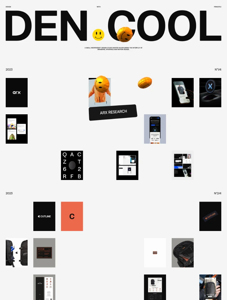
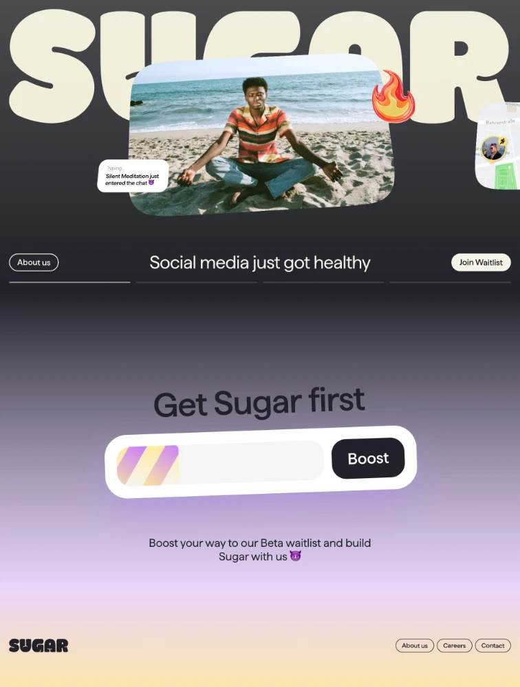
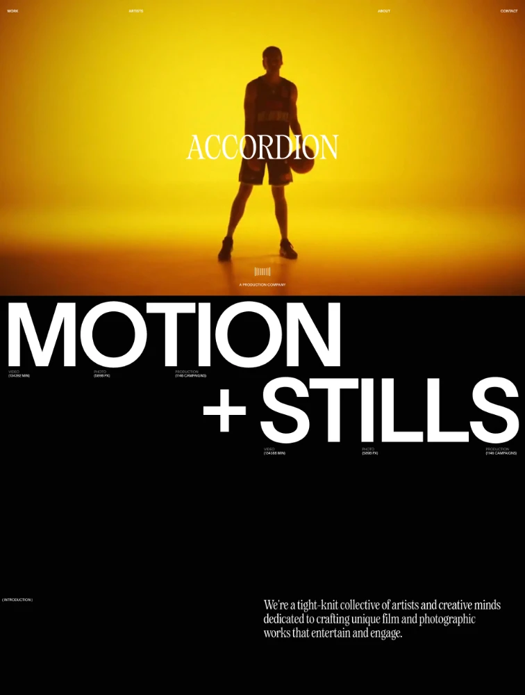
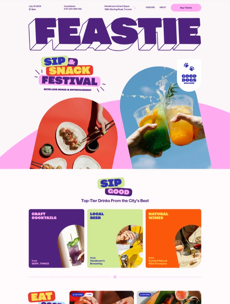
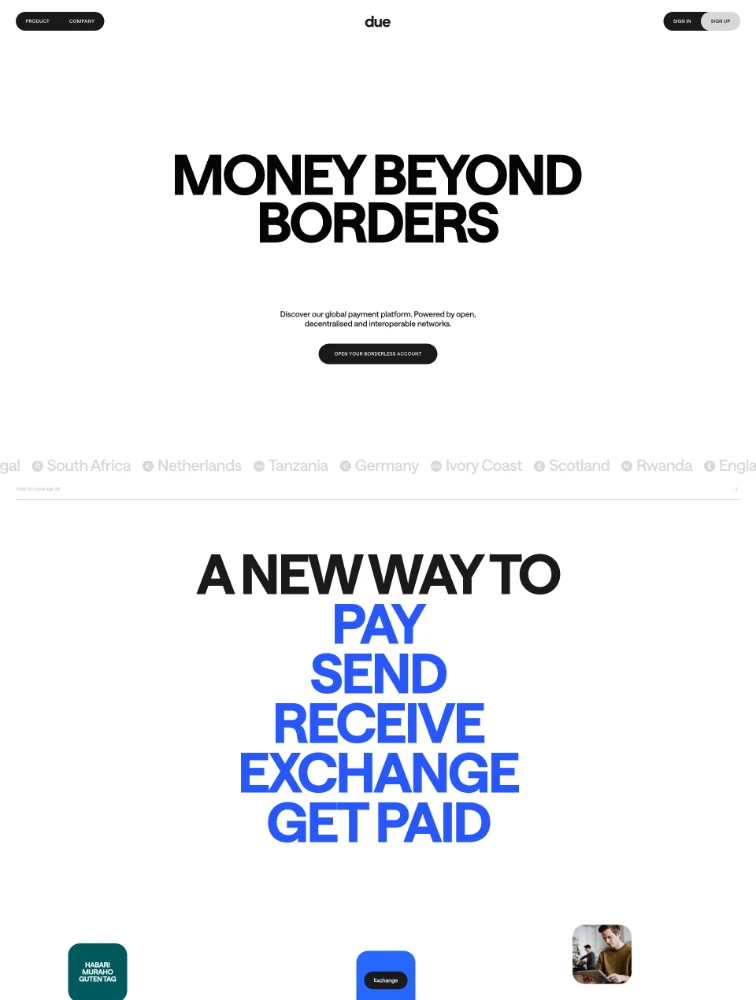
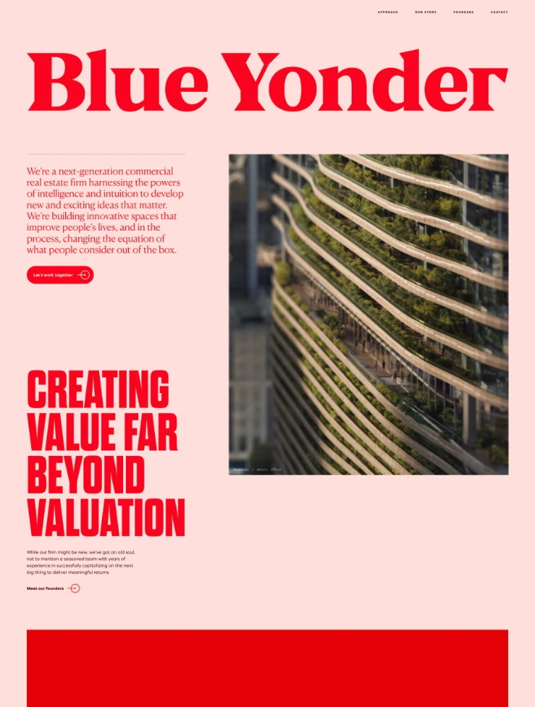
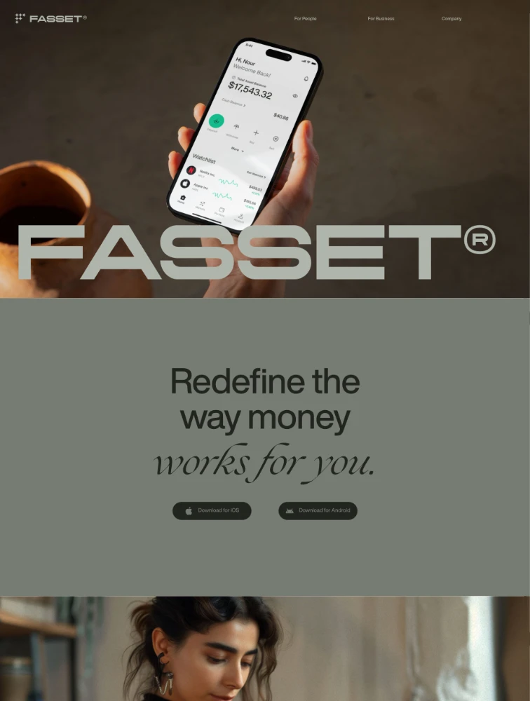
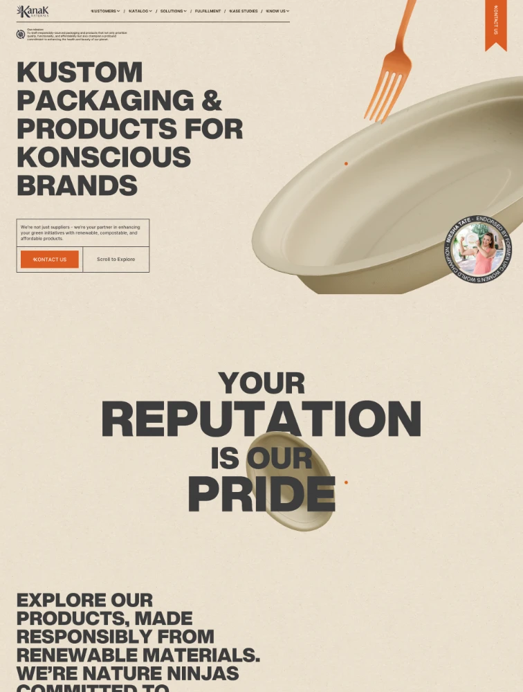
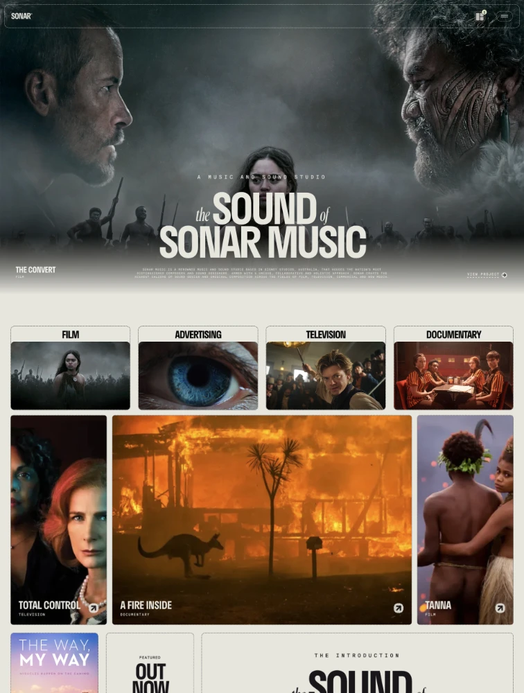
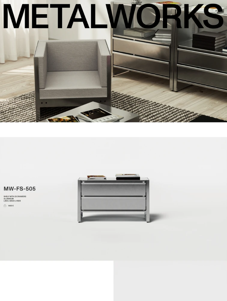
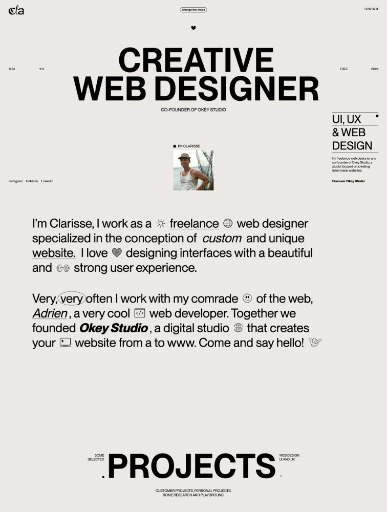
Heavy Fonts landing pages are web pages that prominently feature heavy fonts typography as a key design element. These pages leverage the unique characteristics of heavy fonts to create specific visual impact, communicate brand personality, and enhance readability. Using heavy fonts strategically can differentiate landing pages from competitors, reinforce brand identity, improve user experience through appropriate typography choices, and influence visitor perception and behavior. Heavy Fonts work particularly well for certain industries and brand personalities where the typeface characteristics align with messaging goals and target audience preferences.
When should I use Heavy Fonts on landing pages?
Use Heavy Fonts on landing pages when: (1) The typeface personality aligns with your brand identity and message, (2) Readability and legibility are appropriate for your content length and target audience, (3) The font characteristics support rather than distract from conversion goals, (4) Performance impact of the font files is acceptable for your page speed requirements, (5) The typeface is properly licensed for web use, and (6) It provides sufficient differentiation from competitors while remaining professional. Heavy Fonts work best for specific industries, brand personalities, and content types where the typography enhances rather than hinders the user experience. Always test heavy fonts with your target audience to ensure positive reception and strong conversion performance.
What are best practices for Heavy Fonts in landing page design?
Best practices for using Heavy Fonts on landing pages include: (1) Ensure excellent readability across different devices, screen sizes, and lighting conditions, (2) Use appropriate font sizes, line heights, and letter spacing for optimal legibility, (3) Implement proper font loading strategies to prevent layout shifts and slow page loads, (4) Pair heavy fonts with complementary typefaces if using multiple fonts, (5) Maintain sufficient contrast between text and backgrounds meeting WCAG accessibility standards, (6) Optimize font files and use only necessary weights and styles to minimize file size, (7) Test typography on various devices and browsers for consistency, (8) Use heavy fonts consistently with your overall brand typography system, (9) Consider mobile readability since many visitors browse on phones, and (10) A/B test different typography approaches to measure impact on engagement and conversion.
How do Heavy Fonts affect landing page conversion rates?
Typography choices like Heavy Fonts can significantly impact landing page conversion by influencing readability, comprehension, trust, and emotional response. Well-chosen heavy fonts can increase conversion through improved readability leading to better message comprehension, appropriate personality alignment building trust, professional presentation enhancing credibility, and visual hierarchy guiding attention to CTAs. However, poor heavy fonts implementation can hurt conversion through readability issues, slow loading times, personality mismatches, or accessibility problems. The impact varies by industry, target audience, and specific implementation. Test heavy fonts against alternatives to measure actual effect on your conversion metrics, time on page, scroll depth, and bounce rate.
What are common mistakes with Heavy Fonts landing pages?
Common mistakes when using Heavy Fonts on landing pages include: (1) Sacrificing readability for aesthetics, making content difficult to consume, (2) Using inappropriate font sizes, particularly too small for mobile devices, (3) Loading too many font weights and styles increasing page load time, (4) Poor contrast between heavy fonts and backgrounds creating accessibility issues, (5) Inconsistent typography usage creating visual confusion, (6) Choosing heavy fonts based on trends rather than strategic brand fit, (7) Ignoring web font licensing requirements risking legal issues, (8) Failing to optimize font loading causing layout shifts or slow rendering, (9) Not testing on various devices leading to rendering inconsistencies, and (10) Overusing decorative or display versions of heavy fonts for body text. Successful landing pages use heavy fonts purposefully to enhance message clarity and brand identity while maintaining excellent usability.