Best Red Landing Page Design Inspiration
A curated collection of red landing page design for your inspiration. Get inspired by real landing page examples, each review featuring a full screenshot and highlighting standout features.
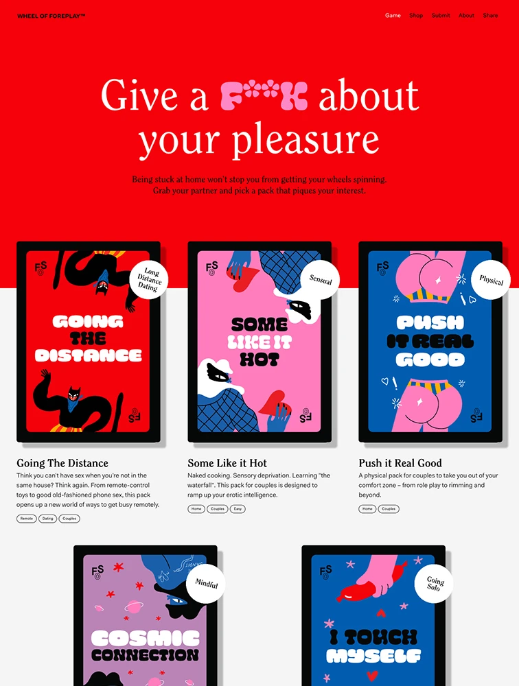

Webflow

Mobbin.com
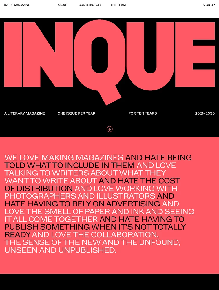
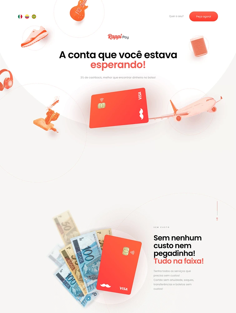
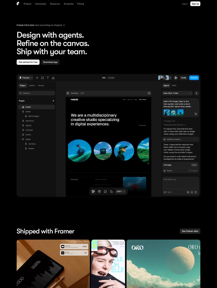
Framer 3.0
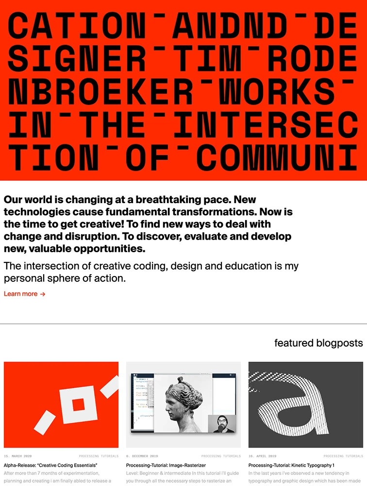

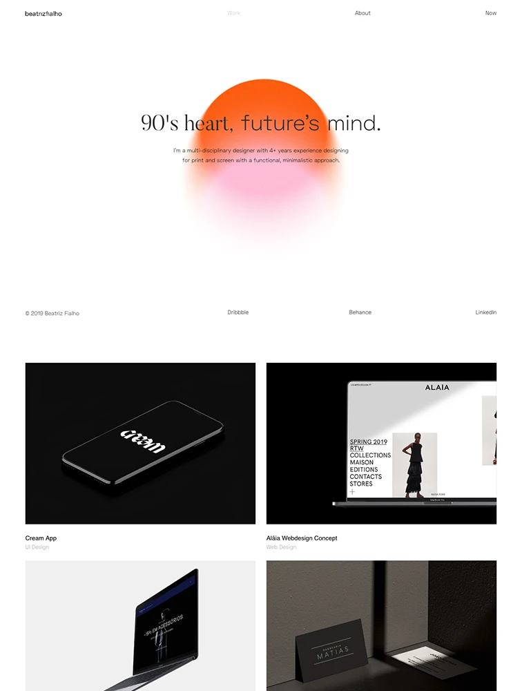
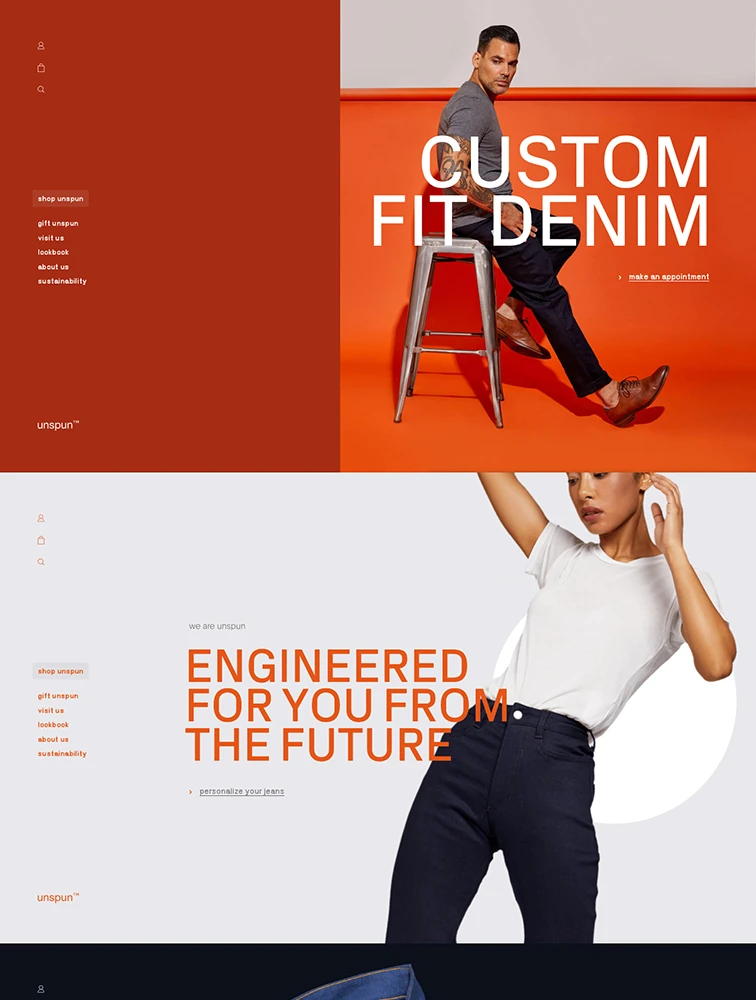
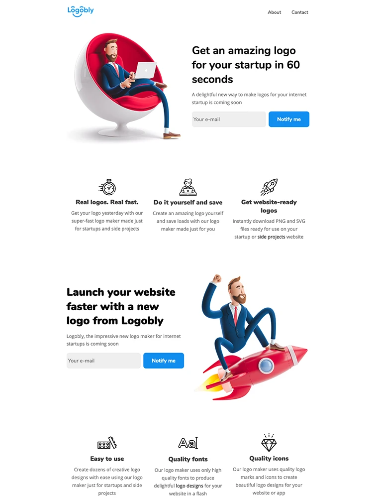
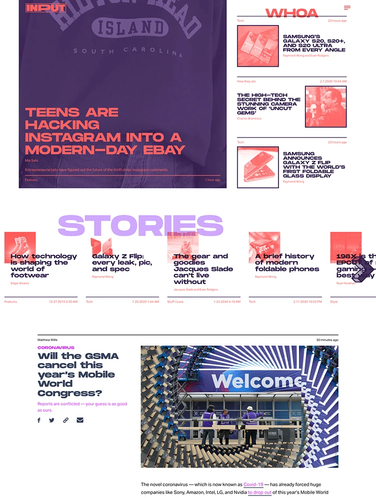
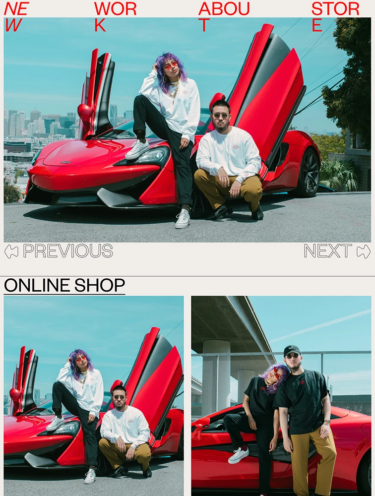
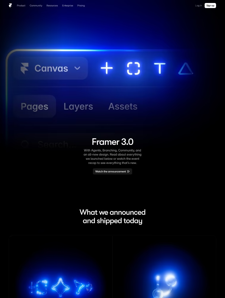
Framer 3.0
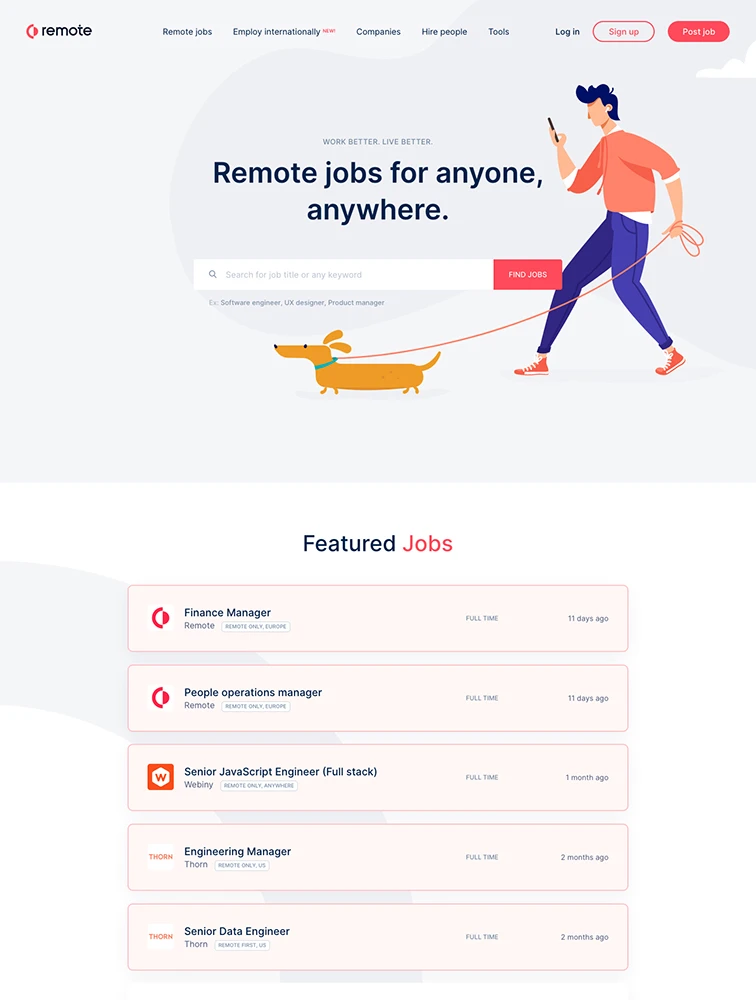
Webflow
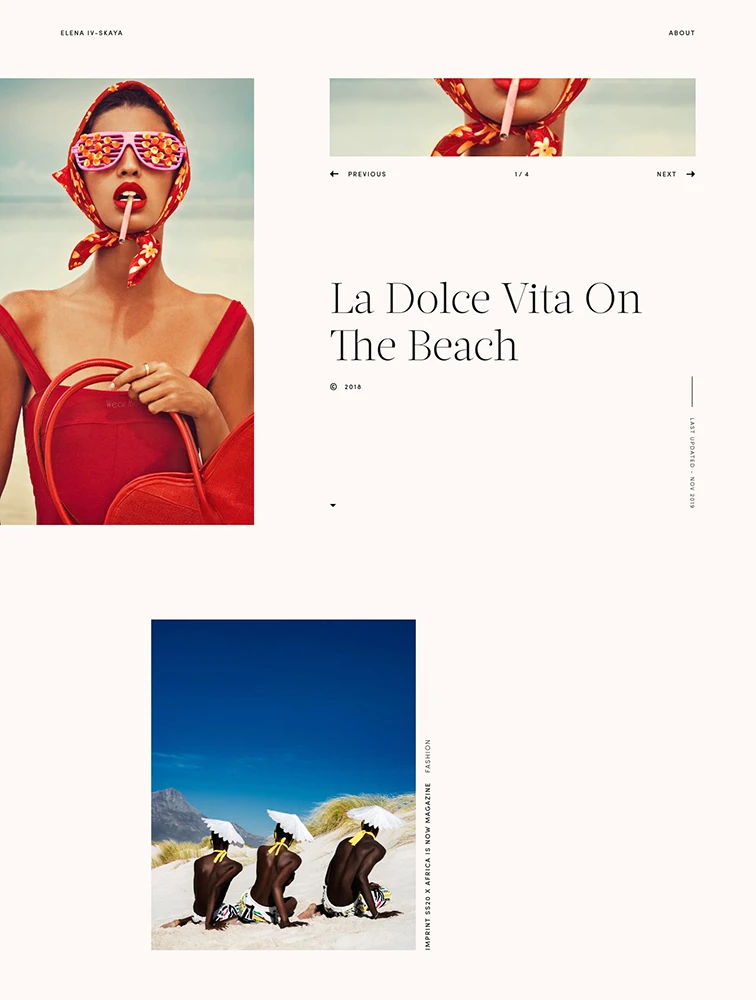
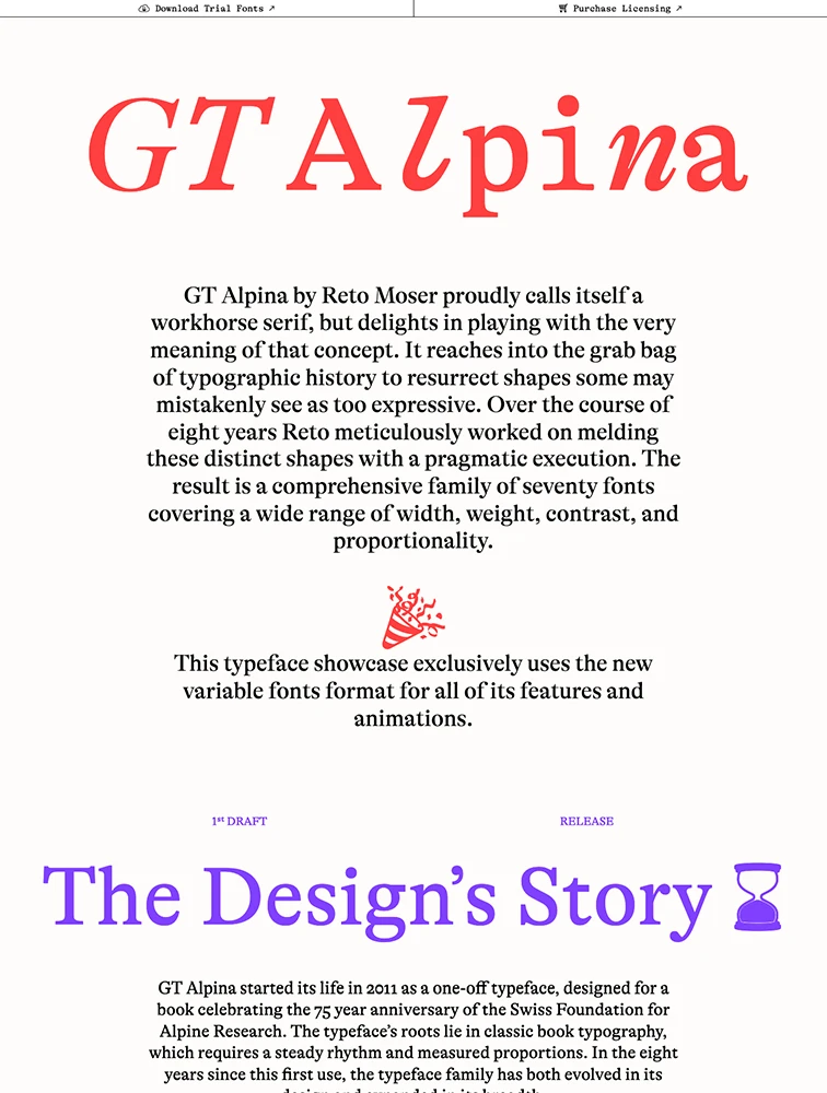

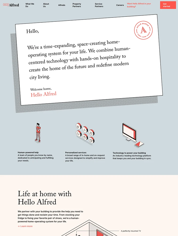
Our Sponsored


Frequently Asked Questions
Everything you need to know about red landing pages
Why use red in landing page design?
Red is a powerful color choice for landing pages because it conveys specific psychological associations and creates distinct emotional responses. Red landing pages work particularly well for certain industries and brand personalities where the color's natural associations align with the message. When used strategically, red backgrounds or accents can significantly impact conversion rates by directing attention to key elements, creating appropriate mood and atmosphere, reinforcing brand identity, and differentiating from competitors. The key is understanding color psychology and ensuring red supports rather than conflicts with your value proposition and target audience preferences.
What types of brands work well with red landing pages?
Red landing pages work exceptionally well for specific brand types and industries. The color's psychological associations make it ideal for brands wanting to communicate certain values or emotions. When choosing red for landing pages, consider whether your brand personality, target audience, and product category align with the color's natural meanings. Some industries naturally benefit from red while others may find it creates cognitive dissonance. Test red with your specific audience, as color perception can vary by culture, age group, and individual preference. The most successful red landing pages use the color intentionally to enhance messaging rather than as arbitrary aesthetic choice.
What are best practices for designing red landing pages?
To design effective red landing pages that convert: (1) Ensure sufficient contrast between red elements and text for readability, meeting WCAG accessibility standards of at least 4.5:1 contrast ratio, (2) Use red strategically rather than overwhelmingly - as accent color, background, or highlight depending on intensity, (3) Pair red with complementary colors that enhance rather than clash, (4) Test different shades and tones of red to find the right balance for your brand, (5) Consider cultural associations with red if targeting international audiences, (6) Make CTA buttons stand out against red with high-contrast colors, (7) Use red consistently with your overall brand color palette, (8) Test on different devices and in various lighting conditions, and (9) A/B test red against alternative colors to measure actual impact on conversion rates.
How does red affect landing page conversion rates?
Red can significantly impact conversion rates both positively and negatively depending on implementation, industry, and audience. The color's psychological effects influence visitor perception, emotional response, and action-taking behavior. When red aligns with brand positioning and audience expectations, it can increase conversions by creating appropriate mood, improving readability and visual hierarchy, making CTAs more noticeable, and differentiating from competitors. However, poor red implementation can reduce conversions through readability issues, audience mismatch, or inappropriate emotional associations. Best practice is A/B testing red against alternatives with your specific audience and conversion goals, as color impact varies significantly by industry, product type, and demographic factors.
What are common mistakes with red landing pages?
Common red landing page mistakes include: (1) Insufficient contrast making text difficult to read, particularly problematic for accessibility, (2) Overuse of red creating visual overwhelm or monotony, (3) Choosing red based solely on aesthetic preference rather than strategic purpose, (4) Ignoring cultural color associations that may differ across target markets, (5) Making red compete with rather than complement CTAs, (6) Using red inconsistent with brand identity creating confusion, (7) Failing to test red on different devices and screen types, (8) Applying trendy red shades that quickly date the design, (9) Not considering how red reproduces in print or other media if relevant, and (10) Assuming red will universally appeal without audience testing. Successful red landing pages use the color purposefully to enhance conversion rather than hinder it.