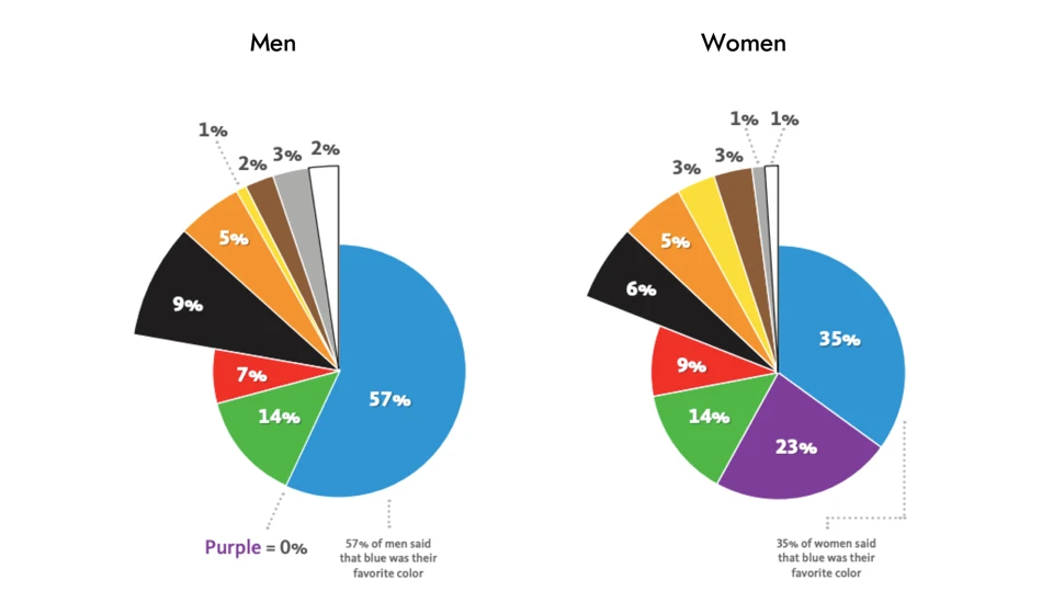
Curated design courses, tutorials, and resources to learn UI/UX design.
by Muzli
by Howard Pinsky
by Webflow
by Bonnie Kate Wolf
by Jon Yablonski
by Bethany Heck
by Dalsukh Tapaniya
by José Torre
by MDS
by Ales Nesetril
by Ashish Bogawat
by Rob Lafratta
by George Hatzis
by Lisa Dziuba
by Jonas Naimark
by Codepo8
by Katie Riley
by Denislav Jeliazkov
by Maex
by Kazuki Akamine
by Jesse Hausler
by Micah Bowers
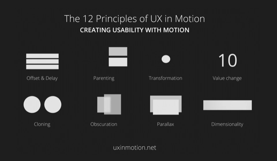
by Issara Willenskomer