Neue Haas Grotesk Typography Inspiration

Explore beautiful websites using Neue Haas Grotesk typeface and get inspired by creative typography implementations.
WEBSITE
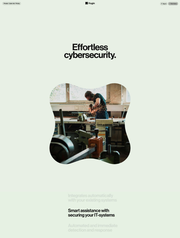
Effortless cybersecurity

Hugin

Technology
NO-CODE
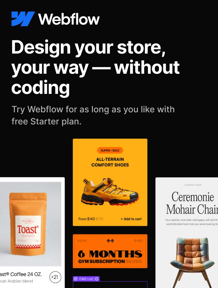
More than a website builder

Webflow Webflow

WEBSITE BUILDER
WEBSITE
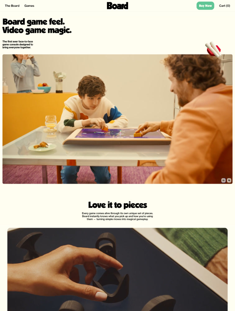
Board game feel. Video game magic.

Board.fun

eCommerce
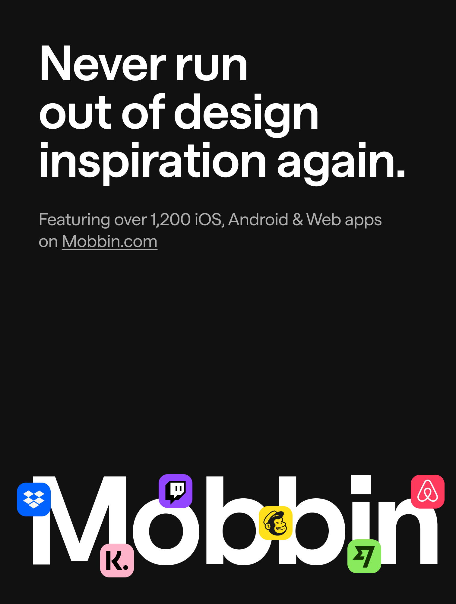
Mobbin.com
The world's largest mobile & web design reference library.

Mobbin Mobbin.com

INSPIRATION
WEBSITE
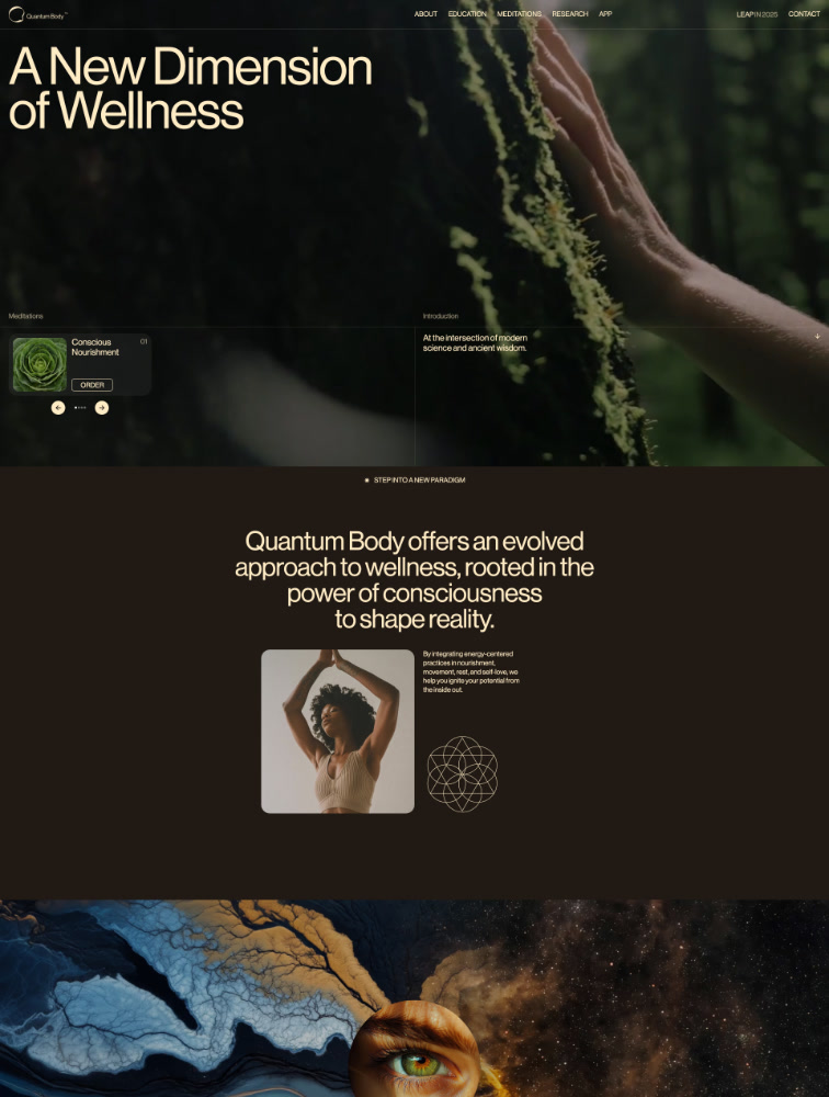
A New Dimension of Wellness

Quantum Body

Health Fitness
WEBSITE
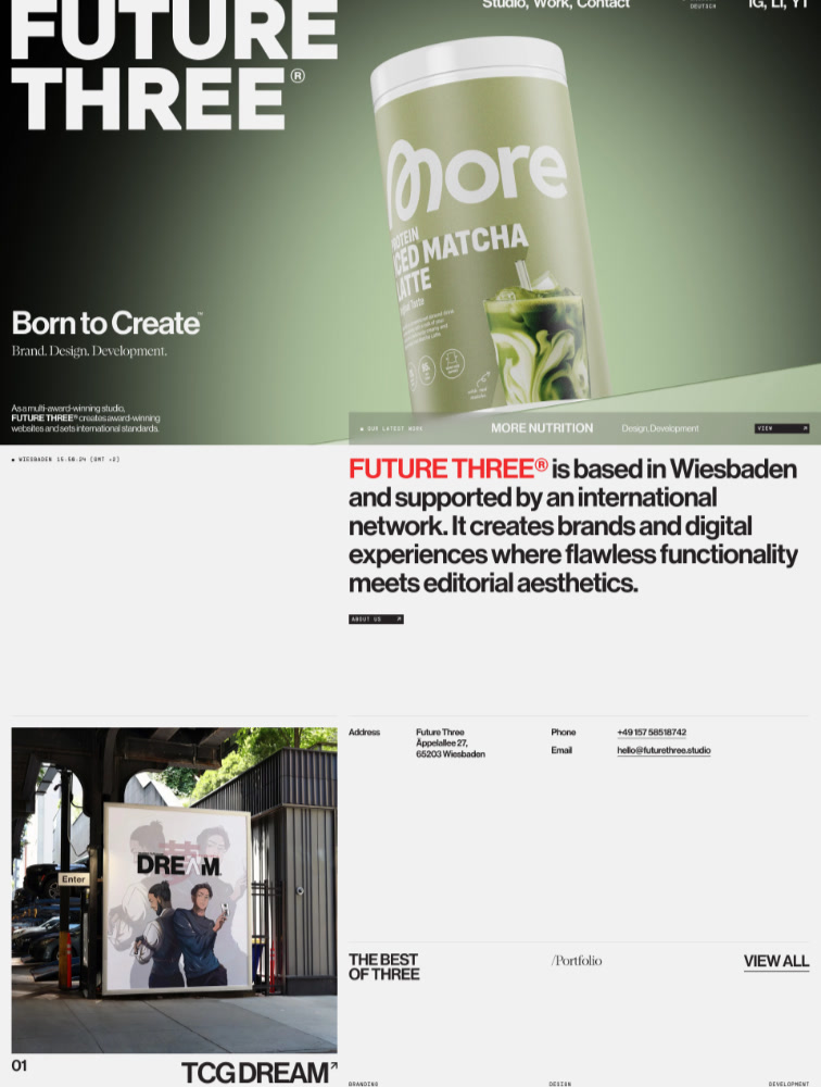
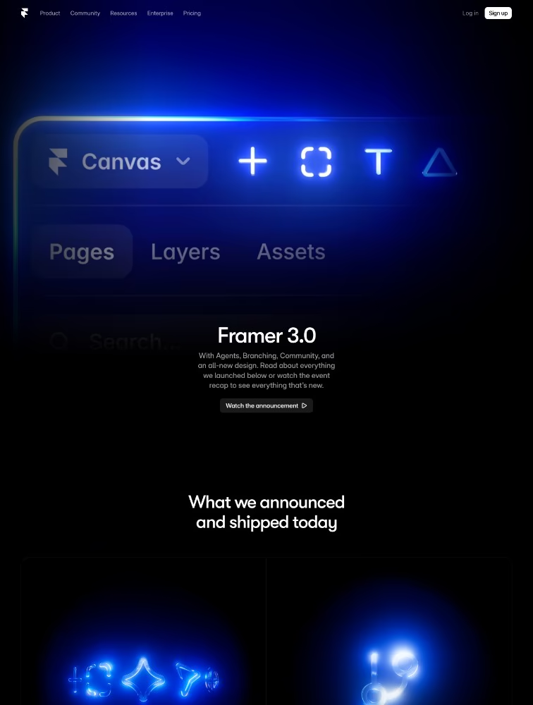
Born to Create
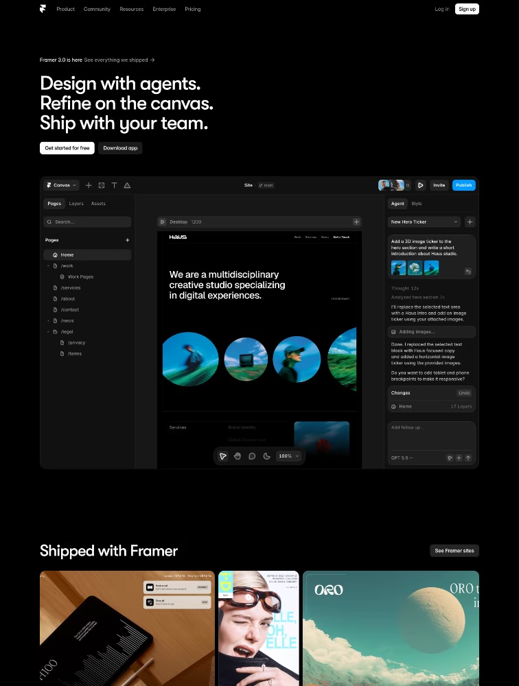
Framer website builder banner
NO-CODE
The web builder for stunning sites

Framer Framer

WEBSITE BUILDER
WEBSITE
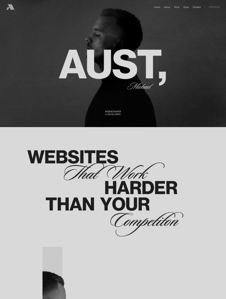
Web designer and developer

Michael Aust

Portfolio
WEBSITE
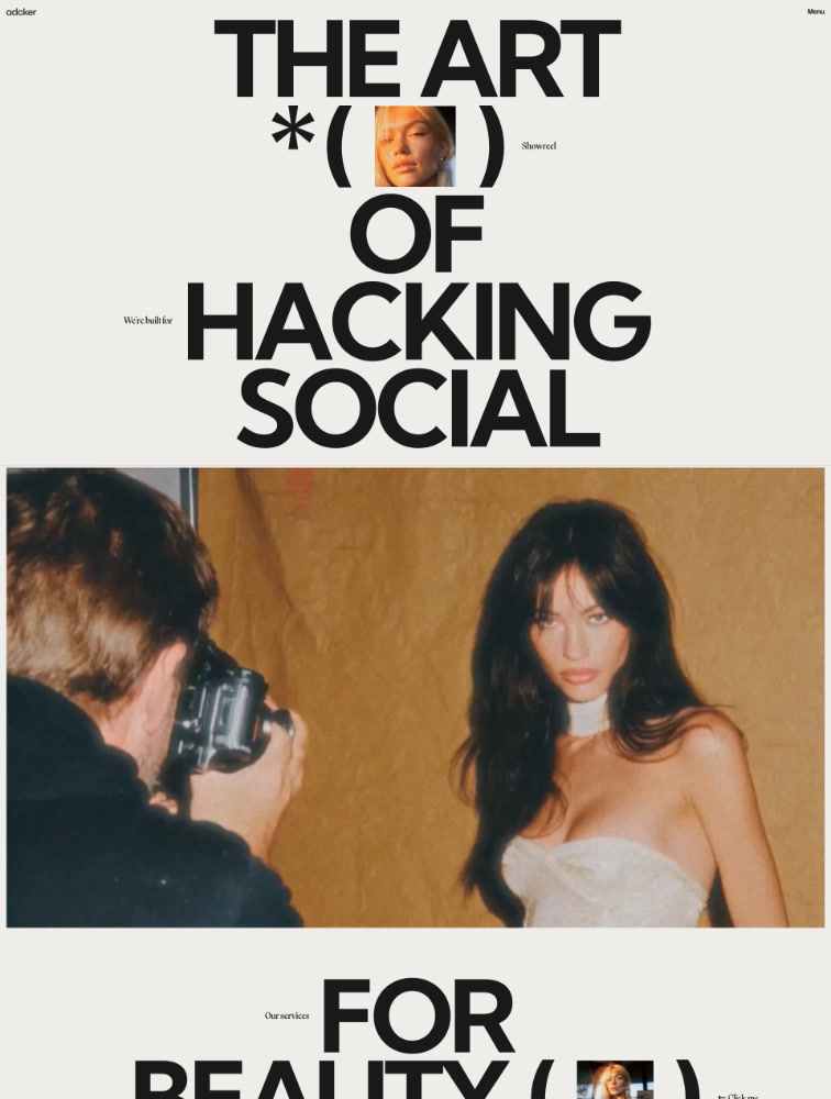
We don’t just do social media, we master it

ADCKER

Agency
WEBSITE
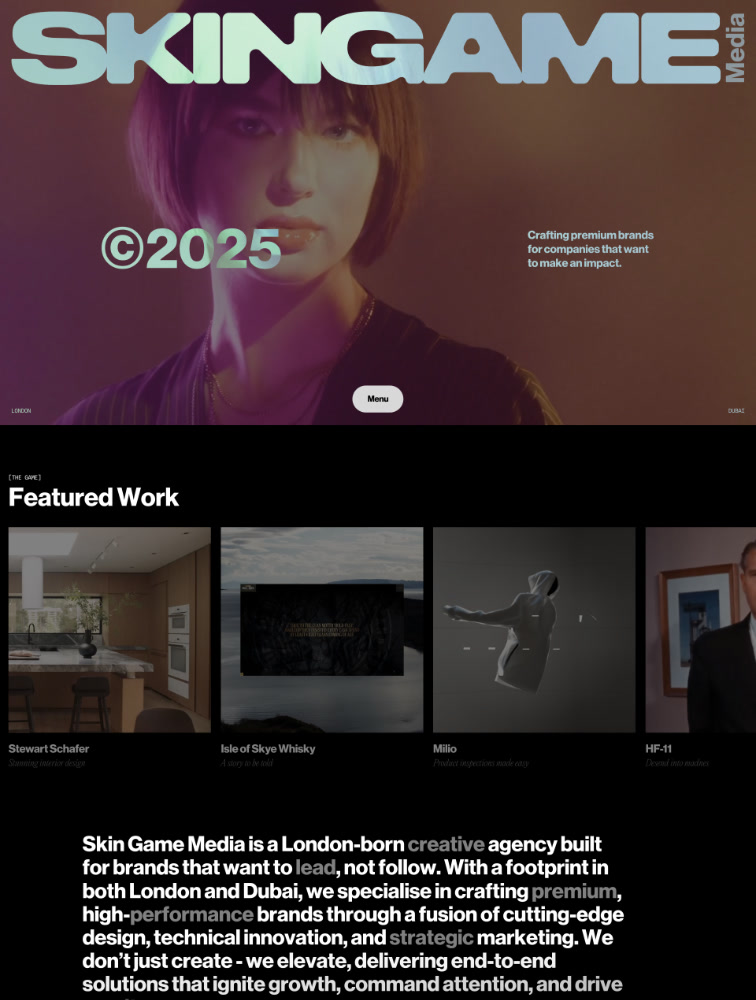
Crafting premium brands
WEBSITE
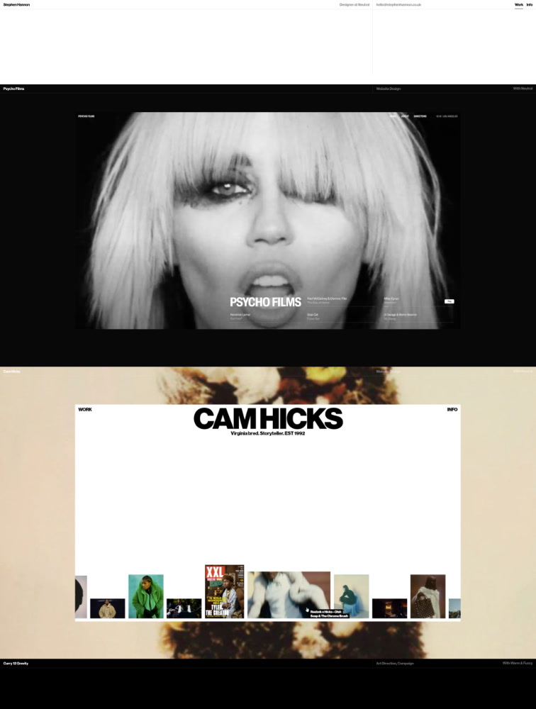
Designer and co-founder of Neutral
WEBSITE
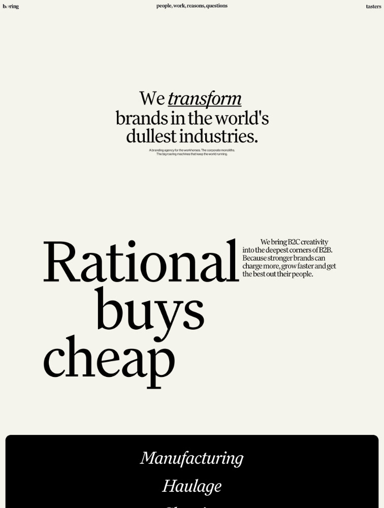
We transform brands in the world's dullest industries.
WEBSITE
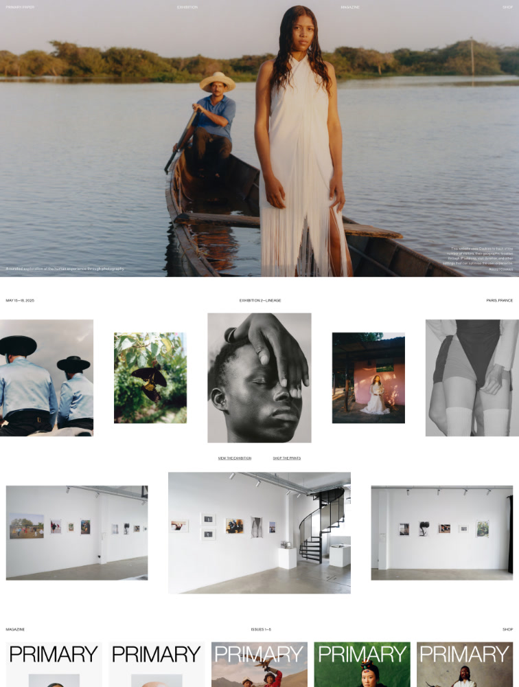
A Magazine. An Exhibition.

PRIMARY PAPER

Photography
WEBSITE
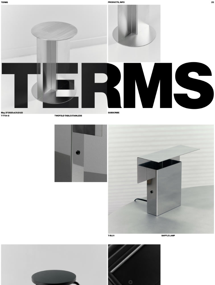
Melbourne based design studio

TERMS

Studio
WEBSITE
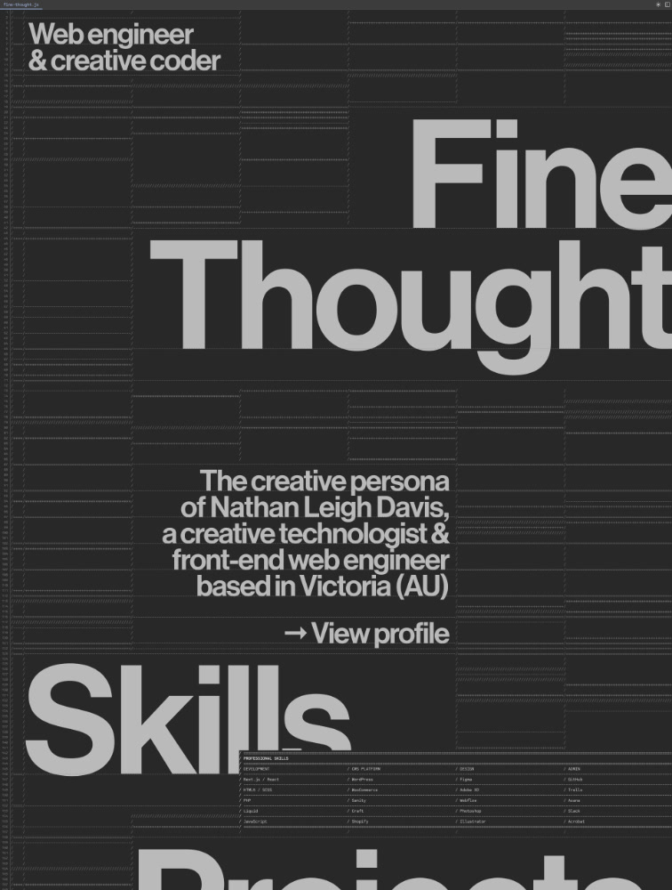
Web Engineer & Creative Coder

Fine Thought

Portfolio
WEBSITE
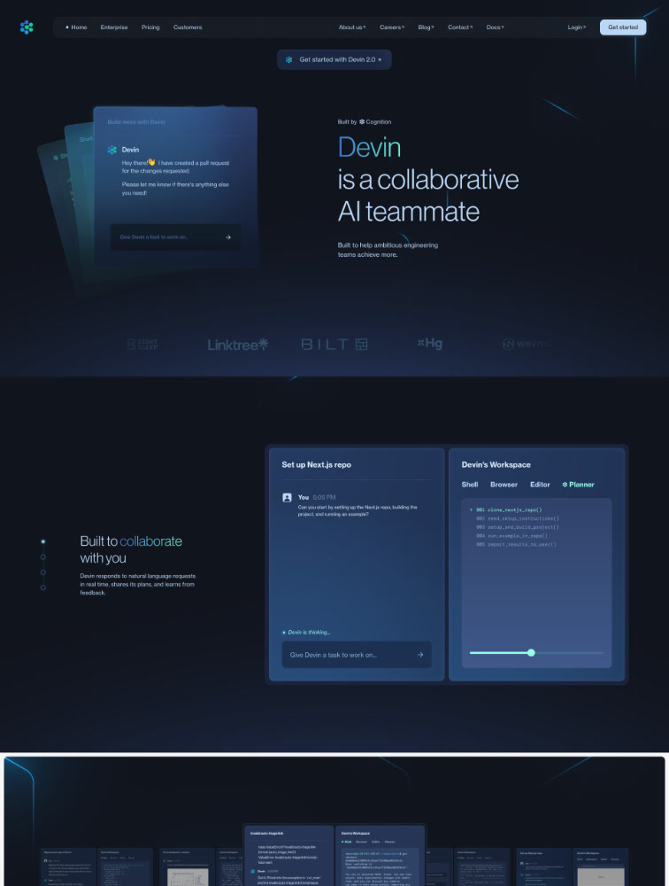
A collaborative AI teammate

Devin

Artificial Intelligence
WEBSITE
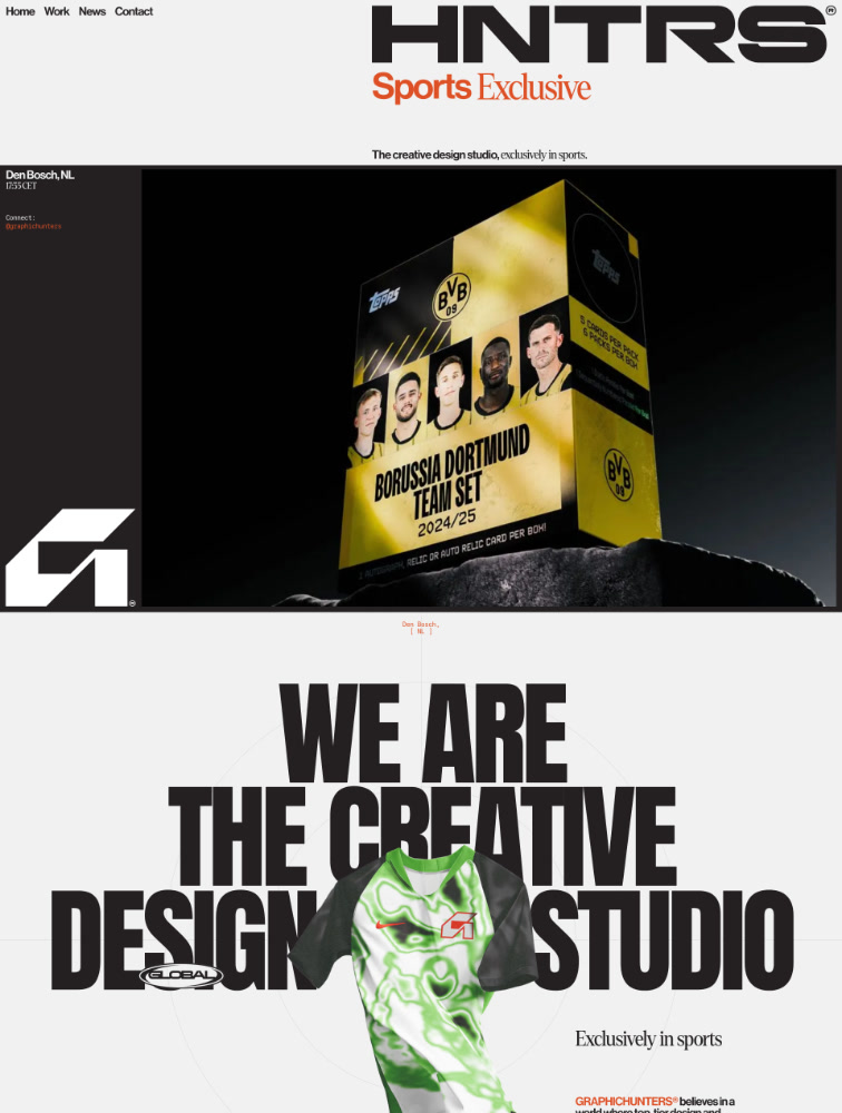
The creative design studio
WEBSITE
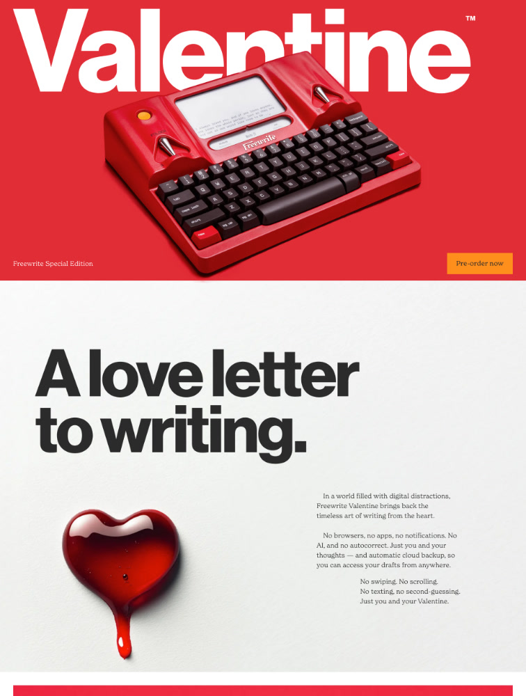
Just you and your thoughts
WEBSITE
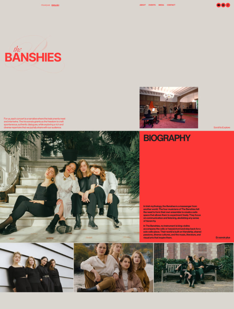
A messenger from another world
WEBSITE
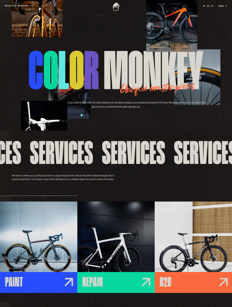
Unique custom road bikes

Color Monkey

Outdoors Travel
WEBSITE
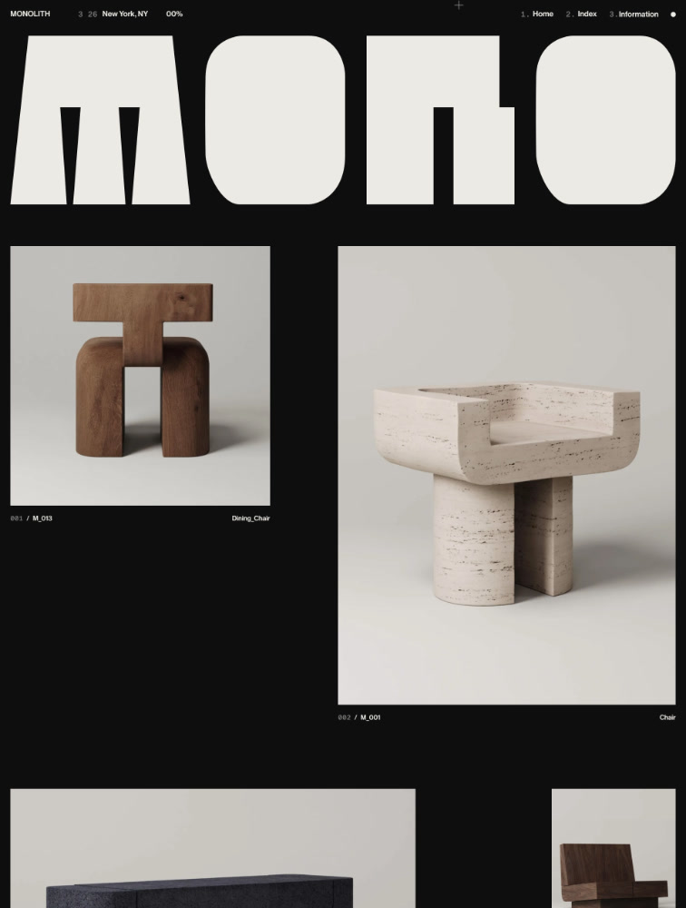
Collectible Furniture and Objects

Monolith

Furniture Interiors
WEBSITE
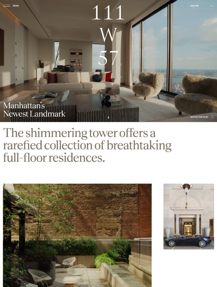
Manhattan's Newest Landmark
WEBSITE
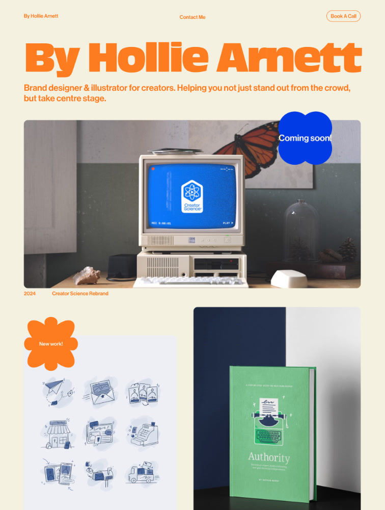
Brand strategy, design and illustration for creators
WEBSITE
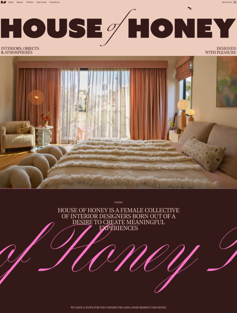
Interior Design

PARADOX Series

Furniture Interiors
WEBSITE
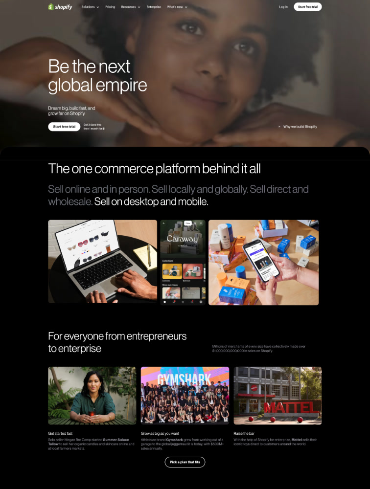
Be the next big thing
WEBSITE
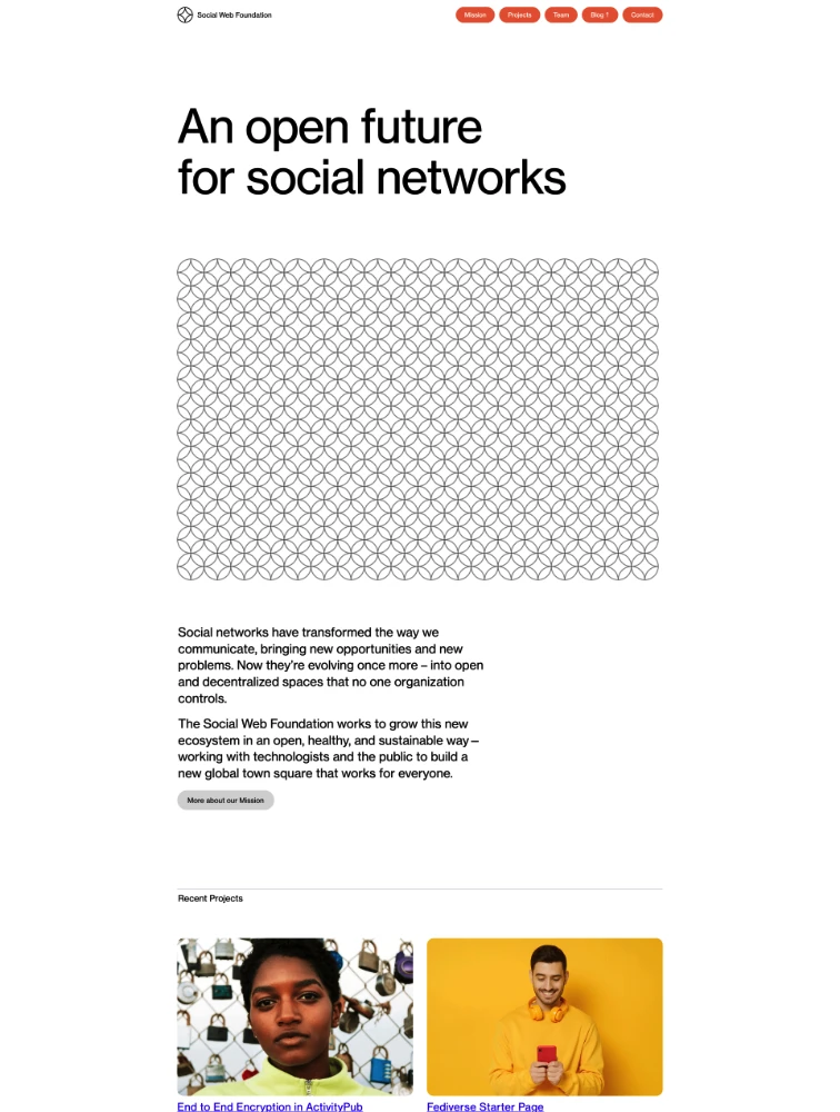
An open future for social networks
WEBSITE
Web Designer & Art Director
Showing 24 of 48 websites using Neue Haas Grotesk font
Page 1 of 2

Frequently Asked Questions

Everything you need to know about typeface landing pages

Why is typeface choice important for landing page design?

Typeface choice is one of the most critical design decisions for landing pages because typography directly impacts readability, brand perception, user trust, and conversion rates. The right typeface improves comprehension by up to 40%, ensuring visitors quickly understand your value proposition. Typography establishes emotional tone - serif fonts convey tradition and trustworthiness (ideal for finance, law, luxury), while sans-serif fonts communicate modernity and clarity (perfect for tech, startups, apps). Typeface influences perceived credibility, with professional typography increasing trust by 30-50%. It creates visual hierarchy guiding attention from headlines to CTAs through size, weight, and style variations. Typography affects loading speed - optimized web fonts load in under 100ms while poor implementation can add 2-3 seconds. It impacts accessibility with proper fonts, sizing, and contrast enabling readability for users with visual impairments. Most importantly, typography differentiates your brand creating distinctive identity through consistent font usage across all touchpoints.

What are the main typeface categories and when should I use each?

Main typeface categories include: Serif fonts (Times New Roman, Garamond, Merriweather) with decorative strokes at letter ends, ideal for traditional industries like finance, law, luxury goods, publishing, and education where trust and authority matter. They work excellently for body text in long-form content. Sans-serif fonts (Helvetica, Inter, Roboto, Poppins) without decorative strokes, perfect for modern brands, technology companies, startups, apps, and clean interfaces. They're highly readable on screens making them ideal for headlines, UI elements, and body text. Monospace fonts (Courier, Monaco, JetBrains Mono) with fixed character width, used sparingly for code snippets, technical documentation, or creating distinctive developer-focused brands. Display fonts (custom decorative typefaces) for headlines and hero sections when brand personality demands uniqueness, used sparingly due to limited readability. Script fonts mimicking handwriting, rarely appropriate for landing pages except specific luxury or wedding industries. For most landing pages, combine a bold sans-serif for headlines with either the same font family at lighter weight or a readable serif for body text, maintaining 2-3 fonts maximum to avoid visual chaos.

What are typography best practices for landing page conversion?

Typography best practices for high-converting landing pages: Use 2-3 font families maximum - typically one for headlines, one for body text, and occasionally an accent font. Establish clear hierarchy through size, weight, and spacing variations making the most important elements (value proposition, CTAs) immediately obvious. Ensure readability with minimum 16px for body text, 1.5-1.8 line height for body copy, and 50-75 characters per line for optimal reading. Maintain sufficient contrast meeting WCAG standards (4.5:1 for body text, 3:1 for large text) ensuring accessibility. Optimize loading by using variable fonts, loading only necessary weights, and implementing font-display: swap to prevent invisible text. Create scannable content with clear headings, bullet points, short paragraphs (3-4 lines), and whitespace between sections. Use responsive typography with fluid sizing adjusting gracefully across devices. Align text appropriately - left-aligned for Western languages, centered for short headlines only. Make CTAs stand out through bold weights, contrasting colors, and strategic sizing. Test typography across devices and browsers ensuring consistency.

How do I choose and pair typefaces effectively?

Effective typeface selection and pairing strategies: Start by defining brand personality - modern and clean (geometric sans-serifs like Montserrat), friendly and approachable (humanist sans-serifs like Open Sans), traditional and trustworthy (classic serifs like Georgia), or bold and unique (display fonts for headlines). Match fonts to audience expectations - tech audiences expect clean sans-serifs, luxury audiences appreciate elegant serifs, creative audiences embrace unique typography. For pairing, use contrast - pair bold sans-serif headlines with lighter serif body text, or geometric headlines with humanist body. Maintain consistency within the same font family using different weights and styles (Inter Regular for body, Inter Bold for headlines). Test readability by viewing fonts at actual sizes in realistic contexts, not just specimens. Consider technical aspects - choose fonts with complete character sets for your languages, multiple weights for hierarchy, and good web performance. Browse proven systems like Google Fonts, Adobe Fonts, or Font Squirrel for quality web fonts. Look at successful landing pages in your industry on sites like Lapa.ninja at lapa.ninja/typeface/ to see what typography approaches convert well for similar products and audiences.

What common typography mistakes hurt landing page conversion?

Common typography mistakes that reduce conversion: Using too many fonts (more than 3) creating visual chaos and unprofessional appearance, reducing trust and increasing cognitive load. Insufficient contrast between text and background making content difficult or impossible to read, particularly problematic for accessibility. Body text too small (under 16px) straining eyes and increasing bounce rates, especially on mobile devices where 60%+ of traffic occurs. Poor hierarchy with similar sizing for headlines, subheads, and body making it unclear what's most important. Excessive line length (over 90 characters) or too short (under 40 characters) hurting readability and comprehension. Centered body text creating uneven left edges that slow reading and increase fatigue. Loading too many font weights bloating page size and slowing load times by 2-4 seconds. Using decorative display fonts for body text sacrificing readability for aesthetics. Not testing fonts across devices leading to rendering inconsistencies or missing fallbacks. Ignoring web font loading strategies causing flash of invisible text (FOIT) or unstyled text (FOUT). Trendy fonts that quickly date your design. Poor letter-spacing, word-spacing, or line-height making text cramped or too loose. Text on busy backgrounds without sufficient contrast or overlays. Always prioritize readability and conversion over aesthetic preferences alone.